Here’s a simple solution to an issue that’s been bedeviling me for some time: how to embed ancient Flash .SWF files into a contemporary responsive website. If you want to skip the preamble, you can jump directly to the walkthrough, or to the demo page & CodePen.
I almost never blog about web design matters, despite it being my career. But I thought this was worth sharing, even though the potential audience is extremely small — possibly me and only me! In the earliest phase of my career, I specialized in Flash animation and design. So I have several old .SWF files and/or entire Flash sites I would like to present on my portfolio site, or at the very least, temporarily resurrect so I can take screenshots or screen recordings. But the problems, oh the problems! Where to begin?
The Problem With Flash
Problem 1 of 3: ding-dong, Flash is long, long gone
My archived Flash files are decades old, and the web has long since moved on. Flash changed hands from Macromedia to Adobe in 2005, who retired the browser plug-in in late 2020, followed to the grave by the authoring app Animate (née Flash) in late 2025.
Luckily, the open source Flash Player emulator Ruffle.js can display SWF files in almost any modern browser. The solution below includes the simplest Ruffle.js implementation that a non-developer such as myself can understand.
Problem 2 of 3: What about phones?
Famously, Apple consciously opted not to support Flash from the advent of the iPhone. Many cite Steve Jobs’ open letter Thoughts on Flash with steering popular opinion on the technology.
So to point out the obvious, Flash predates the responsive web era, and had been typically intended to be displayed at fixed sizes on desktop monitors. So even with Ruffle.js, how to present .SWF files in a contemporary responsive website, that ought to support any screen size? Below, I’ll share the simplest, leanest code that worked for me.
Problem 3 of 3: Modern browsers don’t like autoplaying media with audio
For users, this is a feature, not a bug. But modern browsers do present an interesting roadblock for legacy media that was originally designed to autoplay with video. Even with Ruffle.js, SWF playback may simply halt when it reaches a keyframe with audio. I’ll attempt to cover this below.
The Solution
Step 1 of 3: Ruffle.js
At the bottom of your html page, above the closing </body> tag, paste the following:
<script src="https://unpkg.com/@ruffle-rs/ruffle"></script>
<script>
	window.RufflePlayer = window.RufflePlayer || {};
	window.RufflePlayer.config = {
		"warnOnUnsupportedContent": false,
		"autoplay": "on",
		"unmuteOverlay": "hidden"
	};
</script>
There’s a lot more to implementing Ruffle.js than this, but as a reminder, I’m going for simplicity here. This code uses the recommended content delivery network, so you don’t even need to worry about hosting any .JS files.
Important note: the above will automatically play all .SWF file(s) on the page, which usually works for me bu may or may not be what you want. Modern web browsers will mute any audio (and possibly even halt SWF playback) unless the user taps or clicks directly on the SWF embed. This is not a problem if your SWF file has a built-in “play” button. But if not, you may wish to omit the following line:
"autoplay": "on",…in which case Ruffle.js should automatically overlay a large, ugly triangular “play” button of its own. As a last resort, if you still have Adobe Animate and your original .FLA files, consider adding a “play” button of your own design at the beginning of your movie.
Step 2 of 3: The HTML
Perhaps you’re familiar with the old traditional method of embedding SWF files: a tangled mess of <object> and <embed> tags, with multiple <param> lines, support for Internet Explorer, and on top of all that, you may have also had to use SWFObject.
I’m here to tell you to let all that go. Just forget it all. Feels good, right? This is the least amount of code I was able to get away with, for a hypothetical file originally authored at 640×480:
<object width="100%" height="100%">
	<!-- original dimensions: 640x480 -->
	<param name="movie" value="file.swf">
</object>
Note that I’ve included the dimensions in a comment, for posterity. Width and height are now both set to “100%” in the <object> tag. (I tried using CSS for this, but it didn’t seem to work.)
Wrap the whole thing in a container <div>, with a class name. In this case, 640×480 has the aspect ratio of 4/3, so it made sense to create a class I can reuse for any other Flash files that may share the same aspect ratio.
<div class="embed-swf-4-3">
	<object width="100%" height="100%">
		<!-- original dimensions: 640x480 -->
		<param name="movie" value="file.swf">
	</object>
</div>
Step 3 of 3: The CSS
Did I mention I’m going for stupid simplicity? This is the full extent of the CSS you will need:
<style>
	.embed-swf-4-3 {
		aspect-ratio: 4/3;
	}
</style>
That’s it!
For SWF files with irregular dimensions that don’t conform to common aspect ratios, unfortunately you will need to create unique classes. Here’s an example, for a hypothetical 591×387 SWF file:
<style>
	.embed-swf-591x387 {
		aspect-ratio: calc(591/387);
	}
</style>
I suppose you could use inline styles for special cases like the above, but I prefer to keep all my CSS separate and in one place, no matter how simple.
Important note: the above code will display .SWF files to the maximum width of the viewport or container. If you want to cap the width, see below.
Optional Niceties:
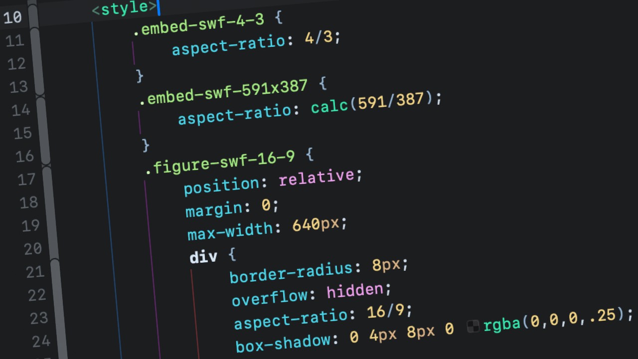
The above is the least you need to get going. But for purposes of my portfolio website, I wanted to add some niceties. Here’s an example of how you can apply a few possible enhancements, including border-radius, figcaption, max-width, and an inset box-shadow, for a hypothetical 640×360 .SWF file, which works out to a 16:9 aspect ratio.
The HTML:
<figure class="figure-swf-16-9">
	<div>
		<object width="100%" height="100%">
			<param name="movie" value="file.swf">
		</object>
	</div>
	<figcaption>This example demonstrates some possible enhancements</figcaption>
</figure>
The CSS:
<style>
	.figure-swf-16-9 {
		position: relative;
		margin: 0;
		max-width: 640px;
		div {
			border-radius: 8px;
			overflow: hidden;
			aspect-ratio: 16/9;
			box-shadow: 0 4px 8px 0 rgba(0,0,0,.25);
		}
		div::after {
			position: absolute;
			top: 0;
			left: 0;
			border-radius: 8px;
			aspect-ratio: 16/9;
			width: 100%;
			content: "";
			box-shadow: inset 0 0 0 4px rgba(0,0,0,.25);
		}
	}
</style>
Here’s a demo page:
And here’s a CodePen (but note that the sample .SWF files will not load for security reasons):
See the Pen Flexible SWF Embed by Chad Ossman (@cossman) on CodePen.
Hopefully all this will be of help to at least one other person out there. Please let me know if you happen to have any corrections or suggestions.