As seems to be the case with many of the studies I'm compiling for this CBS News section of my portfolio, the story of the article & liveblog redesign is a long and winding tale, but thankfully one that did result in a successful finished product.
In this case study:
- Introduction & Context
- Final Designs: Before and After
- Body Copy Width
- Article Footer
- Dark Mode
- Liveblog
- Prototypes
- Issues
Introduction & Context Case Study
I began at CBS News in late 2016, after the creative director had completed a comprehensive redesign of the website. I assisted by polishing and refining the Sketch files and documentation, and working with the engineering team on its implementation and launch.
But over the next few years, the article and liveblog templates were never quite satisfactory. They conflicted with each other, the article had legibility issues, the overlarge header block pushed the content was well below the fold, video ad revenue suffered, and the liveblog was particularly buggy.
I participated in several efforts to redesign the templates, and accumulated a large number of abandoned Sketch files (and eventually, in Sketch Cloud and then Figma). There was much disagreement over direction, and corporate issues were an additional hurdle. Long story short: the CBS News design team was absorbed into the equivalent-but-larger CBS Sports team, there were numerous rounds of layoffs across the entire CBS/Viacom/Paramount/Skydance parent companies, and as a result projects like this slowed down to the point of inaction.
The poor state of the CBS article template caught the eye of Nilay Patel of The Verge and John Gruber of Daring Fireball. Their primary concern was a specific bug that was eventually addressed: an adblock detector was mistakenly firing inside iframes, making it impossible for the user to opt in or out of allowing ads. But their larger point stood: the CBS News web article was a poor experience that prioritized ad impressions over readability, not to mention informing the public of current events.
By late 2024 and early 2025, the News web team had stabilized, and there was a renewed interest in refreshing the website. The internal codename for the project was Story Streamline, and I was thankfully able to leverage much of the work I had previously done. Some of the goals included:
- Create a single template for the several previously disparate article types: standard article, branded article, sponsored article, liveblog, and gallery.
- Improve the video watch experience, primarily for ad revenue. One critical issue with the existing templates was that the video would scroll out of view, and then re-initialize as a floating panel, obscuring content.
- Lay groundwork for a long-proposed (by leadership) convergence of the CBS News and CBS Sports websites. This was one of the biggest roadblocks, as the needs for News and Sports often conflicted, and while News had more traffic, Sports was more profitable.
- A new app-like recirculation unit. This was a specific feature request of one particular stakeholder.
- Systematize typography and color, in part to prepare for an eventual support of device light/dark mode.
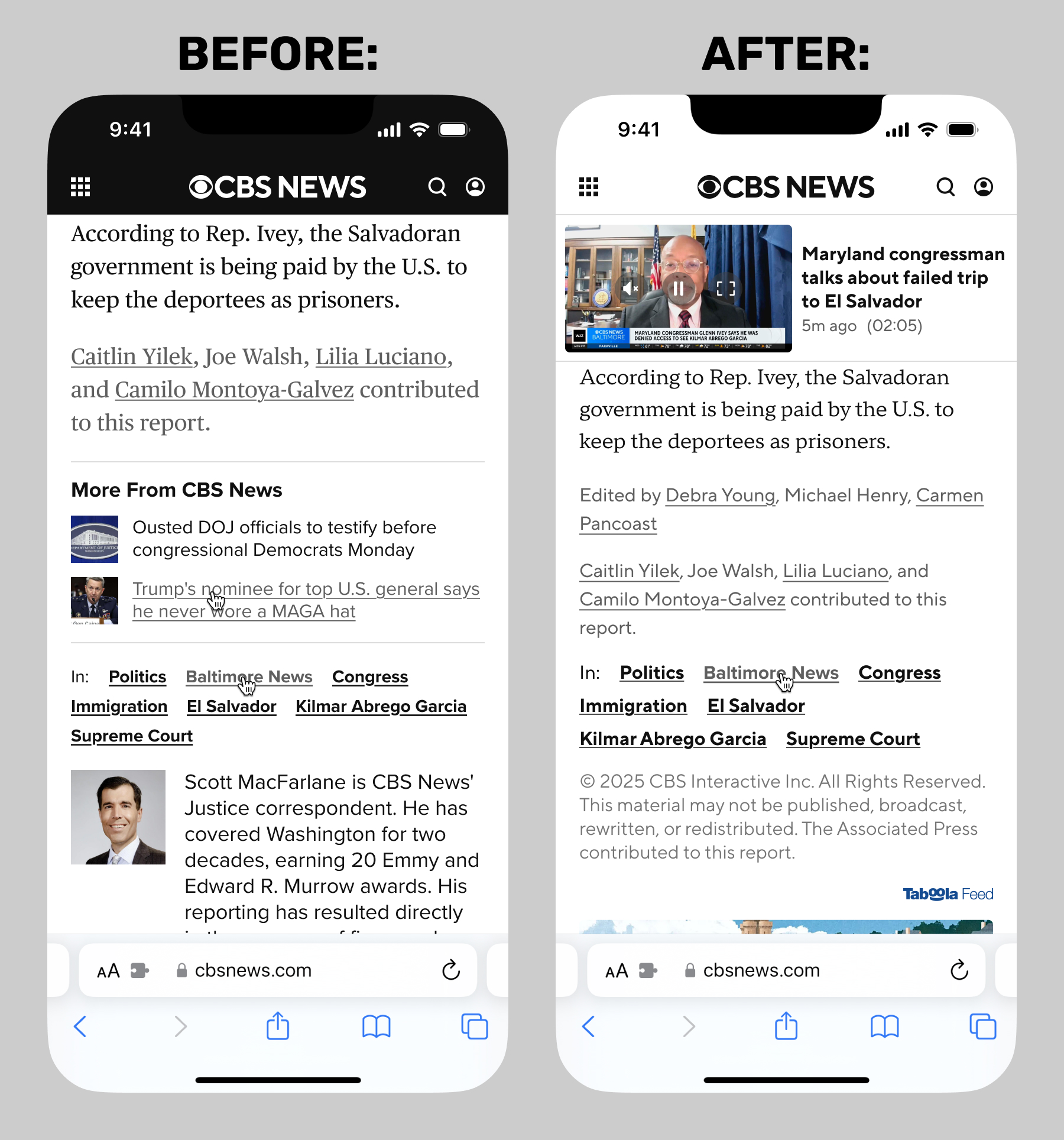
Final Designs: Before & After Case Study
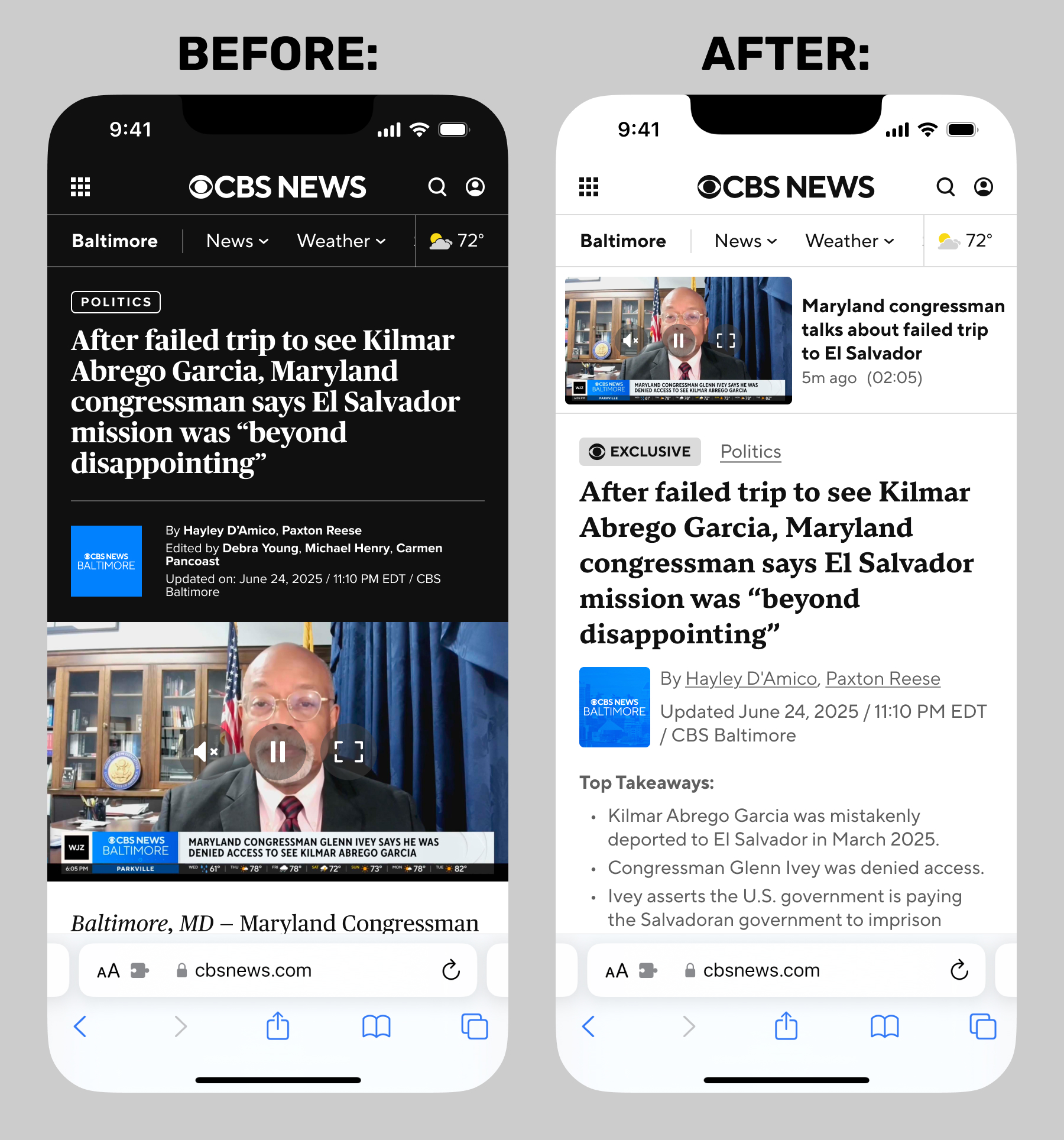
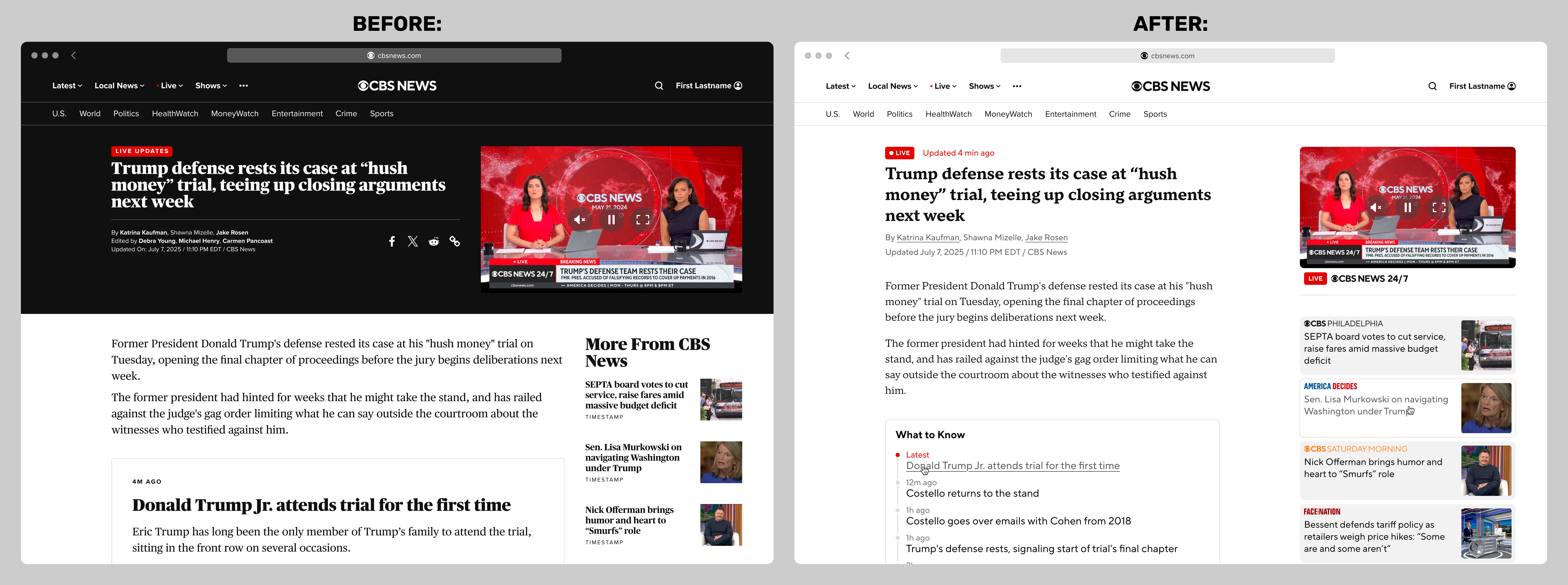
Below are side-by-side comparisons between the original and the final redesigned article templates, with identical content. Some of the improvements you can see at the smallest breakpoints include:
- The previous design's dark header is gone.
- Video: A vastly improved scrolling experience. The video loads in this state, and never leaves the page as the user scrolls.
- Flags/topics: improved treatments for topic links such as "Politics", and support for new flags such as "Exclusive".
- Typography: a new font: TT Norms Sans and Serif, and a newly comprehensive system of sizes and line heights. After much debate on this topic, I was hugely relieved to not be required to use the same fonts as CBS Sports.
- "Top Takeaways": a new feature requested by editorial. Text is now well above the fold on load, provided there is no skybox banner ad.
- Improved treatment for branding and metadata. In this example: CBS News Baltimore, timestamp, and multiple authors and editors.
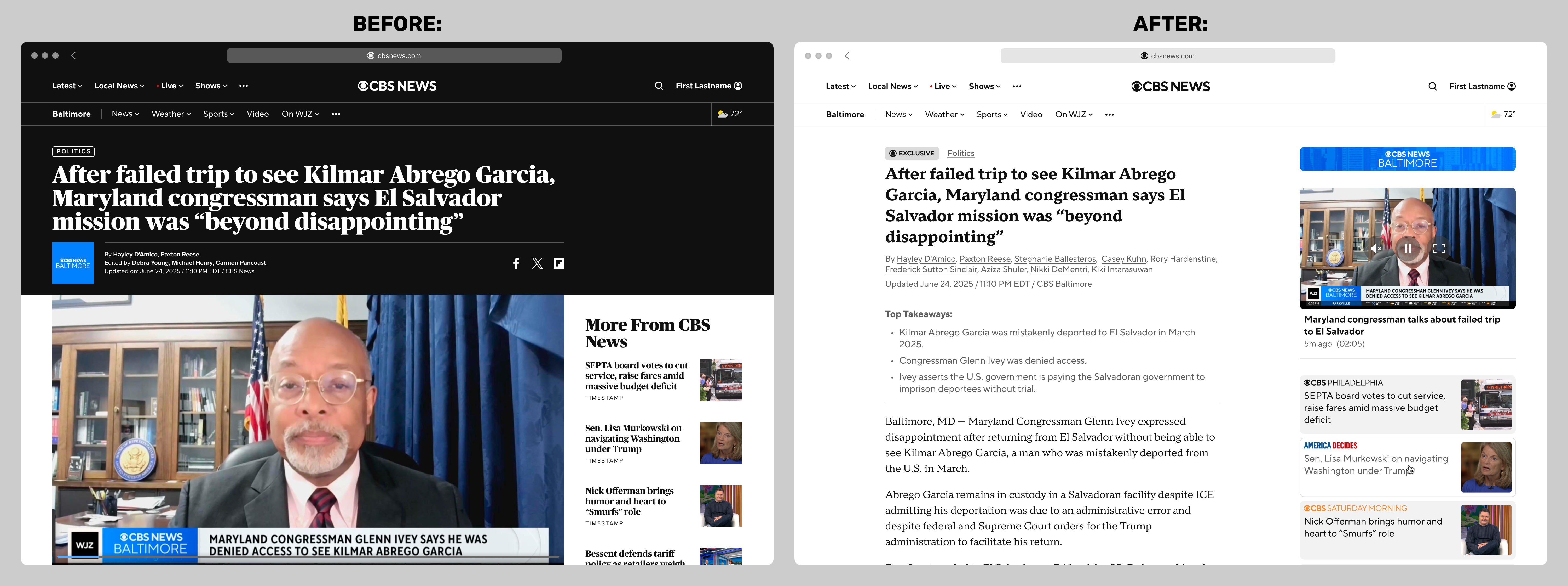
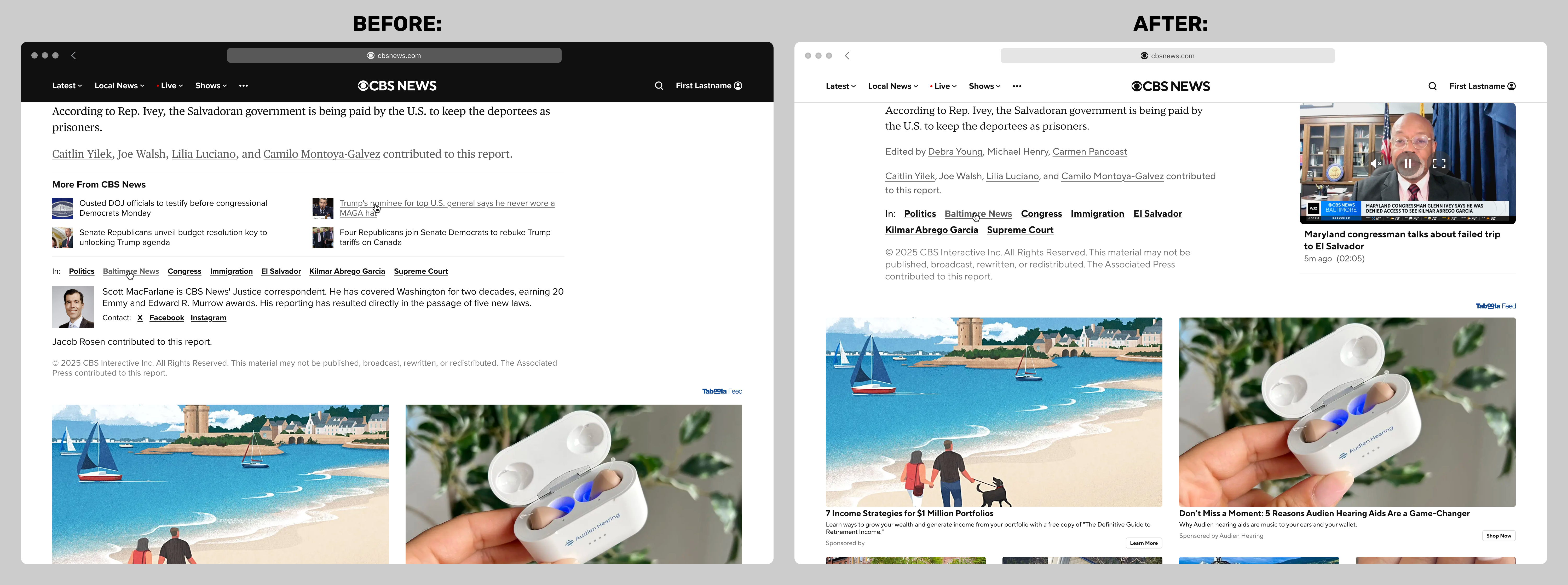
The new template was of course fully responsive. At wider widths, improvements included:
- Video: the same video instance now appears in a right-hand column, and sticks. It never leaves the page on any device, no matter how the browser is resized or scrolled.
- Recirculation unit: a progressive enhancement for wider widths. Requested by an executive who was a fan of news aggregation apps like Apple News and Google News.
- The article body is now well within view on load.
Body Copy Width Case Study
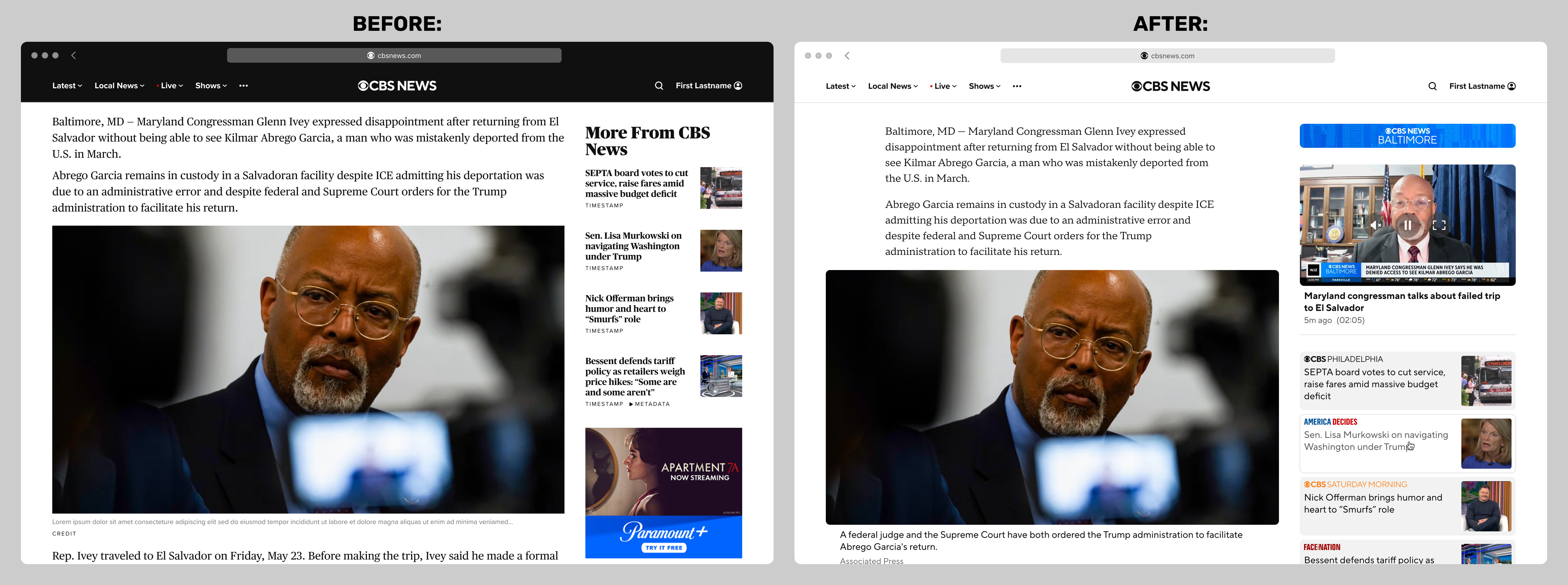
One small but important detail I really fought for: the body copy in the prior template maxed out at 980px at the widest breakpoint, which greatly exceeded the WCAG guidelines. I argued for a max-width for body copy in the redesign, and met a surprising (to me) amount of resistance from CBS News product and editorial.
In my years of experience as a web designer, I have found that stakeholder reticence is not only attributable to a general resistance to change, but also to a fear of whitespace, thinking it signals waste. But I am relieved to say that the final shipping template did include a more comfortable and accessible line length.
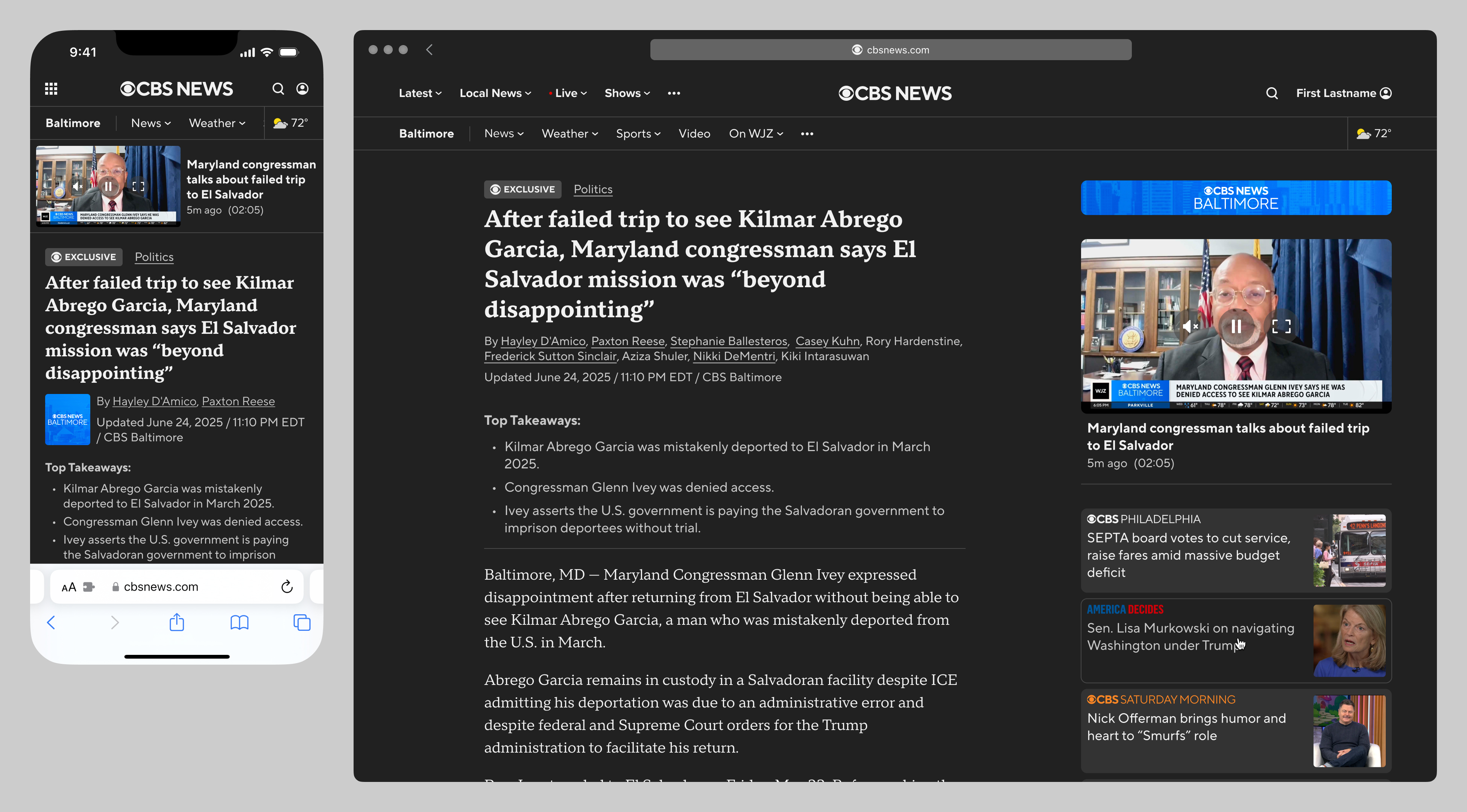
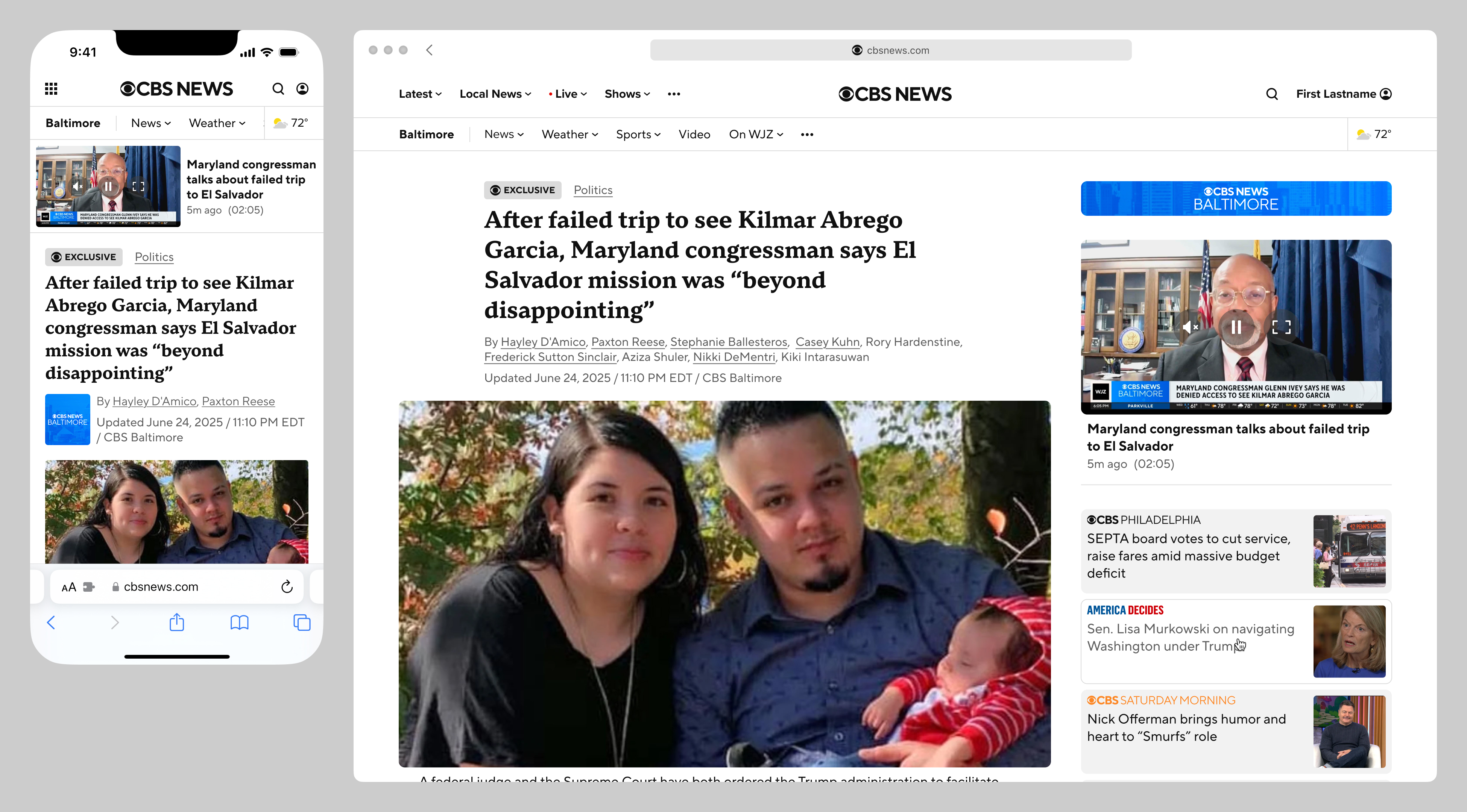
Below are before-and-after mockups of an article in a scrolled state, at a wide breakpoint. The example also illustrates the improvements made to the persistent video player, which in the old version floated over content and ad units, and often conflicted with the sticky nav.
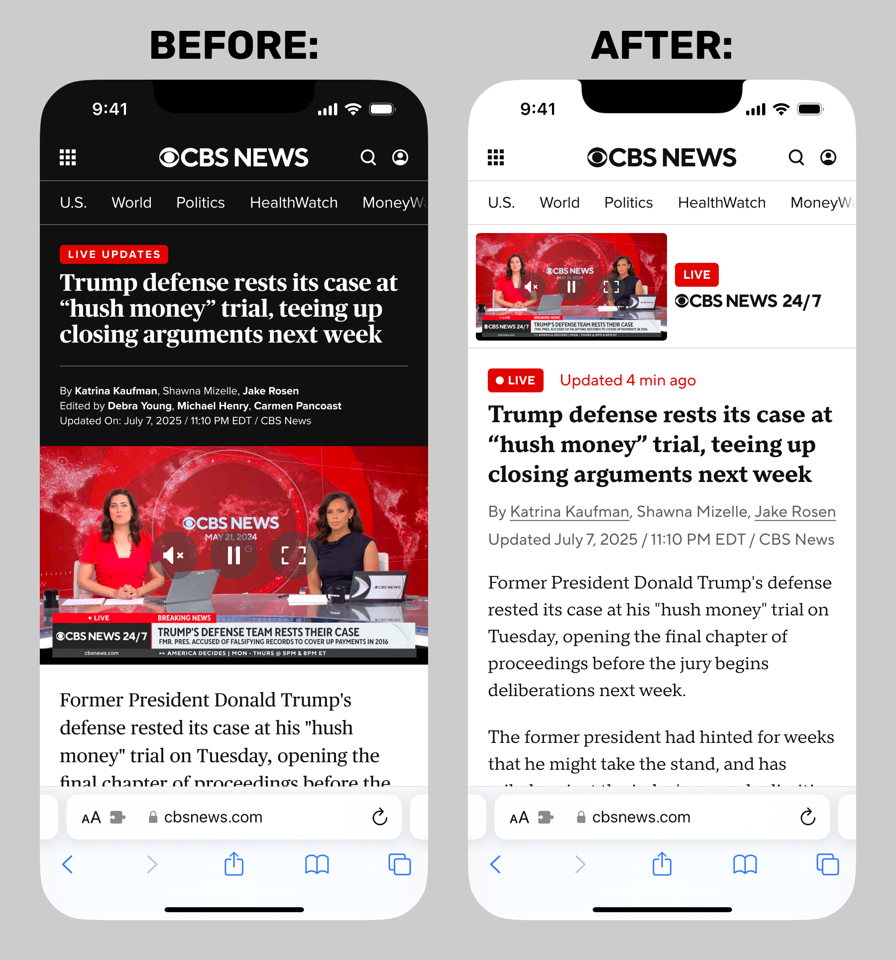
Article Footer Case Study
A key source of revenue for CBS News web was a very large ad unit at the bottom of article pages, typically served by Taboola or Flipp. Contractural obligations stipulated the vertical spacing between the end of the article and the top of the ad unit, and also from the very top of the page to the top of the ad unit. These restrictions naturally often came into conflict with editorial needs (such as journalists' and editors' bylines) and SEO needs (such as topic links and recirculation).
The CBS News web product person handled most of the negotiations between Taboola and CBS News editorial, white I made numerous attempts to visually condense the article footer material. Taboola was resistant to us making any changes at all to our templates, but was placated when we presented full-page mockups of a typical article. The improvements at the top of the template recovered literally hundreds of pixels of vertical space at wider breakpoints, and optimizations at the bottom of the template improved the situation further.
Below are side-by-side comparisons of the old article template and new, in a scrolled state. The previous article footer material could fill an entire screen on a typical mobile device.
Dark Mode Case Study
My Figma file and prototype each supported device dark mode. This feature was not scoped for production, but was a "freebie" from my point of view, so I included it as proof-of-concept.
Liveblog Case Study
The redesigned template was created to apply to all possible types of articles, especially liveblogs, a need-to-have for any contemporary news website. Below are before-and-after screenshots of the prior liveblog template, versus the new:
Prototypes Case Study
Below are screen recordings of the responsive prototypes I built to evaluate and present the article and liveblog redesigns. I unfortunately can't archive them here on my porfolio site, as they include webfonts I don't have the license to publish. I built these in HTML & and CSS, with Less.js and a little jQuery (which I have since learned to work without). The first screen recording below demonstrates the persistent video, which never leaves the page.
Issues Case Study
These templates launched in 2025, and I was told it was largely viewed as a success, across the company. But from my point of view, I personally have a few lingering issues:
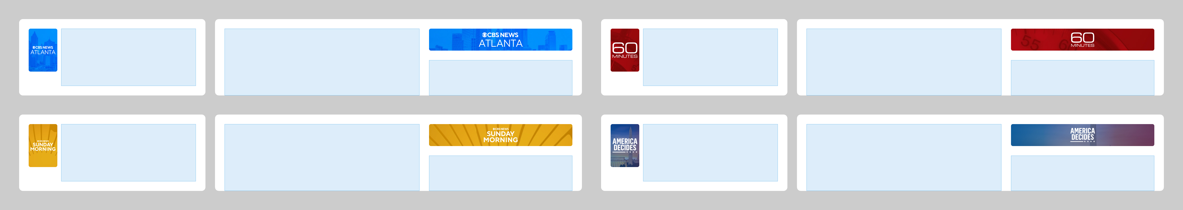
Issue 1 of 3: Brand Chips
I strongly dislike the responsive treatment for the brand "chip" (CBS News Baltimore in the examples above). In the final, approved designs that launched, the chip is positioned below the headline at the smallest breakpoint, beside the article metadata (authors and timestamp), where I believe it belongs. At wider breakpoints, it jumps grid track, to the top of the right column. As a result, it's orphaned by itself, and seemingly associated with the video. This nonsensical outcome was the result of stakeholders seeing two distinct treatments as discrete options, and choosing both.
Not only does this not make any sense, it was also extraordinarily difficult to prototype (and I belive also for the engineering team to achieve in production). For my purposes in the prototype, I wound up building an overly complex CSS Grid system, with the chip as a distinct grid item, so the same code block could be positioned in the midst of a column at smaller widthes, and at the top of a different column at wider widths.
Each chip uses the same two assets across all breakpoints: a background JPG and a logo SVG, which presented an additional complication: most brands had stacked and horizontal logo variants, and in this usage case, utilizing the stacked variant would look poor at wide breakpoints, while the wide variant would also look poor at smaller breakpoints. So most brands use the stacked variant, and look better at smaller widths.
Long story short, I lost this particular argument. Below are wireframes of two representative brands (CBS News Atlanta and 60 Minutes), out of the dozens of extant CBS News brands I had to account for. The wireframe blocks depict the CSS grid items, in order to make this layout achievable.
Issue 2 of 3: Lead Images
CBS News editorial strongly did not want a feature/lead image. I still think lead images are table stakes for most web article templates as a whole, and in this specific case, would aid in the visual structure at wider widths. I do grant that including a lead image would push the text content well down below the fold. Below is a mockup of how the redesigned template would have looked with a lead image.
Issue 3 of 3: Recirculation
I don't thing the redesigned reciculation unit (present only at wider widths) is successful. The graphical logos and colors were very difficult to work with, and in practice, a typical article would include many recirc articles from the same source, resulting in a redundant stack of identical logos.
The final unit included a card treatment unlike anything else on the site, as requested by a stakeholder who liked news aggregator apps such as Google News and Apple News. I personally dislike and never use such apps, finding them full of sponsored content, algorithmically promoted content I'm not interested in, sources I do not trust, and increasingly these days, AI-generated slop. I do not believe that a primary source such as CBS News should present its own content in such a style.