This particular portfolio case study will be a little different. This is an example of a project where I had little-to-no creative input, but was nevertheless an utterly massive undertaking that consumed a large portion of my time at CBS News.
In the planning phase for the 2024 national general election period, the CBS News product and engineering teams had limited resources. In conversation with editorial, they opted to reutilize long pre-existing data display components from previous election cycles. The specific brief was "no new features".
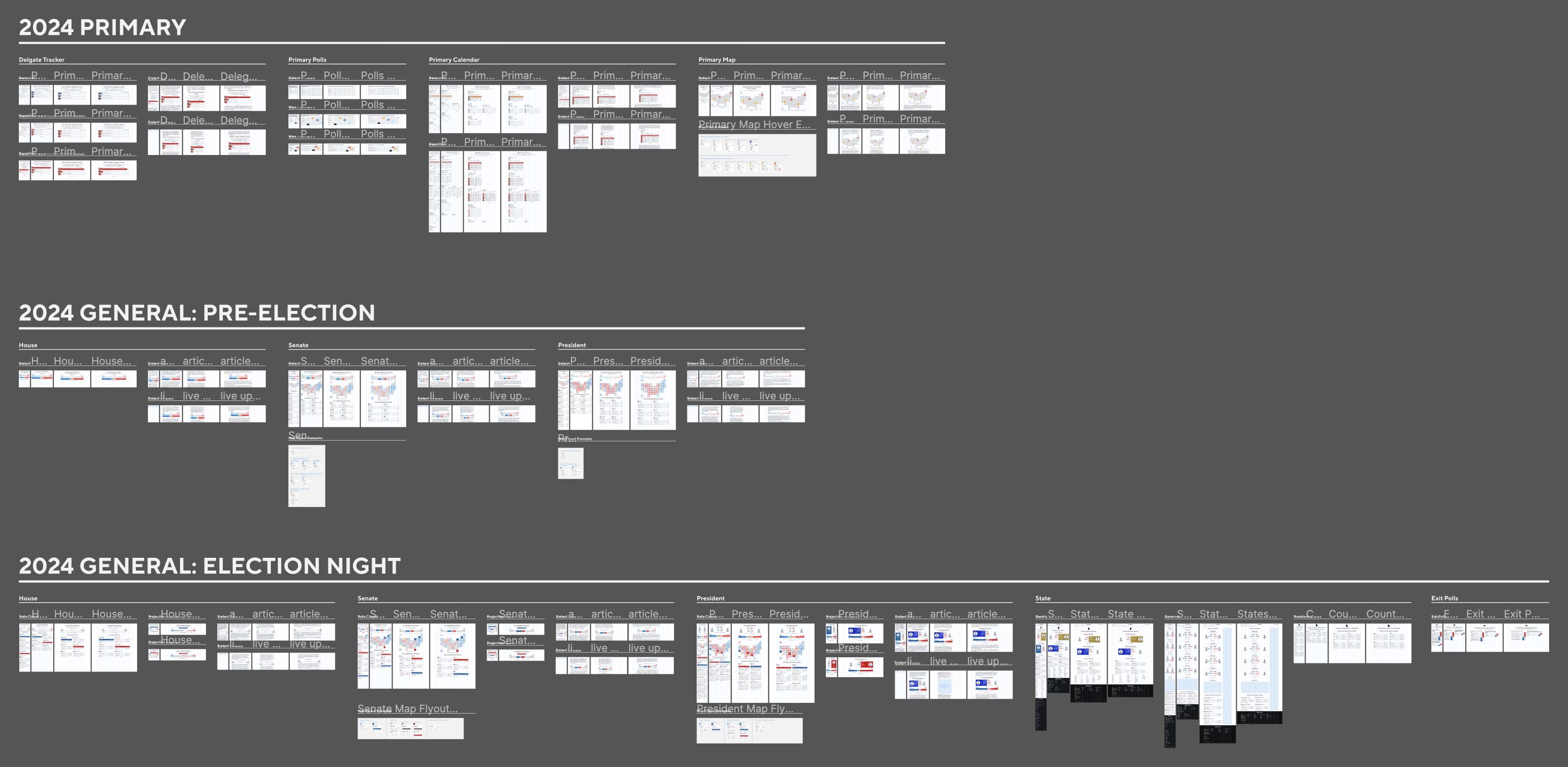
The CBS News and CBS Sports designers had recently been reassigned into brand and platform-specific silos, and I had recently become the sole web designer for CBS News. So I inherited the task of refining and standardizing the extant elections components, with which I had previously never been involved. I collected all existing designs (originally scattered across numerous Sketch files and Invision projects), into one single Figma document.
The files had had many previous owners (some of whom were no longer with the company), spanned many election cycles, and were chaotic, disorganized, and inconsistent with each other as well as with the production website. The laborious process of consolidating and standardizing them took months of focused work.
Even more confusingly, the previously-assigned designer had undertaken a lot of very good exploration work intended for the 2022 midterms, including an excellent visualization for House results, but all of it was unproduced, and thus out of scope for me to utilize for 2024. I unfortunately had to normalize the files against the versions that had been implemented for production in 2020 and 2022, however buggy.
This phase of my involvement is difficult to illustrate here, but perhaps the below screenshot of my finished Figma file will give an idea. It is illegible at this size, but gives an overview of all components in all possible variations and breakpoints, across the three main phases of the 2024 elections period:
- primary election
- pre-general election interregnum
- general election day and after
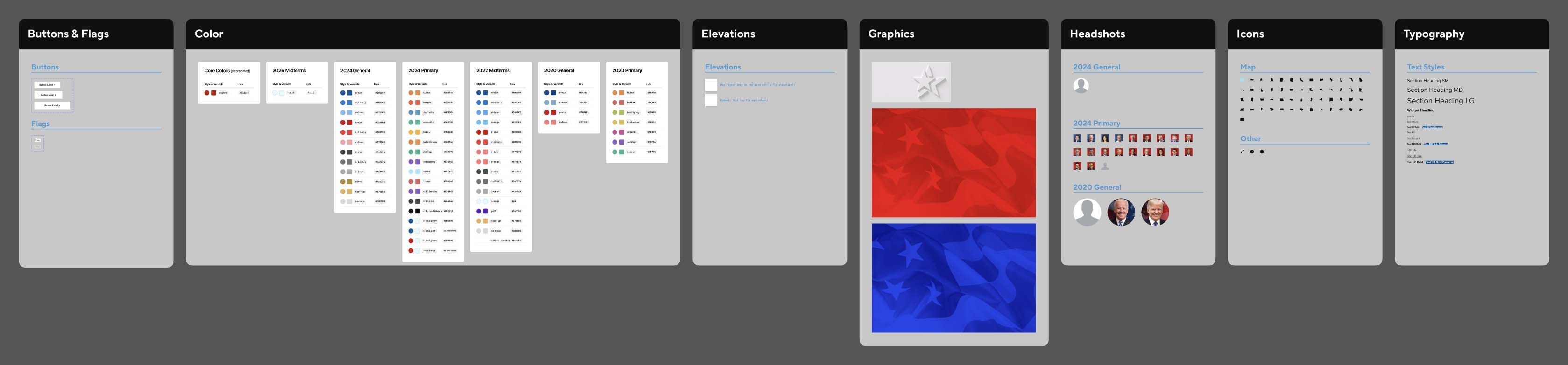
I also of course established for the first time a library of components (candidate headshots, map icons, etc.) and type & color styles. An overview screenshot of the entire file is below:
In the period between the primary and preparations for the general election, we did have a little wiggle room to make improvements. Not quite "new features", but important refinements. I proposed a few key changes:
- standardizing text link styles
- adjusting some map & bar chart colors for visual differentiation (previously, the "won" and "likely" colors were too similar)
- a new text link style for when white text would appear atop a color surfaces
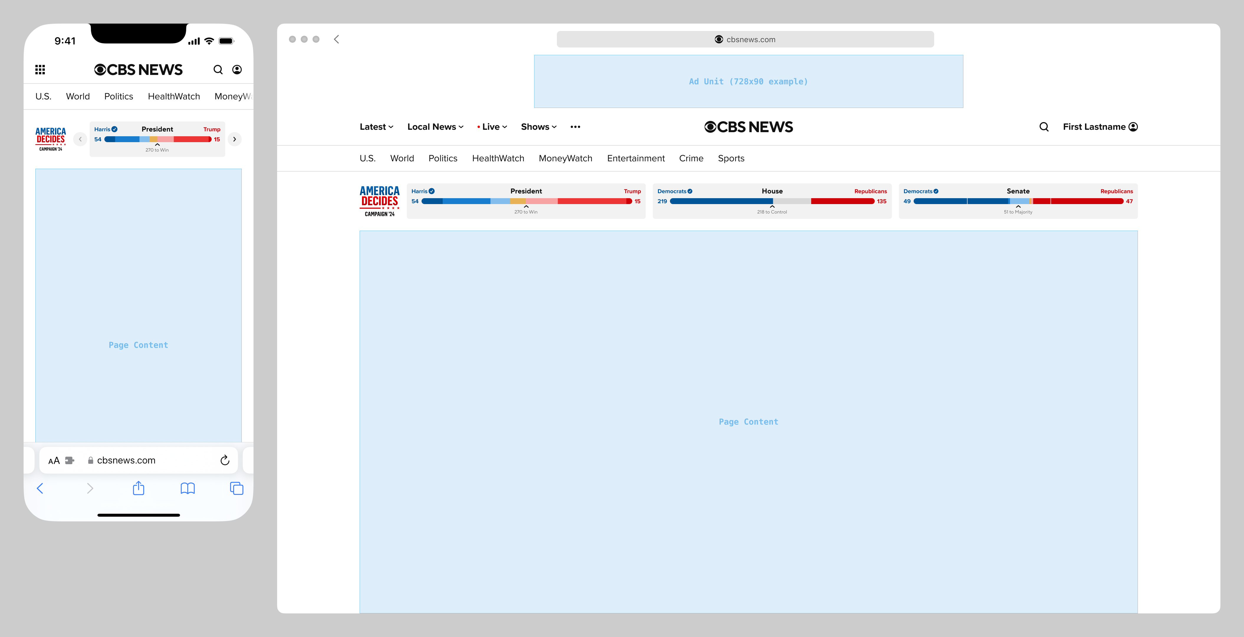
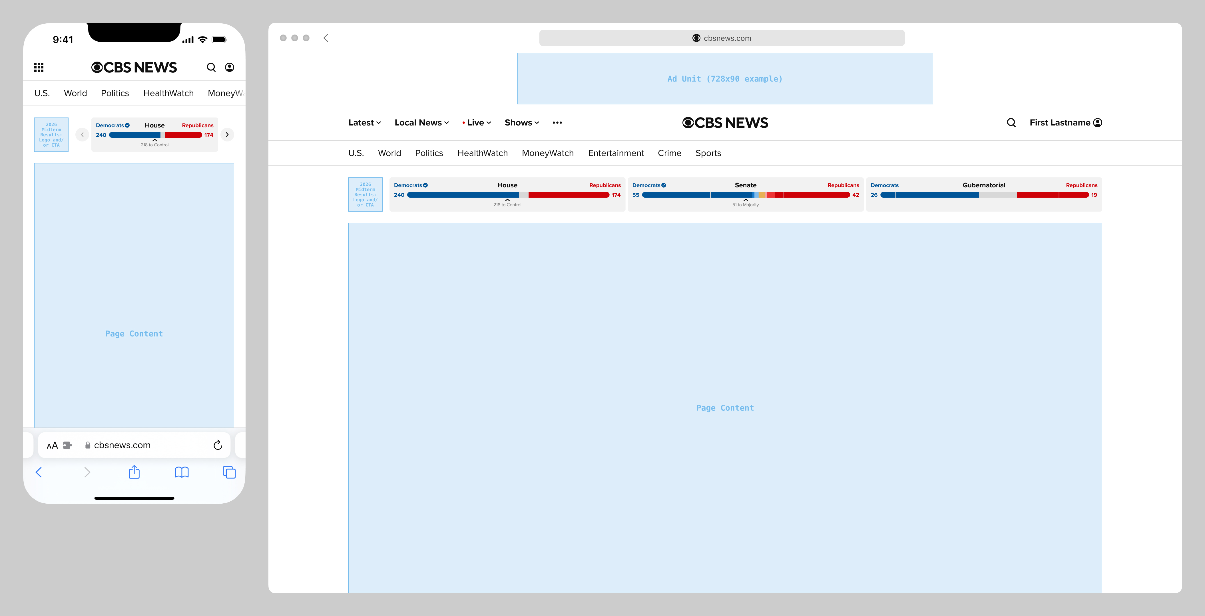
I was also asked to explore possibilities for adding animation to some of these components. I built a responsive prototype of the presidential map and balance of power widgets in HTML/CSS/JS, to demonstrate realistically feasible animation when data updates (for example, when results are reported for Alabama and California), and also rebuilt for modern fluid responsive behavior.
Like a lot of similar projects, this prototype was demonstrated internally, and seemed to go over well, but was not implemented. Long story short, I reported to multiple groups, each with different and conflicting asks. This prototype was requested by outside parties, and CBS News product & engineering were not involved. A screen recording of the prototype is shown below:
I did propose one newly-designed component, loosely based on a full-width unit on the CBS Sports website called the SAAG (for "Scores at a Glance"), that displayed numerical data like athlete stats and game results. The proposed elections variation would have displayed the CBS News editorial projections for the Presidential, House, and Senate races, and eventually on election night, the actual results. As with the prototype above, this project was presented internally, but not produced.
Late on general election day, I was asked to stay up late and collect as many screenshots as possible from CBS News and its peers, across many platforms, in device chrome. As a remote employee, and not a developer, I was not equipped to capture any OTT/CTV or Android apps, but I grabbed as many web and iOS apps as I could. The requirement that they be presented in device chrome was immensely time-consuming, and I feel, unnecessary. I could have collected more, otherwise.
And to be honest, it was a traumatizing experience to spend the entire night cataloging news sources, as we all watched the US reelect a senile old fool, and a fascist, authoritarian, lawless, inhumane administration, and knowing that a living hell was to come for many immediately, and eventually for all.
If any of the above was used in any internal postmortems, I was not privy.
I did share my candid opinion with my supervisor that CBS News was clearly, unmistakably, the worst of all news organizations reporting on the election. Even those that used canned third party data displays were more effective than CBS News.
The dated design and inflexibility of the individual widgets was only part of the problem; my biggest issue was that I was genuinely shocked to see that CBS News editorial deliberately opted not to do what I would consider two essential things:
- display election results at the top of the cbsnews.com homepage
- deploy a set of pages dedicated to results and data display
Both of these were technically possible with the extant components, were represented in the newly consolidated design reference I had created in Figma, and had been implemented in the past. Instead, editorial created what we called internally a "show door" (only a small portion of which contained election results widgets), and embedded discrete widgets in the bodies of articles and liveblogs.
The evidence in the competitor screenshots above bears it out: results on the homepage, and pages of detailed results are table stakes for any news organization. The apparently conscious decision to deliberately not do any of this in 2024 remains shocking to me.