A long-running project for me was a comprehensive redesign of the CBS News web navigation. The process unfolded over many years, and launched in phases.
In this case study:
- The final navigation redesign
- Sticky nav behavior
- Show & Local navigation
- Nav Menu Redesign
- Secondary Flyouts
- Pointer Devices
The Final Navigation Redesign
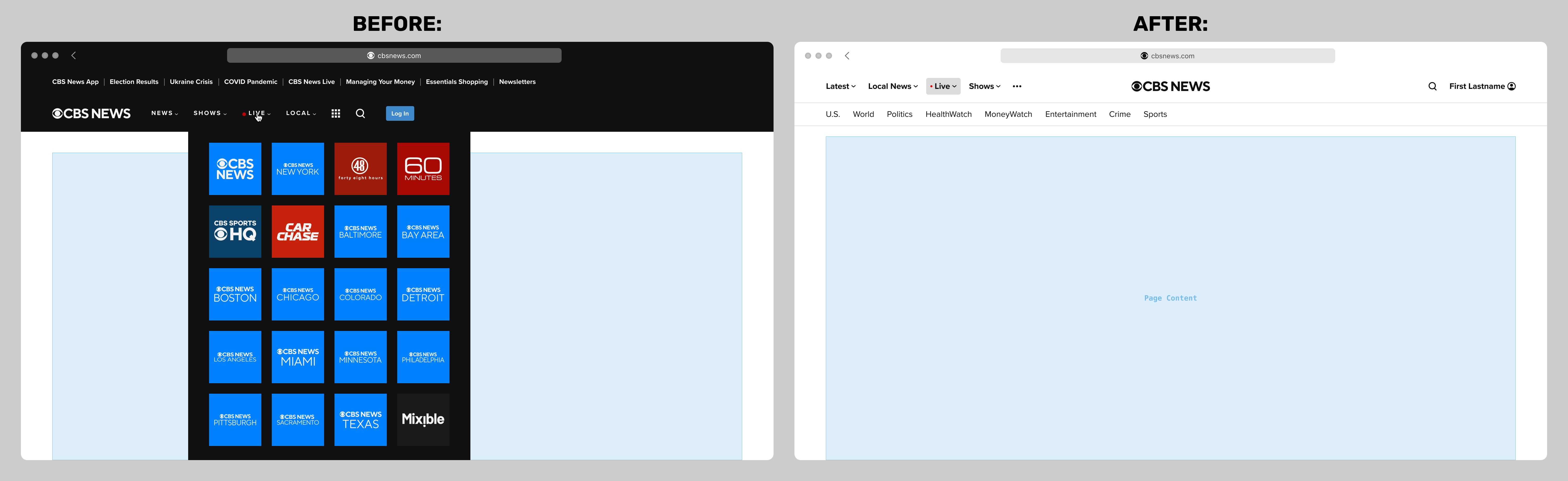
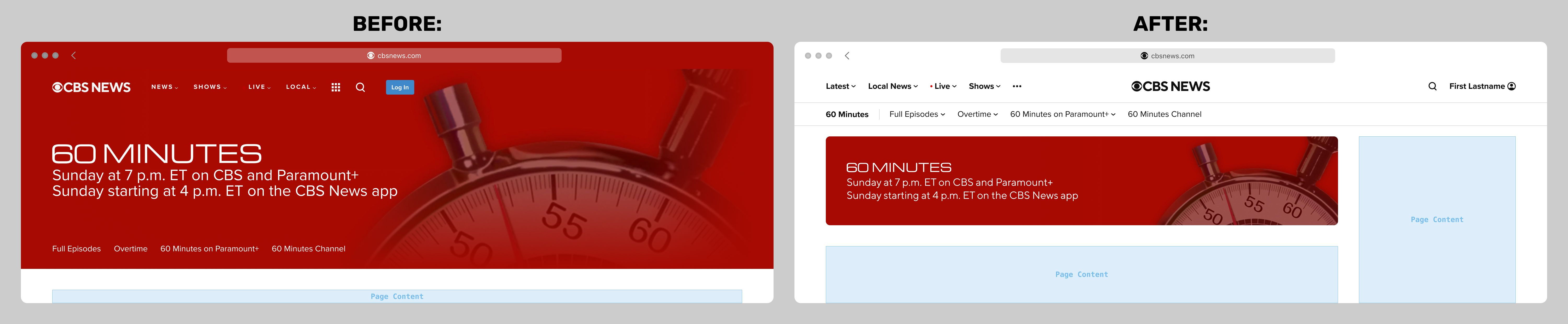
Below are before-and-after screenshots at the widest breakpoint:
At the smallest breakpoint, the menu was much improved over the prior version, but launched in a minimum-viable-product state shown here. I describe the aborted project to enhance it later in this case study.
Sticky Nav Behavior
The topic of sticky navigation was hotly debated. My unpopular opinion is that the navigation component of almost any website is among the least important aspects of a page, and when scrolled, should get out of the way. (I am aware that at this time of writing, my own portfolio site has a sticky nav, and believe me, I'm still debating it with myself!)
My preferred sticky behavior was that the CBS News nav should scroll out of view when the user is scrolling down, but slide back into view when scrolling back up. I was the lone advocate, and was loudly and emphatically outvoted. Below is a screen recording of my prototype.
Below is a screen recording of my final responsive prototype. As with almost all my prototypes, this was intended to illustrate a few points difficult or impossible to convey in static Figma or Sketch mocks, such as the responsive behavior, hover styles, and account flyout. Dark mode is shown for demonstration, but was not on the product roadmap. Note the presence of a skybox ad unit at the top of the page, a complex consideration for anything to do with scrolling.
Show & Local Navigation
One of the biggest complications was how to handle CBS News local affiliates, which had once each had discrete websites of their own, but had since been folded into the main CBS News domain. The initial implementation was to shoehorn them into what we called internally the "show door" template, with a customized version of the primary navigation. The result was disastrous, and was difficult to untangle.
My solution was to institute a three-tiered navigational structure:
- Primary: global, with no exceptions. Referred to internally as "national". Supports submenus.
- Secondary: contextual. On "national" pages, it would be an adaptation of the so-called "supernav" that was the top tier on the previous iteration (primary an SEO driver). On Show or Local pages, it would the their dedicated navigation. Supports submenus
- Tertiary: contextual, optional. Most local affiliates required an additional tier. No submenus required.
Before-and-after mockups of typical show and local navigations are below:
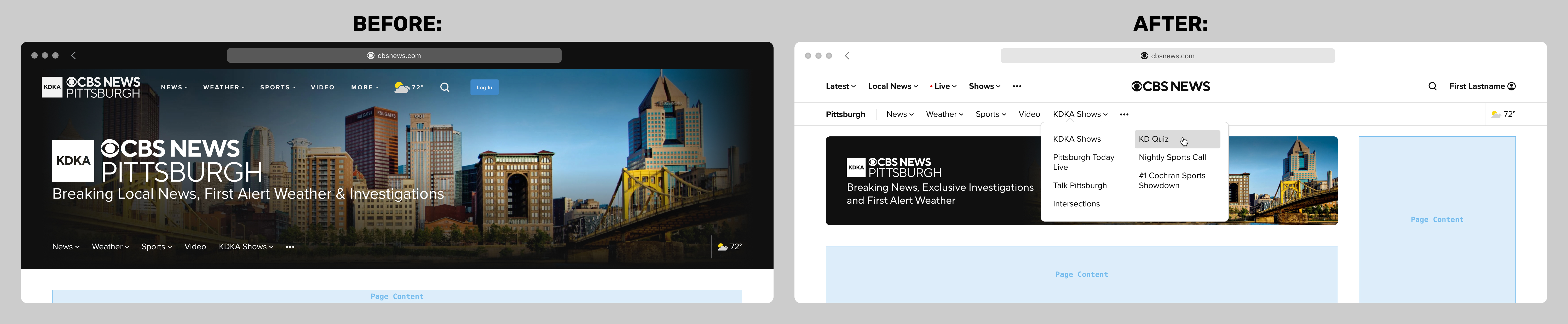
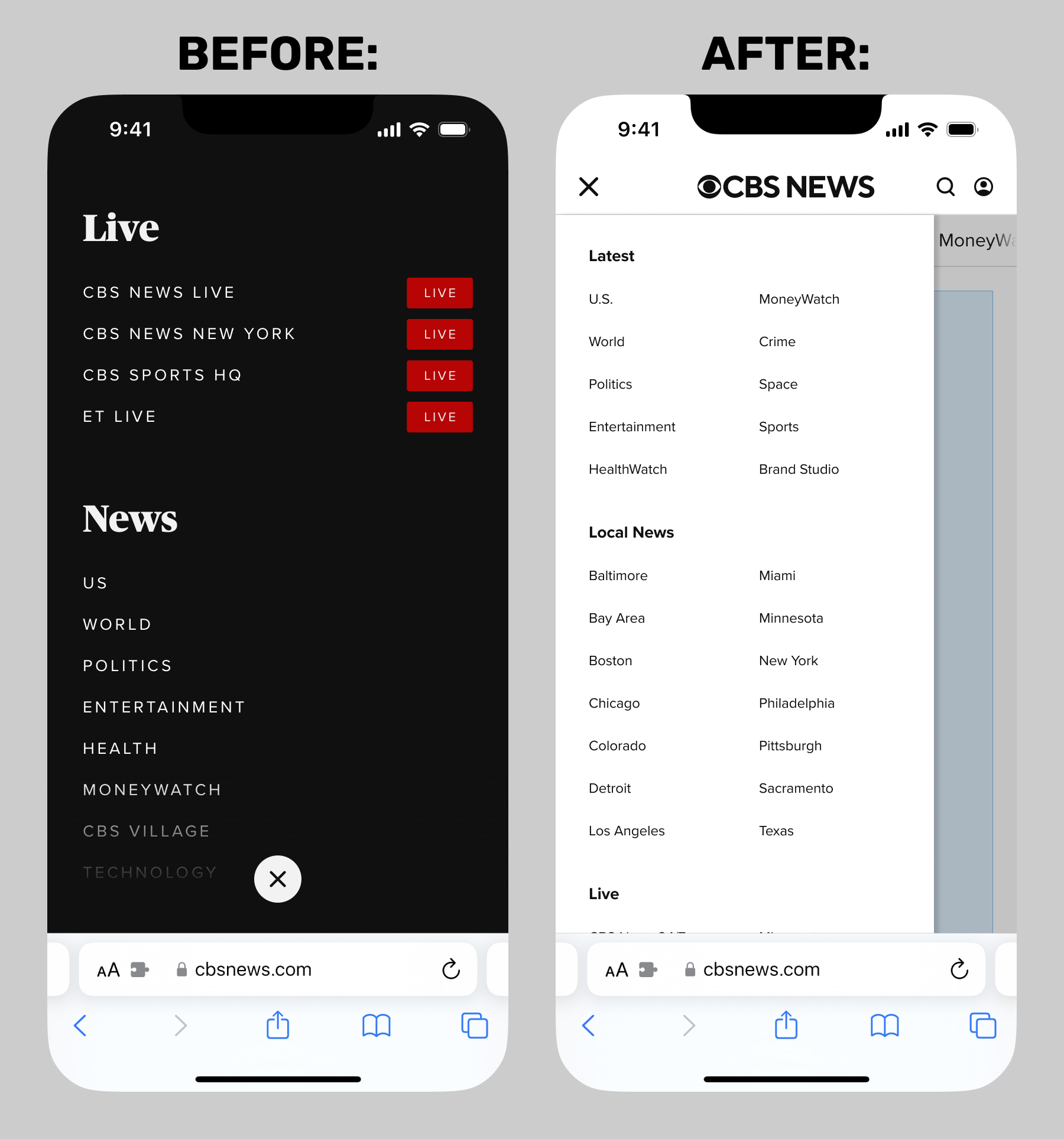
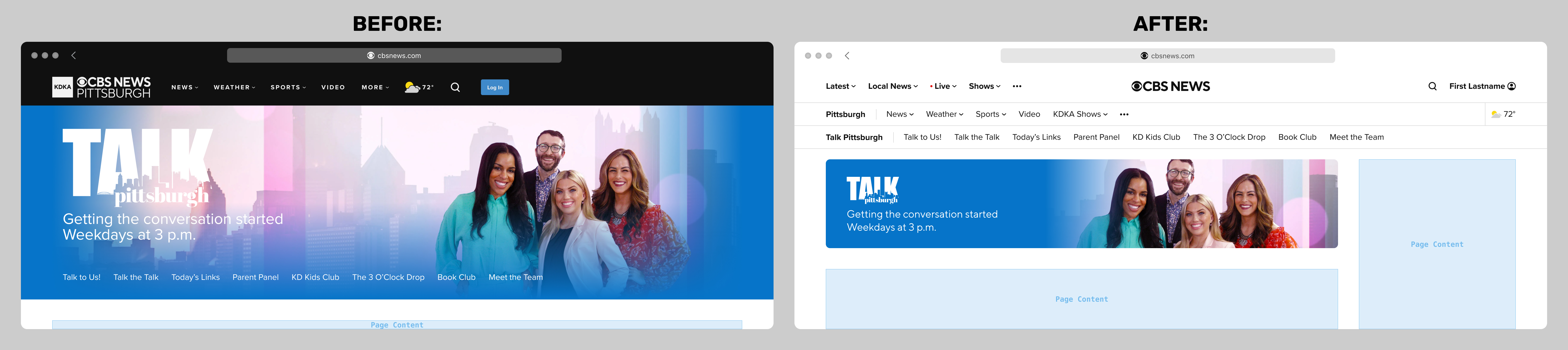
A side effect of absorbing the local affiliates meant that there must be an additional tier in the navigational tree for "local shows", for example the CBS News Pittsburgh show Talk Pittsburgh.
Virtually nobody within the organization liked a triple navigation, but it was understood and accepted as the only feasible solution for "local shows". Below is a before-and-after mockup of a local show navigation:
Nav Menu Redesign
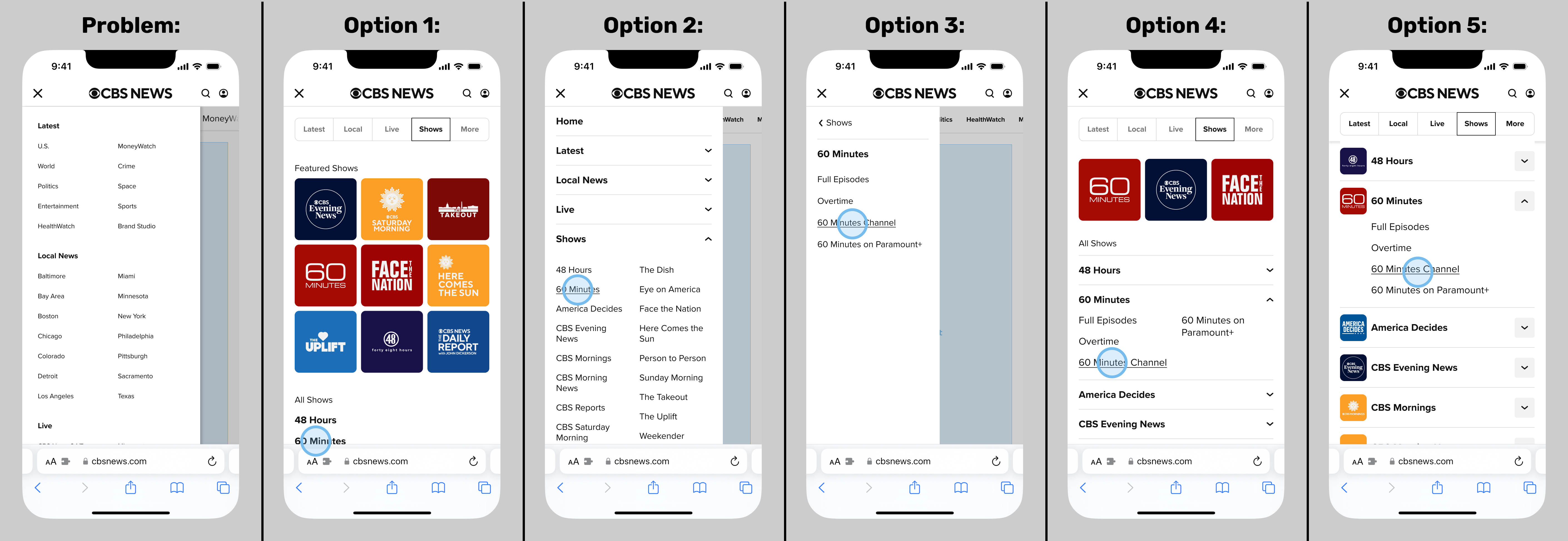
This next part of the story is unfortunately an illustration of the dysfunction that affected my colleagues and I at the time. The design problem-to-solve was clear to everyone: the redesigned menu (aka "sidenav" or "hamburger menu") had launched in bare-bones minimum viable product form, and desperately needed to be optimized. It was essentially a crude sitemap, and did not provide access to the next-deeper navigational tier. For example, at smaller breakpoints, you could navigate from Home › Shows › 60 Minutes, but not from Home › Shows › 60 Minutes › 60 Minutes Channel. At wider breakpoints, you could.
But organizational issues at the time had us all running in circles, working extremely hard but launching little. I personally was assigned to two different departments: one foot in the CBS News web team (including product and engineering) and the other foot in the CBS Design team (including CBS Sports designers and a selection of corporate executives -- News web product and engineering not included).
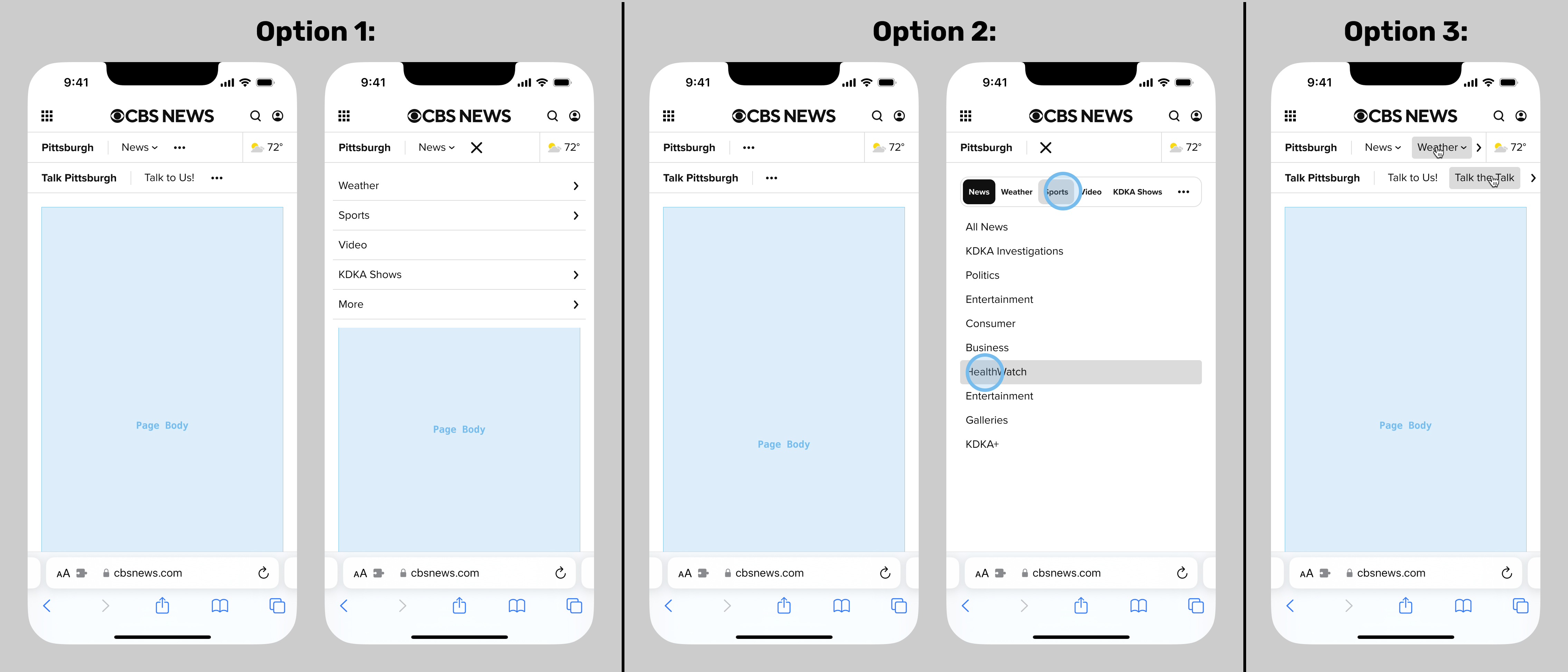
The latter team had regular meetings called "Flight Deck", where work was assigned, presented, and critiqued. One particular executive would emphatically raise this CBS News web navigation issue in every single meeting, no matter the topic. So in deep collaboration with my direct supervisor and the entire CBS Design team, I put together a series of options, which you can see below. From left to right:
- The so-called "Minimum Viable Product" existing version that everyone agreed needed to be overhauled
- Options 1-2: improved, but still did not allow navigation one tier deeper
- Option 3: an app-like menu system, deemed too complex for web
- Options 4-5: the best solutions, with input from my supervisor and the entire CBS Design team. Even better, these would have been a step along the path of the long-discussed merging of the CBS News and Sports websites.
But when presented in the next dreaded (by me) Flight Deck meeting, the executive hated it. It transpired that he was complaining about a different navigation issue, and had not been communicating clearly to any of us.
Additionally, when the above was presented in a separate meeting with CBS News product and engineering, they felt blindsided and shot the entire thing down. Their issues included the level of effort, and the huge amount of load this feature would put on the website.
Incidentally, the executive's concerns about the navigational issues affecting the smaller breakpoints were addressed in a separate iterative revision to the navigation. But to my disappointment, no further effort to improve the menu happened while I worked at CBS News.
Secondary Flyouts
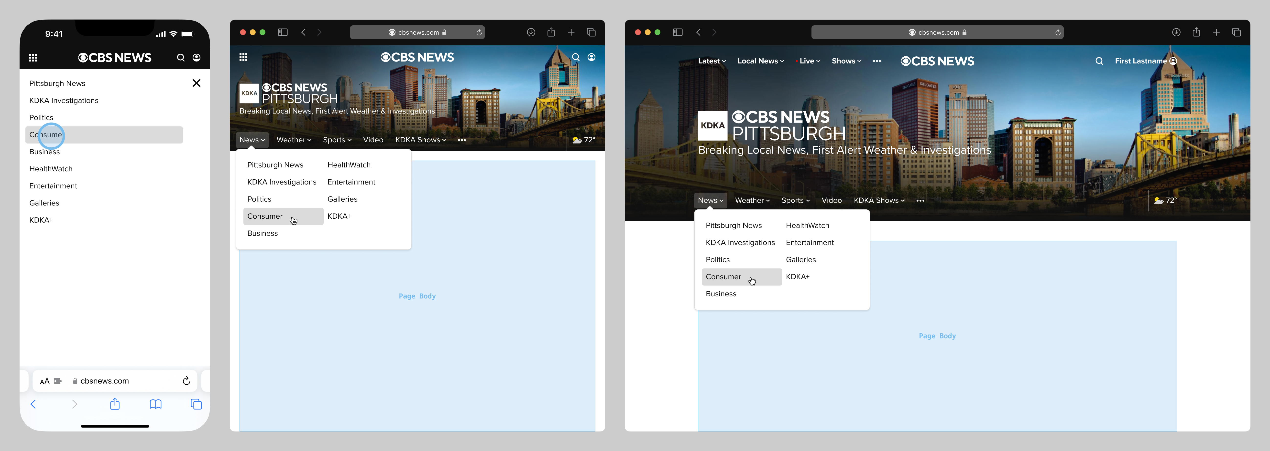
The aforementioned complaint by an executive, which most of us mistook to be regarding the menu, was in fact regarding secondary nav tier flyouts. They were supported at the two widest breakpoints, but not at the smallest two. This issue was a legacy problem related to the local affiliates having been absorbed into the main cbsnews.com site some time prior. This issue only affected local affiliates, not shows or local shows.
Once we clarified the executive's concerns, we added support for secondary flyouts across all breakpoints. The tricky part was solving for the smallest breakpoint. Finished mockups are below, shown in three representative breakpoints. The flyouts were newly supported at the smaller two, and the News web engineer that implemented these came up with an ingenious technical solution to support touch and pointer devices.
Pointer Devices
Another bit of unfinished business was a project to address an important issue: users of devices with legacy pointer devices (such as a mouse with no touch surface or rollerball) could not scroll the navbars horizontally, at smaller screen widths. This issue was flagged by the QA team, and was a huge blind spot for me, a habitual trackpad and touchscreen user. But in my defense, this didn't occur to anyone else either, until the QA process.
Below are exploratory mockups of possible improvements. Shown at a smaller device width for illustration, but this improvement would have been for any width. The first two are plainly unfeasible for web, and would be bad experiences anyway. The third was generally agreed to be the best option, but wasn't yet on the roadmap when I left CBS News.