This is a case study of a design competition in which I participated, circa 2012. The site Venus Febriculosa, dedicated to design and literature, held periodic design contests both enigmatic (for instance, to literally illustrate a poem), problematic (design a cover for Vladimir Nabokov's Lolita), or both.
Their eighth contest was a bit different: create an alternative sleeve for Brian Eno's 1978 album Music for Films. The original cover was aggressively minimalist, and unique amongst Eno's often lushly packaged discography.
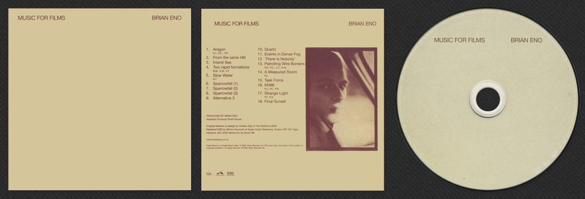
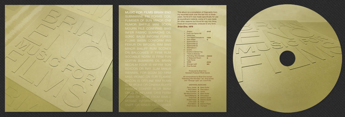
The extant cover already approached perfection, or as Venus Febriculosa put it, "not so much designed as intentionally left blank". Here is the album front, back, and label as reproduced in the 2005 "Original Masters" CD edition, scanned from my personal copy:
As a longtime Eno listener, this contest was right up my alley. I mused over it for weeks, and quickly executed my concept over the course of a few days. My humble entry was unsurprisingly not among the excellent winners, but it was a pleasure for me to participate, and a productive exercise. Nevertheless, I thought it would make a good subject for a case study to include in my design portfolio. Here is my submission:
Some of the points that went into my thinking:
- The original album sleeve design was defined by its minimalist color scheme and typography. I wanted to echo and honor these, without copying.
- Although Music for Films is not officially part of Eno's "Ambient" series of four albums, much of the music does fit the genre label. I wanted my design to be subtle, tactile, and textured.
- Eno famously played with words throughout much of his career, such as the track "King's Lead Hat" being an anagram for his collaborators Talking Heads, and transposing the letters of his name into the pseudonym C.S.J. Bofop to write his own liner notes for the album Thursday Afternoon. One of the rules of this contest was that the artist name and album title had to appear, but I wanted to incorporate Enoesque wordplay in some fashion.
- As a designer primarily for web, I'm used to working entirely with digital materials. For this design, I wanted to utilize photographs of physical objects.
- Celluloid film optical sound tracks are very beautiful and visual, and I wanted to try to incorporate or allude to them, at the danger of being too literal.
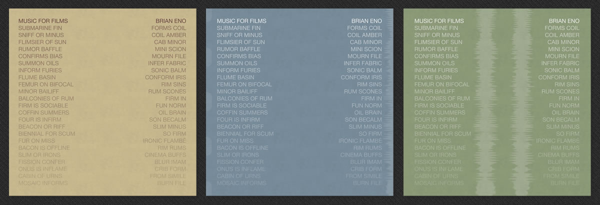
Below are three versions of my first concept, using several anagrams of "BRIANENOMUSICFORFILMS", with an optical sound track and film sprockets. It seemed like a workable idea in my head, but in execution turned out to be far too derivative of the original cover.
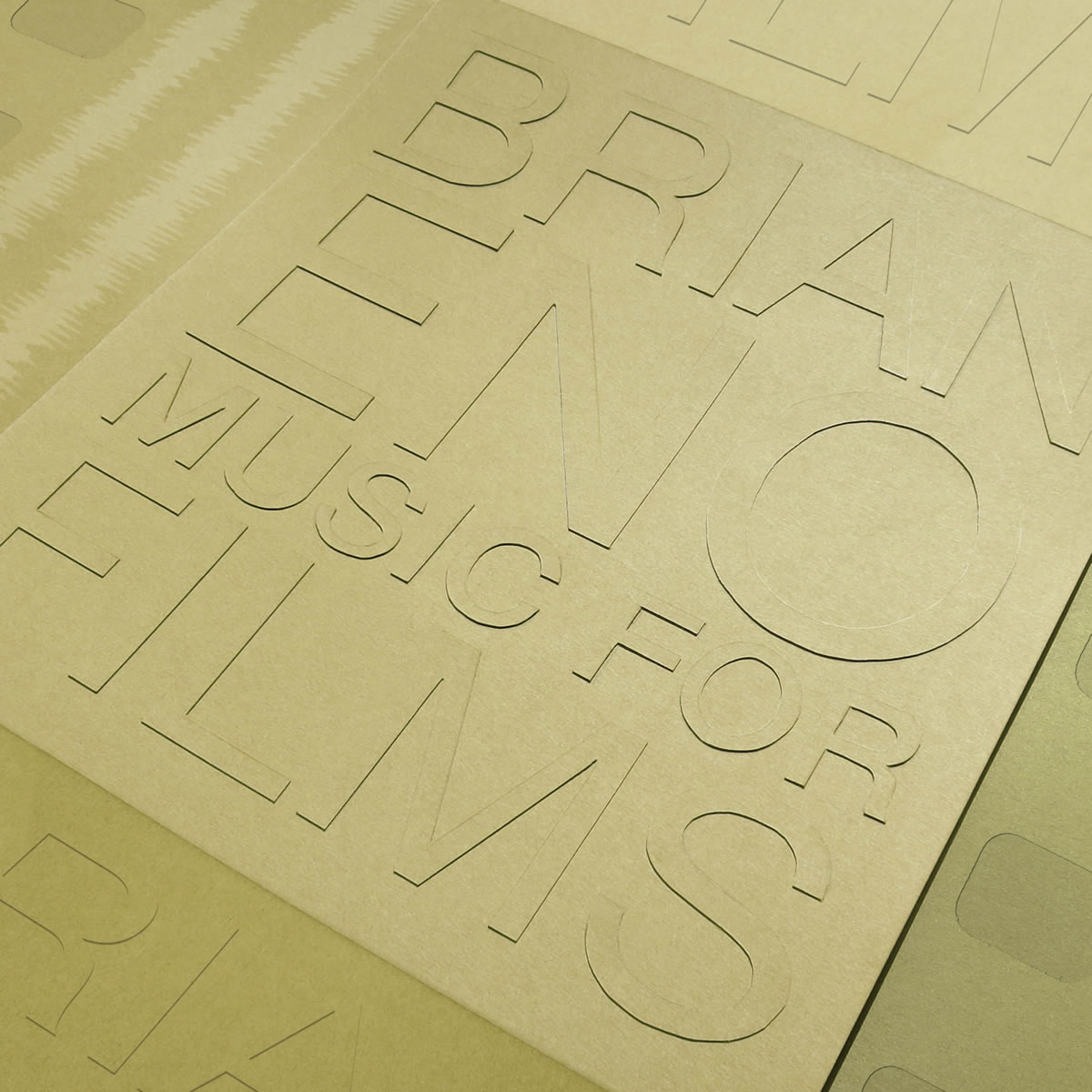
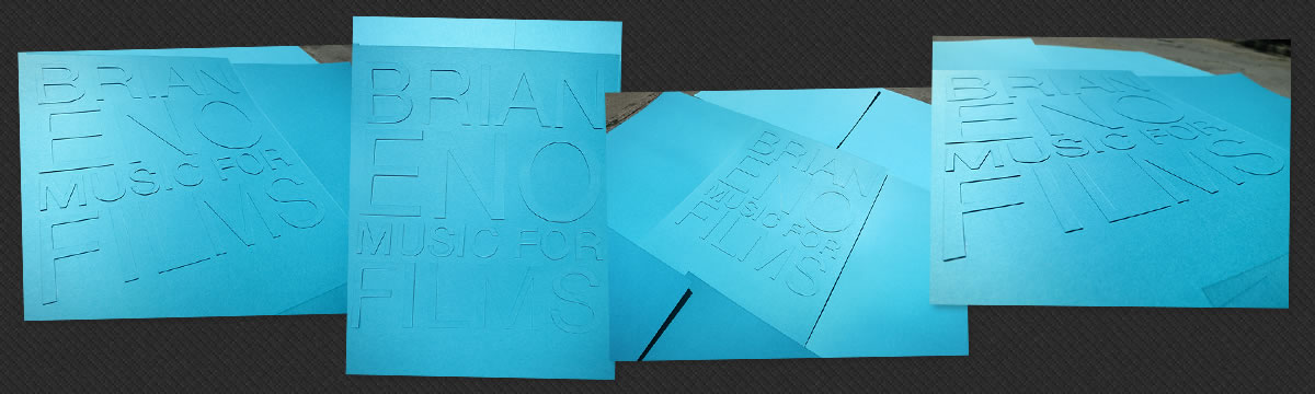
My next concept was inspired by the oft-told story of Eno conceiving of Ambient music in 1975, on bedrest after an accident, forced to listen to music being played so quietly as to be almost, but not quite, inaudible. I laid out the basic typography in Illustrator,printed them on heavy cardstock, cut out the letterforms, carefully lay them out atop more of the same stock, and photographed them from various angles. I had hoped that the letters would be just barely legible. In execution, I found that the contrast and shadows created by the letterforms were much greater than I imagined they might be. Here are some of the raw photographs:
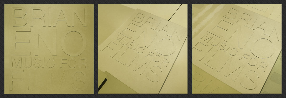
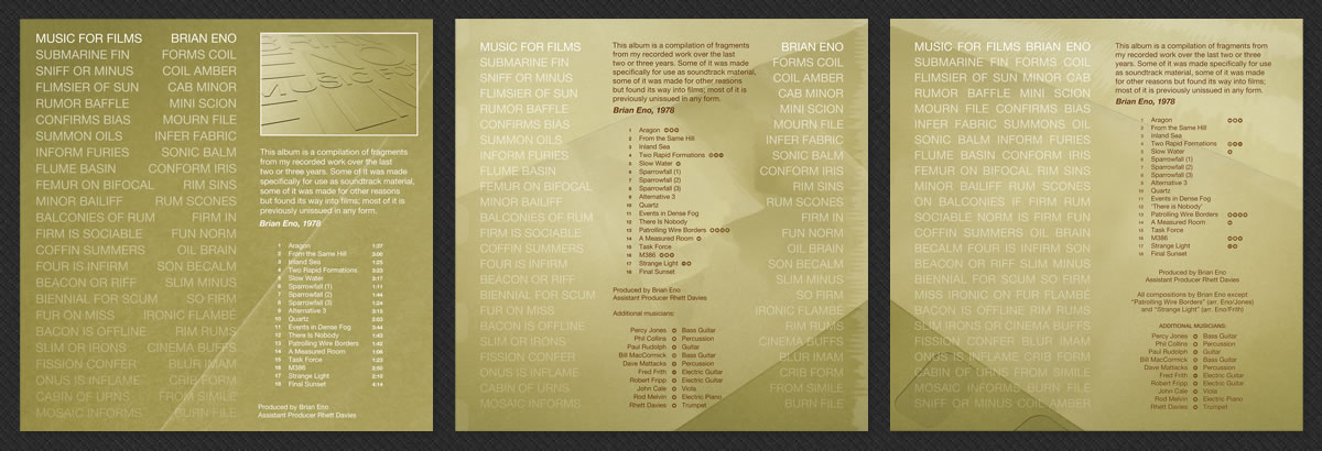
Below is a progression towards the final version of the front cover. The first version is still extremely rough, as I abandoned it once I saw that the contrast turned out to be too great, and I felt Photoshopping it too much would ruin the tactility of the original photo.
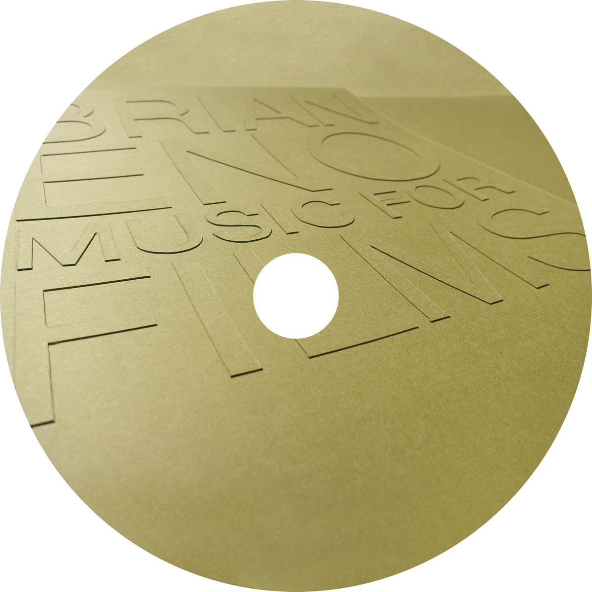
The two later versions utilize a photograph from a more interesting angle, with extensive Photoshopping to add or remove planar surfaces. The final version includes an optical sound track and film sprockets. In retrospect, perhaps I should have stopped with the middle version.
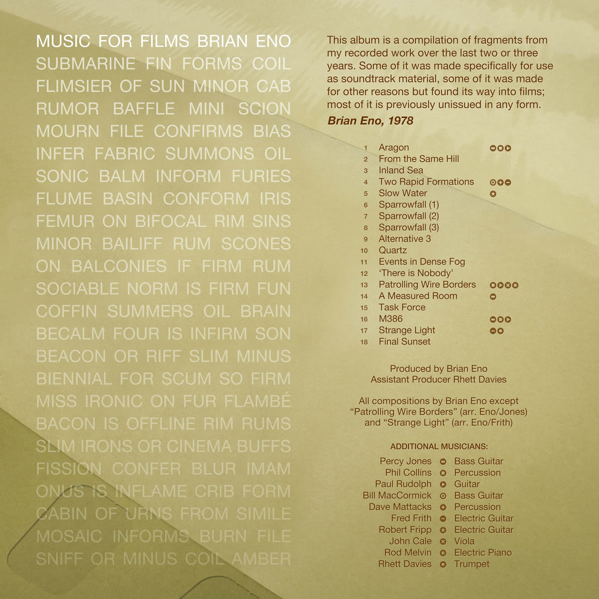
Below is a progression towards the final back cover, each including the earlier anagram concept. I never liked the original album's confusing method of crediting the guest musicians by their initials, so I additionally attempted to create a more graphical indication of which tracks featured which musicians.
It was an interesting task to undertake. If I were to start again from scratch, I think I would avoid the following three dead-end roads I originally went down:
- I was too obsessed with including literal imagery related to optical film.
- While the idea of incorporating anagrams is relevant to Eno, I think it was one idea too many cluttering up the back cover.
- The idea of using photographs of coarse paper resulted in something that looks, perhaps unsurprisingly in retrospect, too much like a Photoshop-derived texture.
In larger form, here is the final version of the complete package: