I first created a personal website circa 1996 or 1997, as a film student at Columbia University. Over time, it served as a hub for my student films, writing, portfolio, and personal projects. It was known variously as The Fringe, On the Fringe, The Fringe Archipelago, Fringe Digital, and ultimately what it should have been all along, chadossman.com.
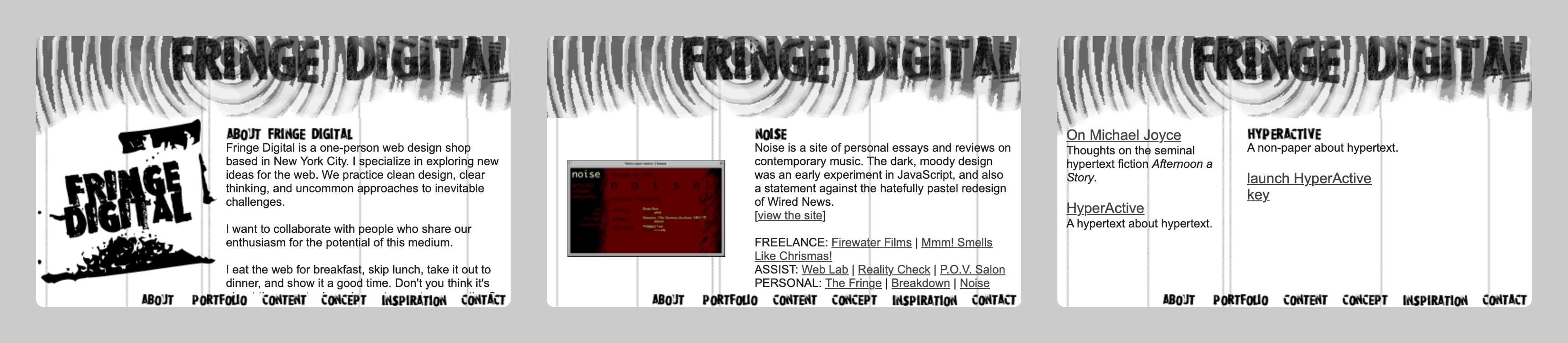
I don't have any screenshots or backups of the earliest versions of the site, but below are screenshots from about 1999 to present. First is a short-lived incarnation with a grunge aesthetic:
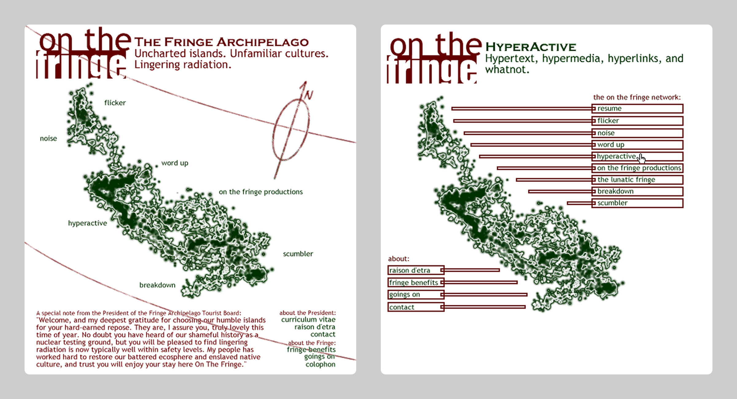
I briefly utilized a bizarre "sitemap" pun, of a radioactive archipelago. I can't explain now what I was thinking then:
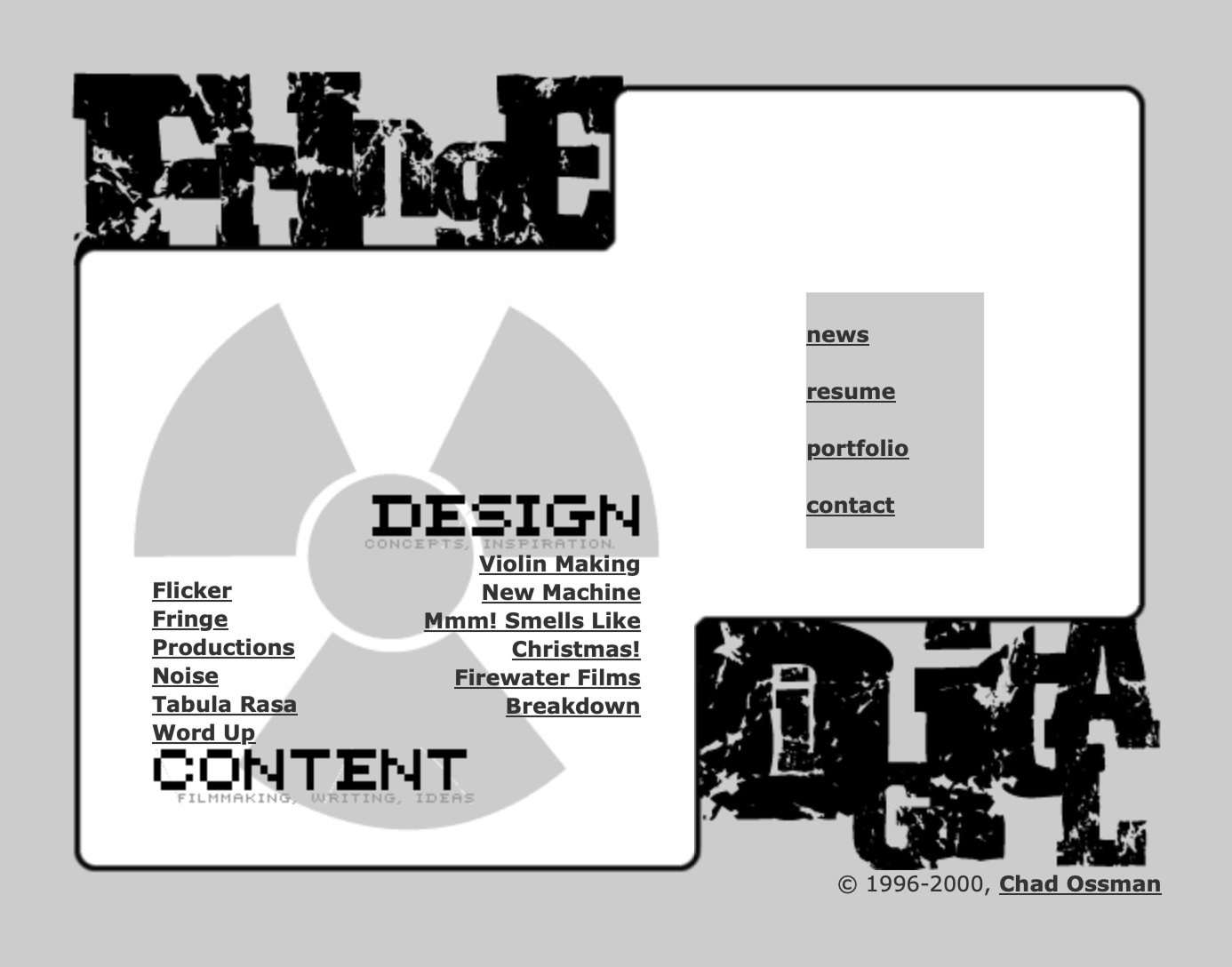
Around 2000, I continued the radiation theme but dropped the weird map idea. I don't have screenshots, but hovering over the section names would fill the radiation icon with relevant graphics:
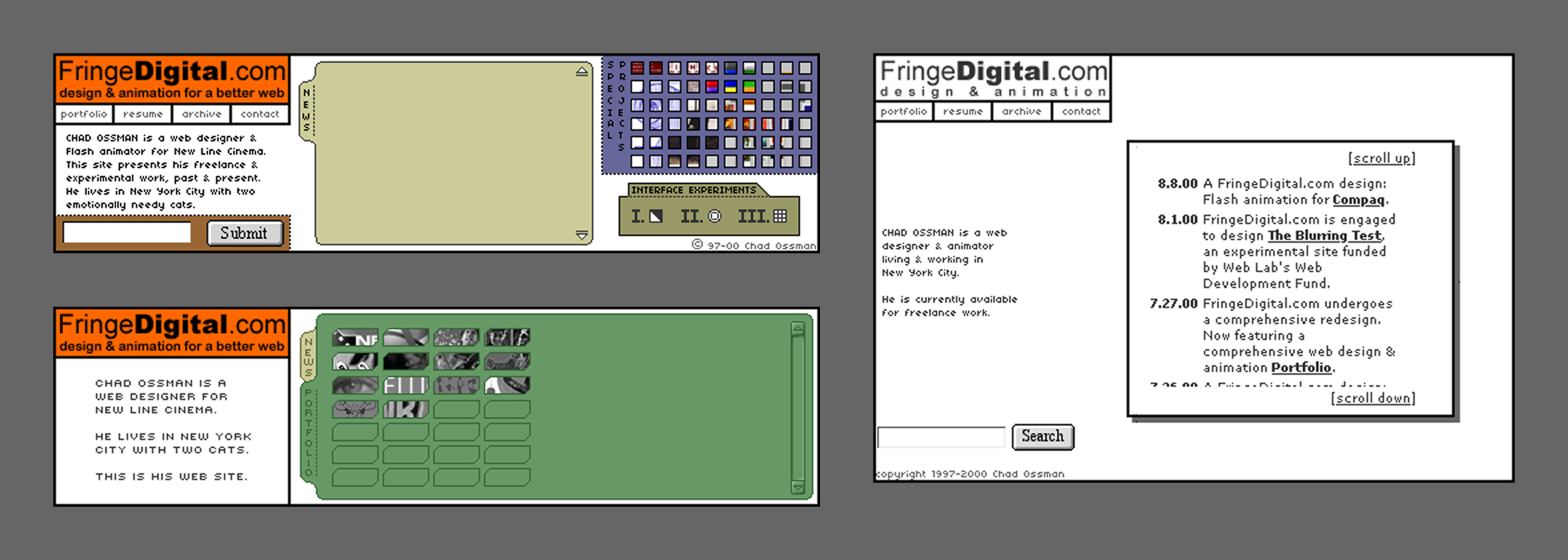
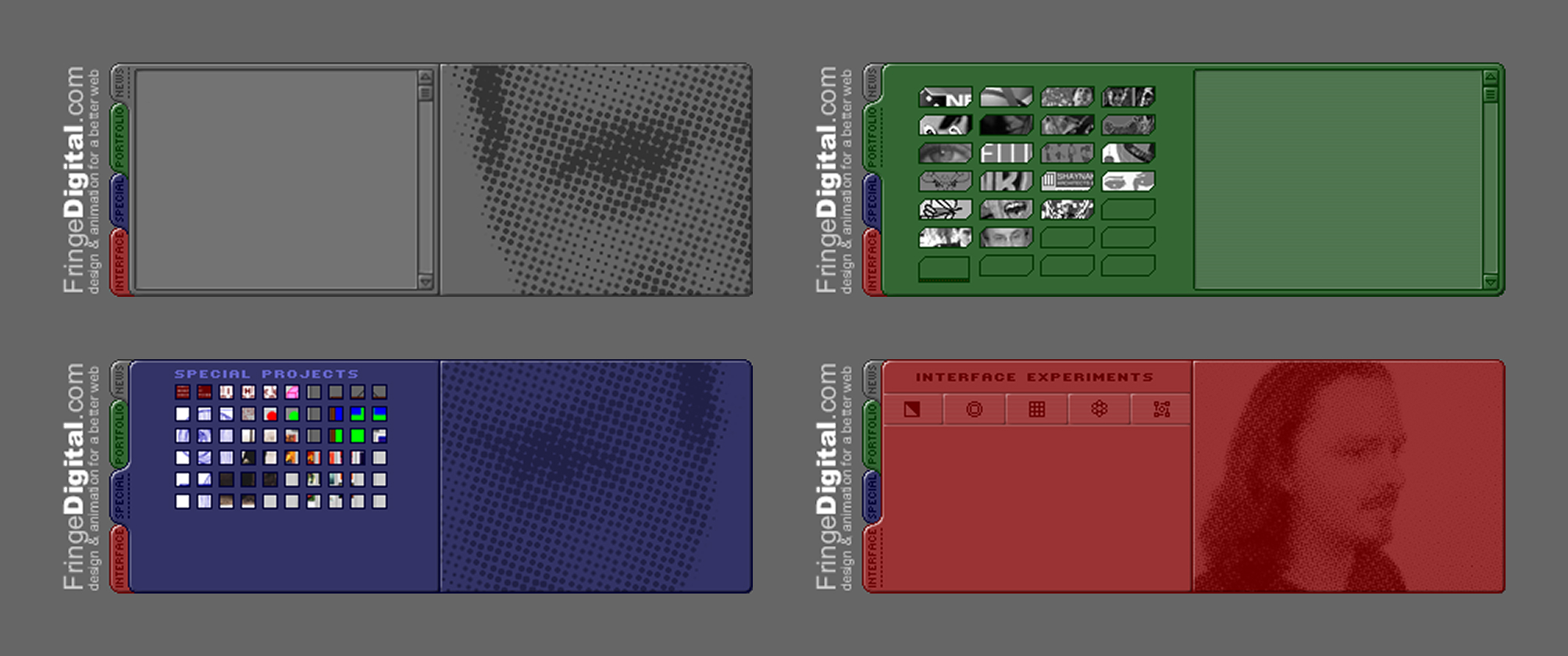
A little later in 2000, I launched a complete rethink. Now we're talking. This was the beginning of an elaborate new phase for the site, with toggle-able tabs, bitmap text, scrolling panels, and an overall minimalist pixel-art style that was in vogue at the time. These screenshots are incomplete, as I do not have a working backup of the site:
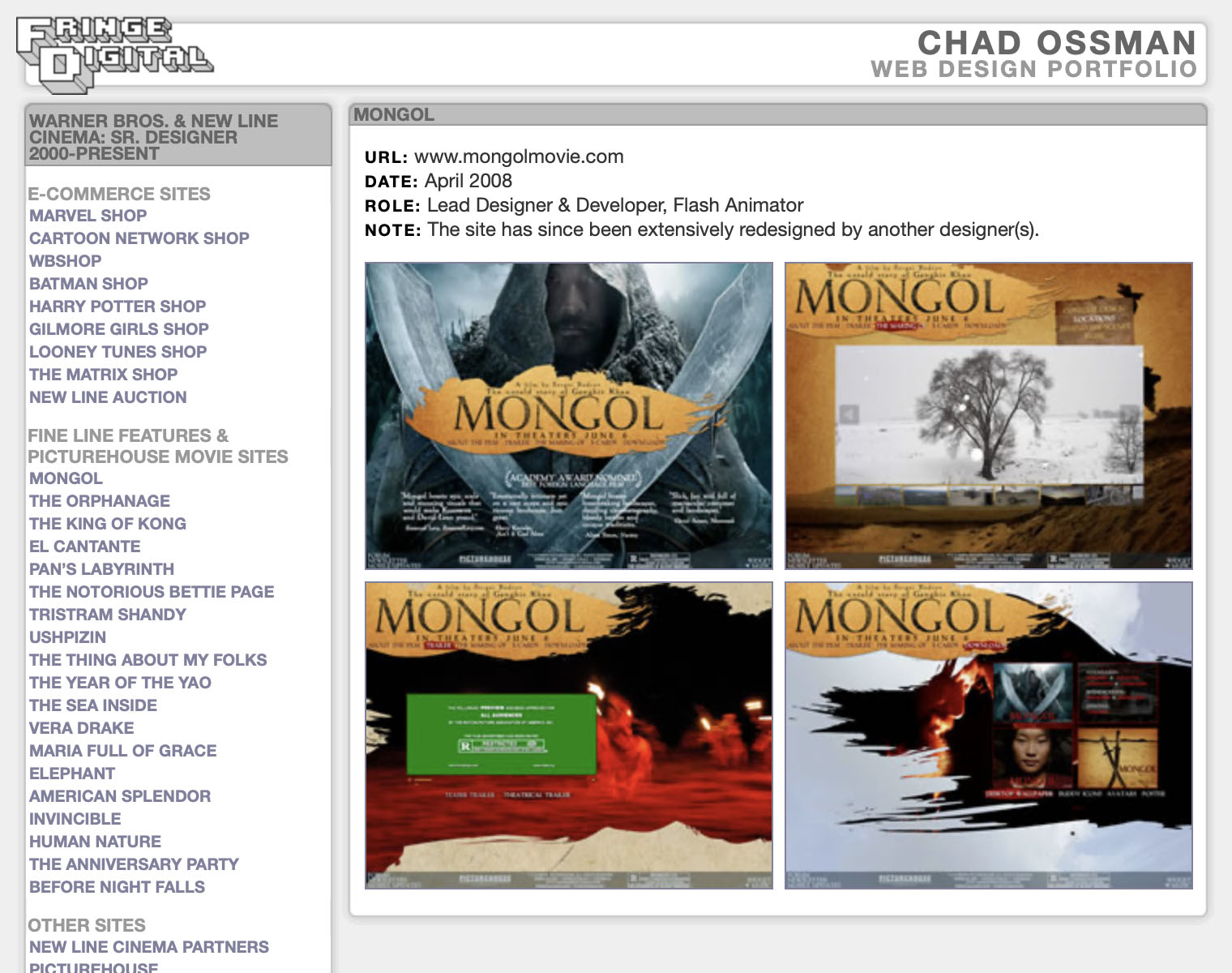
By 2003, the above had evolved into what is still my favorite iteration of the site. I do grant that it was absurdly small at 440px x 150px, even for the time, but I had a vision. Like the above, I don't have a full backup, so these screenshots are unfortunately incomplete.
Around 2006, I deleted my entire website, and replaced it with a bare-bones portfolio. I had listened to feedback that my beloved 2003 site was not usable or even legible. While this advice wasn't exactly wrong, I overcompensated with this boring, perfunctory redesign. Just terrible; this is clearly the worst version.
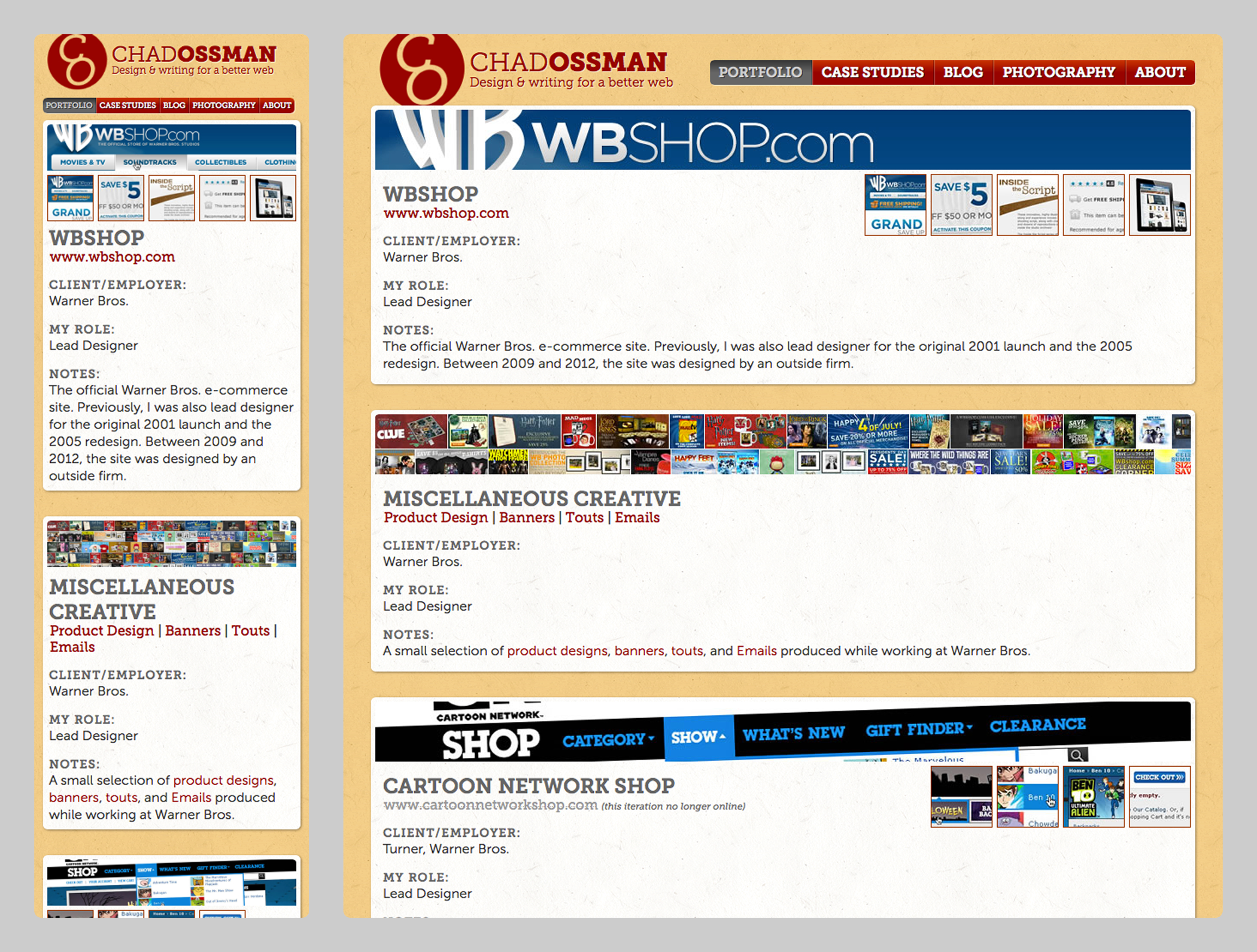
By 2013, I had finally built a proper, responsive version of my portfolio. The colors make me flinch now, but it was part of a "personal brand" for my job search at the time: I also used these fonts and emblem on my physical resume and business cards, printed on yellowish card stock, so it was all of a piece.
The new structure at this point was a homepage with three basic content blocks: portfolio highlights, blog highlights, and Flickr feed. The portfolio section was organized as a reverse-chronological feed.
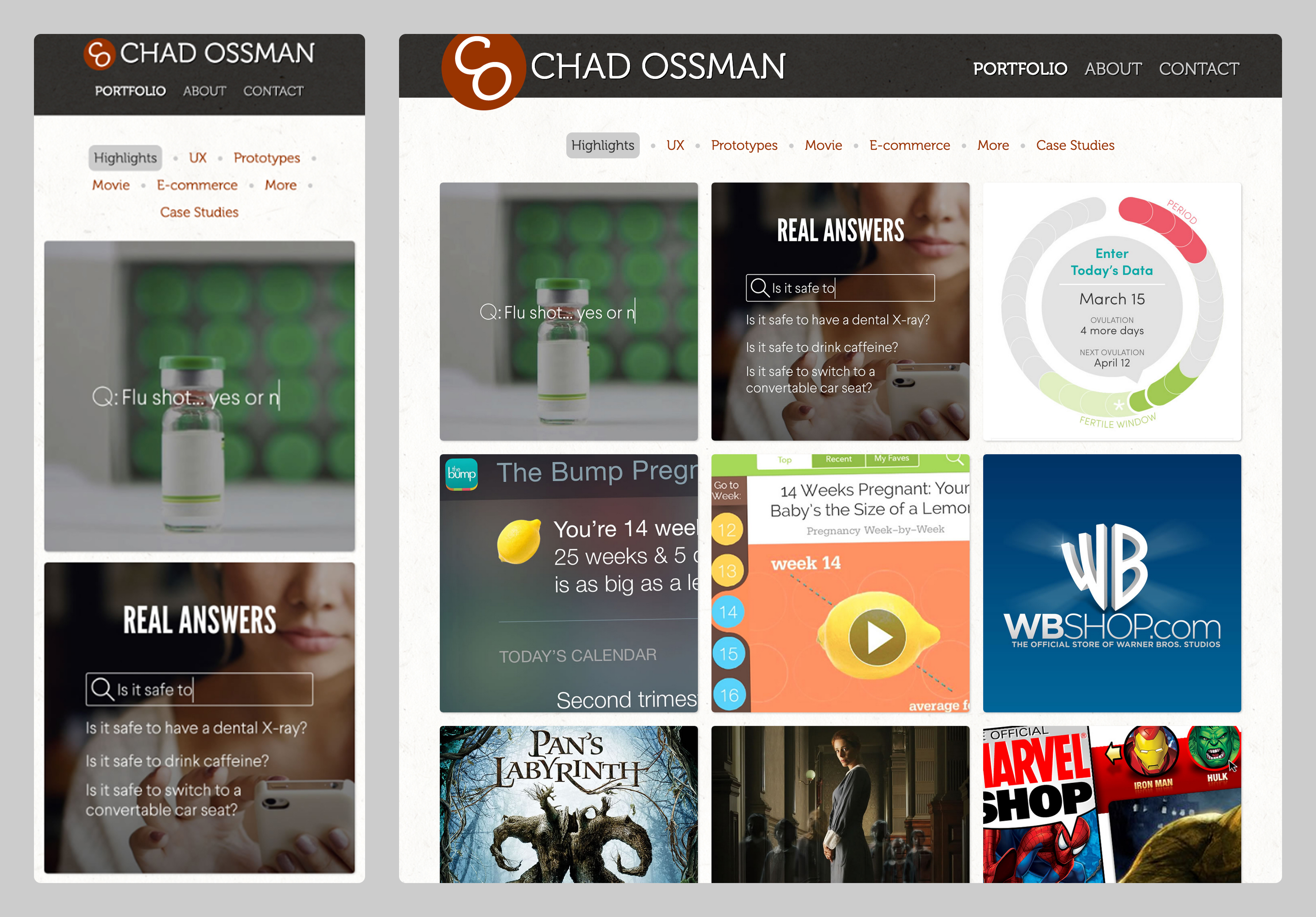
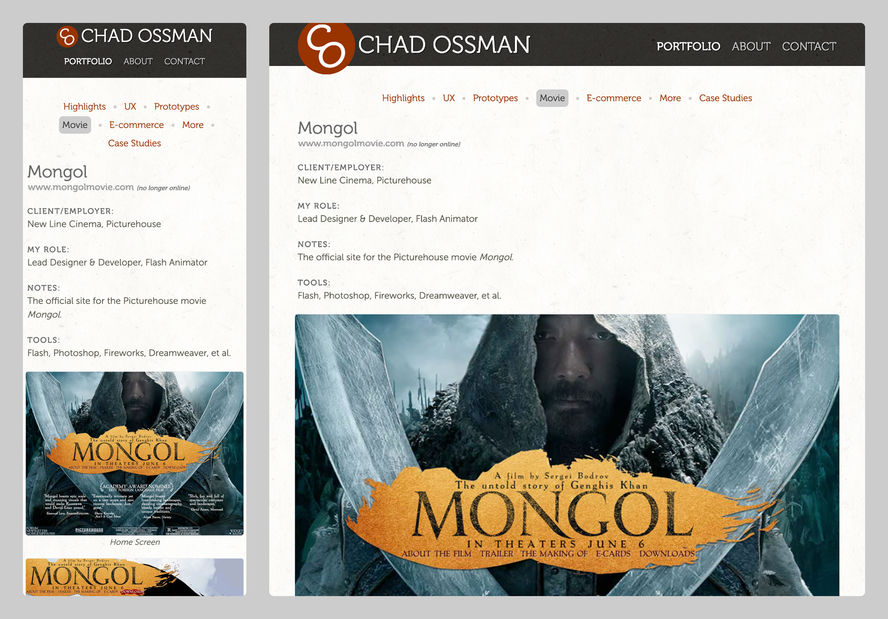
By 2016, I had reorganized and refined the above into a more presentable form. In the screenshots below, you can see it is the ancestor of the current 2026 version. The new homepage was fully dedicated to portfolio highlights, and each portfolio entry had its own page.
After beginning work at CBS News in 2016, I replaced my portfolio site with this single page:
In early March 2026, I relaunched my portfolio site, fully redesigned and greatly expanded. I have plans to re-integrate other projects (past & current) beyond my portfolio, so it will hopefully evolve back into a full personal site.