I designed the full suite of print and online materials for my wedding in 2012. This case study will walk through my process and thinking for some of items. The selection of photographs displays the finished materials in context.
An important point for us was to avoid the ornate script fonts typically used on traditional wedding invitations, which sometimes tend towards illegibility. I selected two "handwriting"-style fonts (which had to also be available in webfont format for the companion site).
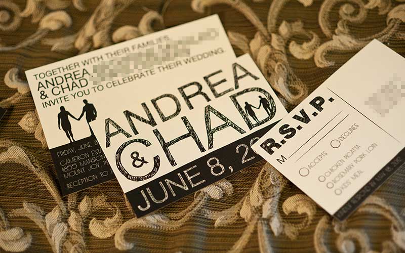
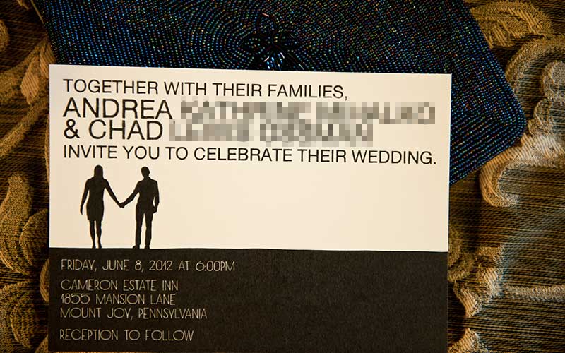
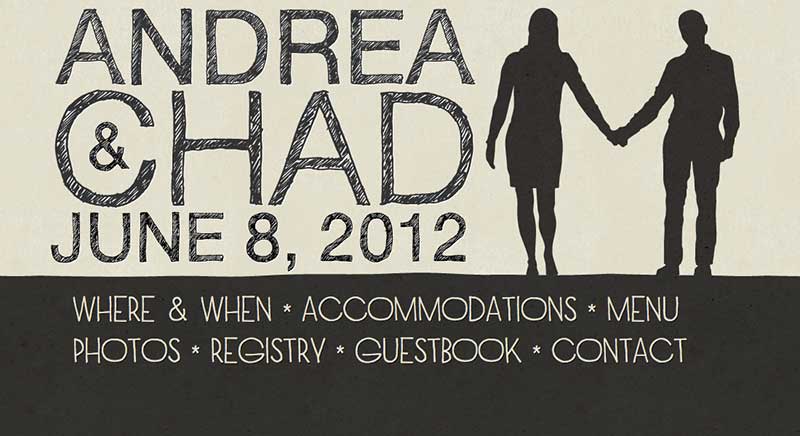
The first step was to design the invitation and companion website simultaneously. Taken together, they had to establish a consistent aesthetic for everything else yet to come. I strove for a handmade look, starting with the hand-drawn silhouette illustration that became the recurring icon throughout most of the materials. This and all other print materials were designed in Adobe Illustrator. These invitations were the only pieces that were professionally printed.
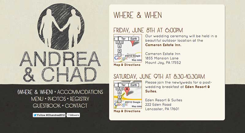
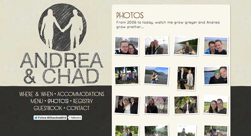
The companion website chandrea.org needed to be completed and launched before the guests received their invitations. With the exception of the logo, all typography was rendered in webfonts, with no use of Flash. I designed the graphics in Adobe Photoshop and Fireworks, and hard-coded the site by hand. It included modest social media integration in the form of a Twitter feed and Facebook guestbook.
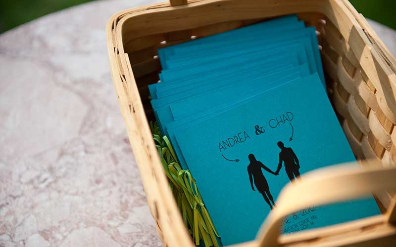
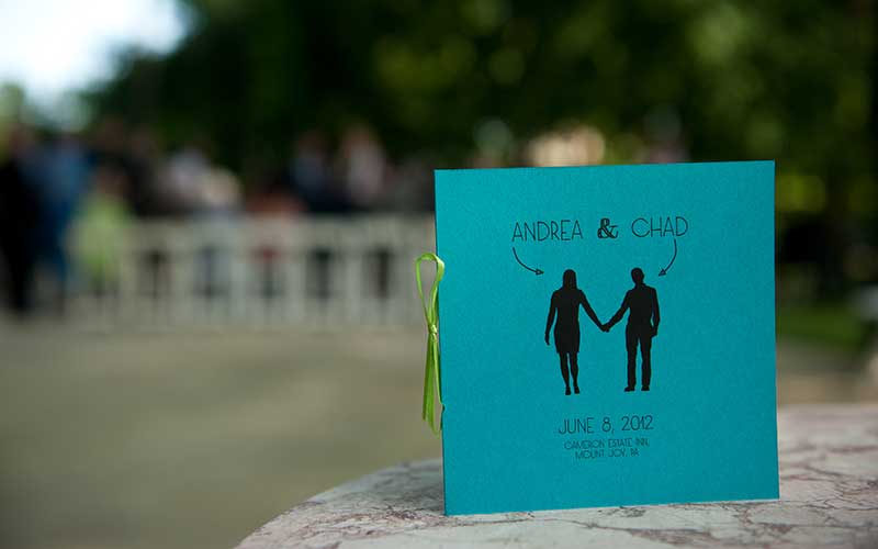
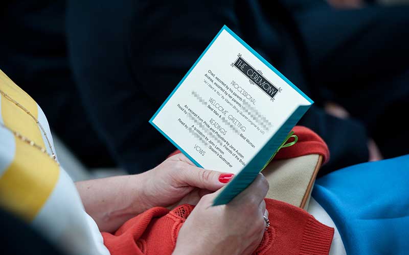
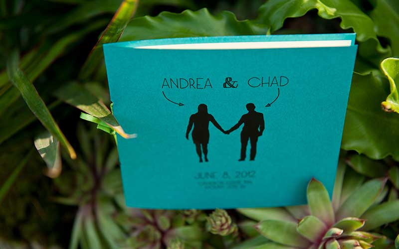
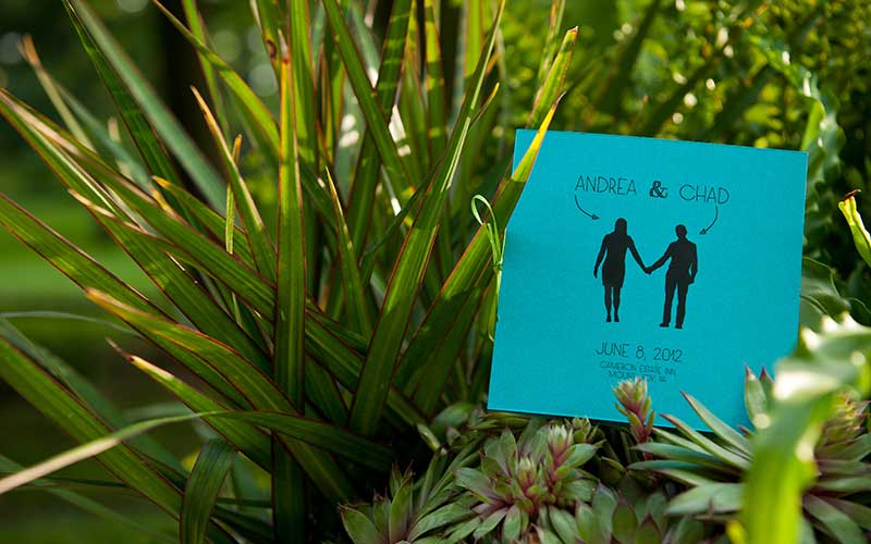
The program design continued the hand-drawn aesthetic, but introduced the two colors chosen for the ceremony. From this point on, I printed and assembled everything by hand.
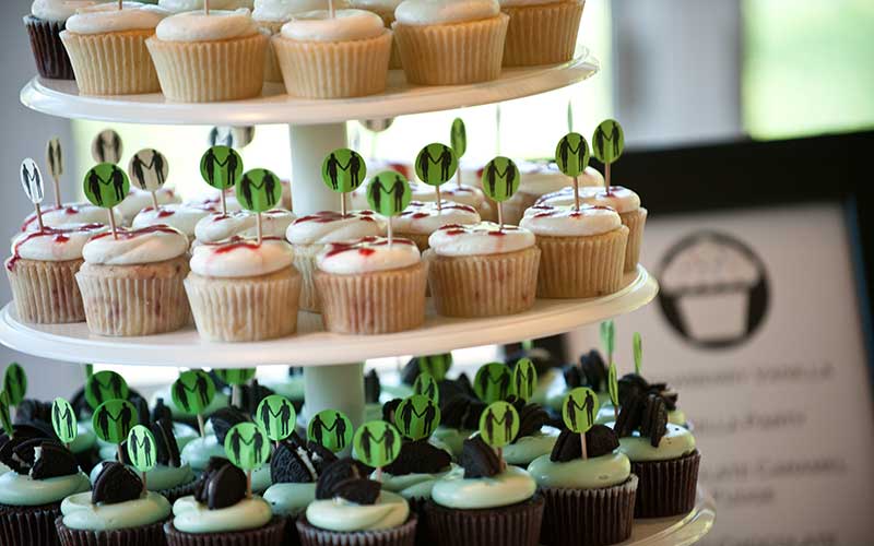
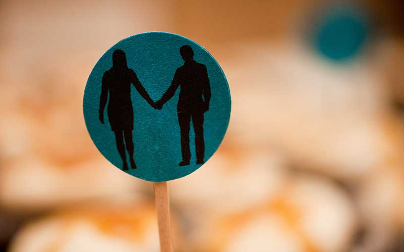
We served individual cupcakes instead of a traditional wedding cake, and the silhouette illustration made an ideal graphic for decorative cupcake flags.
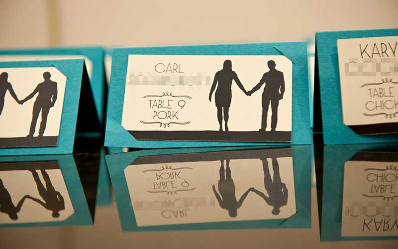
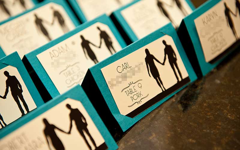
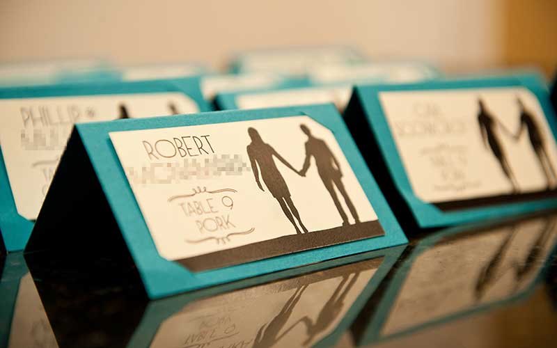
The escort cards paired well with the program design, in terms of color, paper stock, and typography. Some guests asked if I had actually written them by hand. Interestingly, the venue had very strict regulations for the escort card design and content.
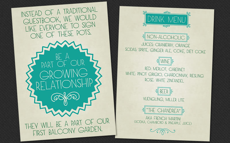
The drink menu and guestbook instruction cards were lighter and more playful in tone.
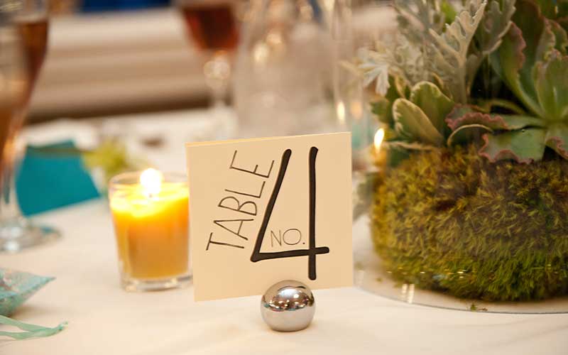
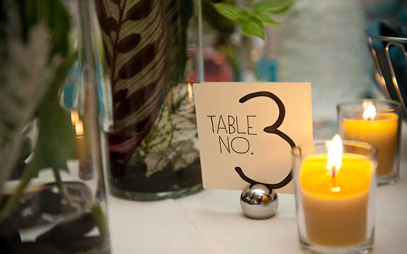
The table number cards used a more playful type treatment, while still using one of our two signature fonts.
With the benefit of hindsight, hare are some choices I would reconsider:
- One of the two fonts I chose (Sketchetica) turned out to be rather difficult to work with in practice. It was only useful on printed matter, and even then only at a very large point size. I wound up not using it after the initial invitation and website logo.
- The site was functional on mobile platforms, unlike many out-of-the-box wedding sites at the time that used Flash. But if I were starting over, I would have gone one step further and created a responsive site.
- We selected our color scheme midway through the process. In retrospect, it would have been nice to utilize these colors in the initial invitations and site.
- Professional printing services are great if you have complex cutting and scoring needs, but we found many simpler jobs could be done at home. Granted, we had invested in a decent printer, quality paper stock, plenty of ink, an X-ACTO blade, and patience.
- Regarding social integration for the site, the Facebook-driven guestbook was useful, but we received virtually no activity on the Twitter feed.
Most of the above photographs were taken by the wonderful Fig Tree Photography.