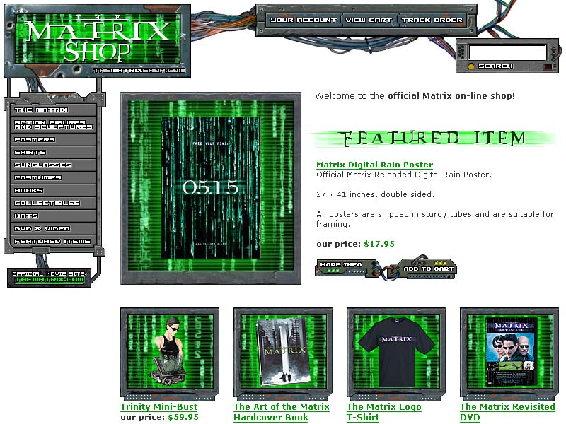
The official Warner Bros. The Matrix e-commerce site. It was not unusual for Warner Bros. properties to have strict requirements, but in this case we were permitted no digital assets other than a logo and an image of the green/black "digital rain" effect. We were asked to be visually compatible with the official Matrix movie site, but that team refused to supply us with anything. I pulled almost every graphic I could find off the movie site, and hacked them up in Photoshop and Fireworks.
As for the movie logo, it was supremely unsuited for small-dimension low-resolution graphics for an e-commerce website. I utilized an unofficial freeware Matrix-like font, outlining the characters into vector shapes, and painstakingly reworking them for legibility at small sizes.
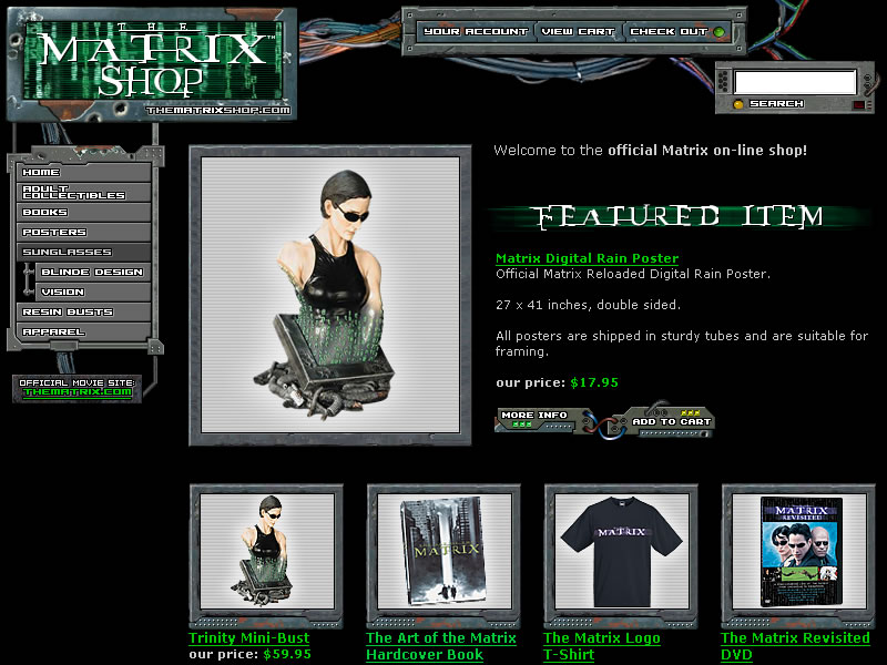
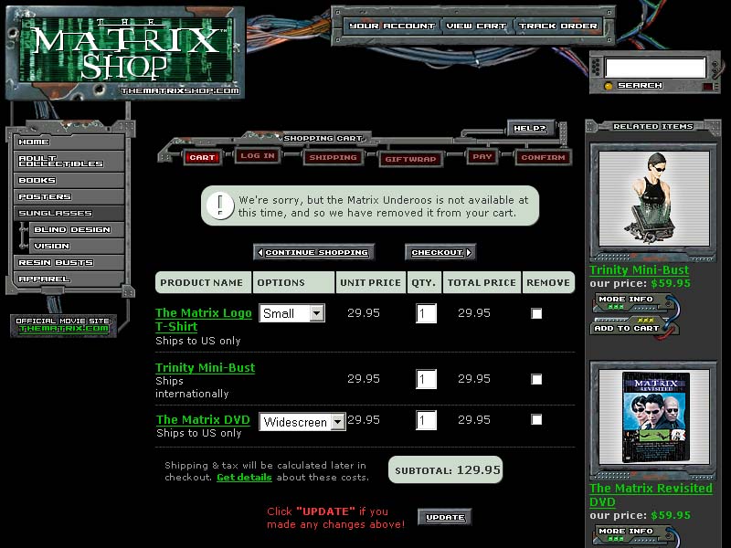
There was much debate at the time about whether or not we should prioritize a Matrix-like dark theme, or a more accessible light theme. We ultimately chose the dark theme shown in the screenshots above, but perhaps the unused version below would have been more effective, in sales terms.