One of the largest tasks for the small team I joined at XO Group was the complete redesign and relaunch of the legacy TheBump.com website.
In this case study:
Prototypes: Adaptive Behavior Case Study
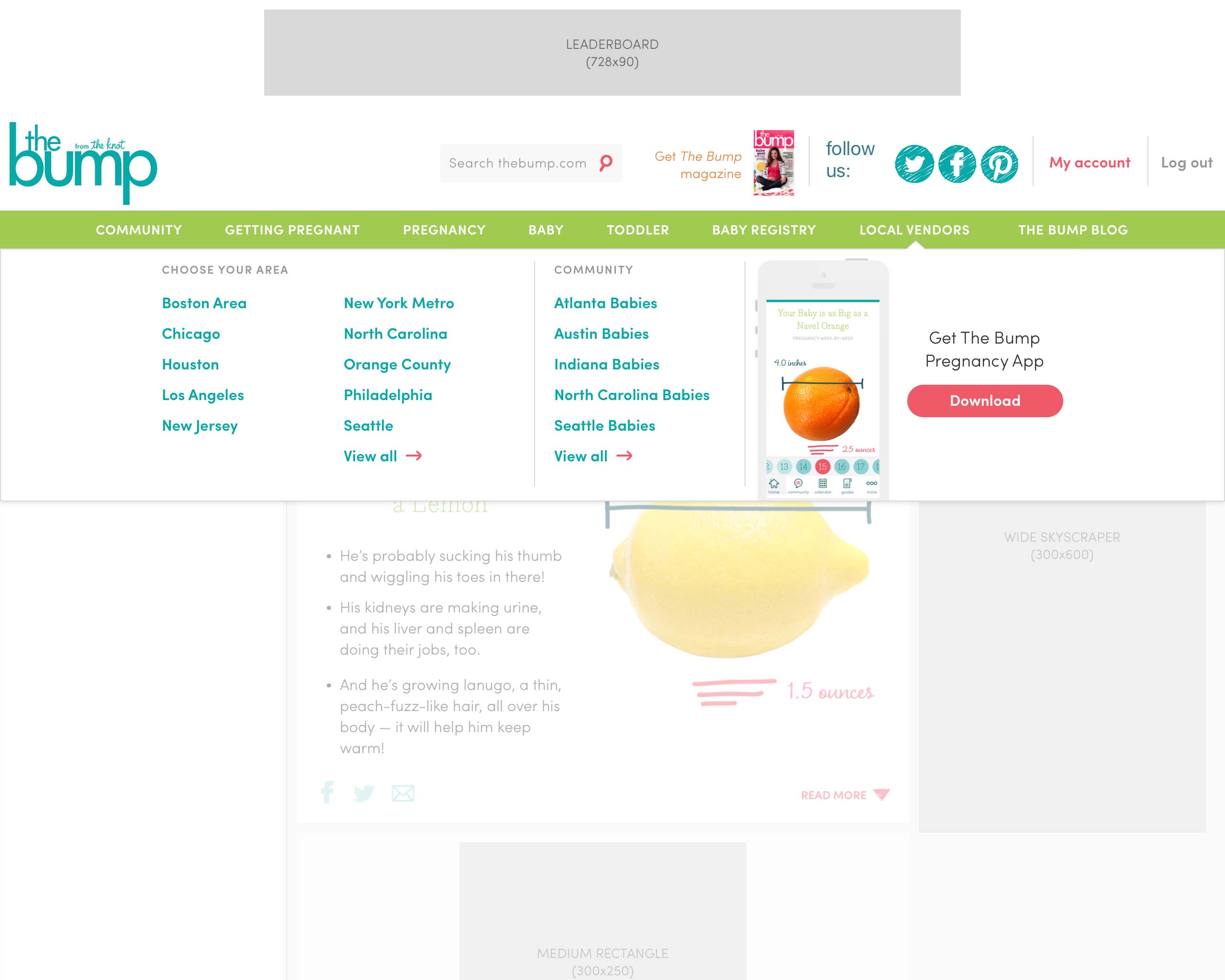
The long pre-existing site had a separate "m-dot" mobile version, and as such, could not be made properly responsive with the timeline and engineering resources we had at the time.
Even so, we did explore various adaptive column structure concepts for desktop web. Below are screen recordings of a few prototypes I built:
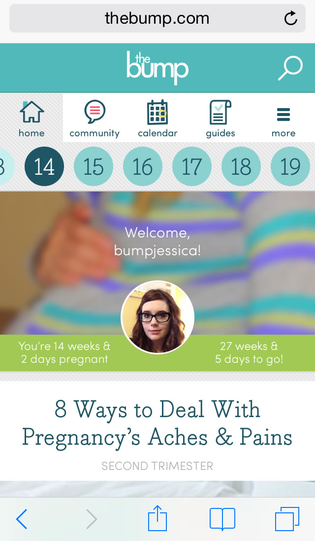
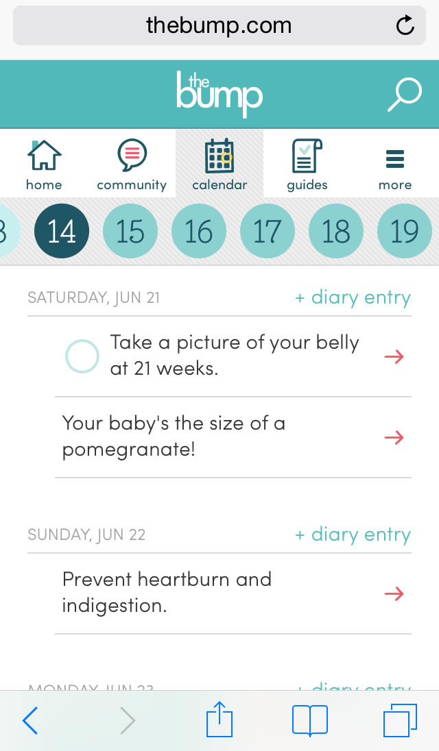
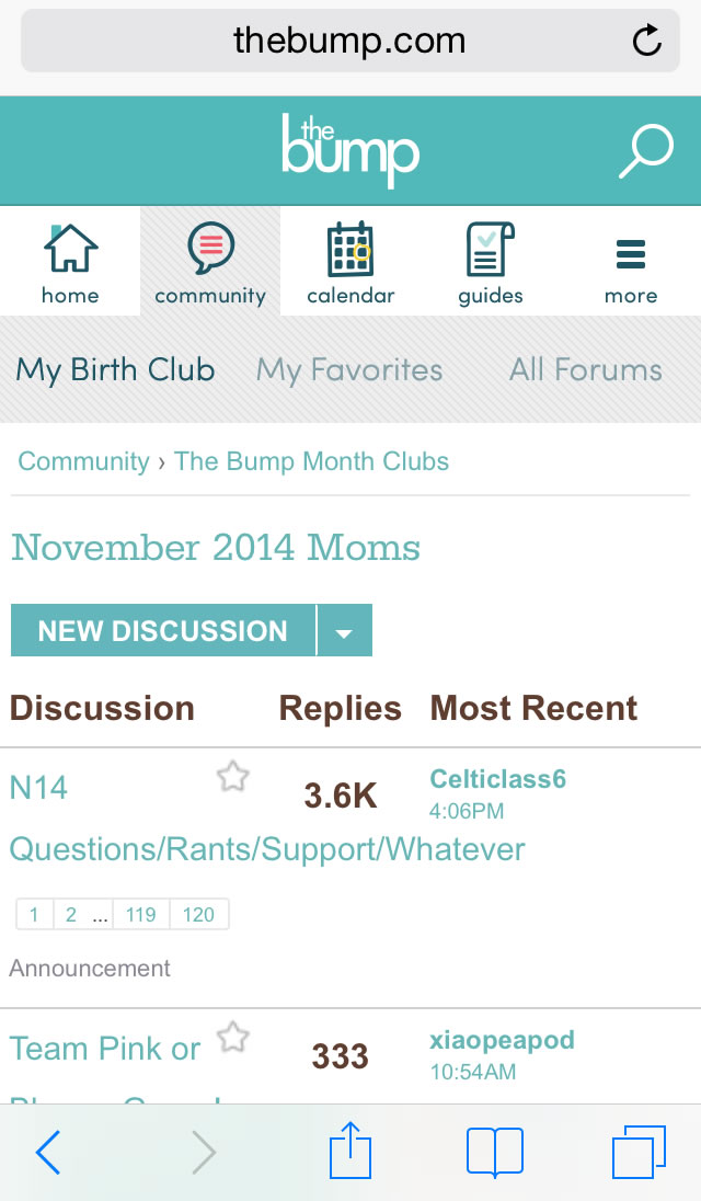
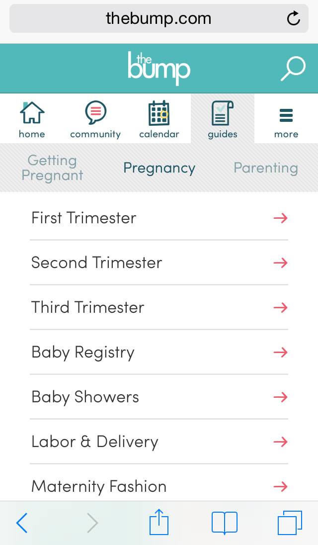
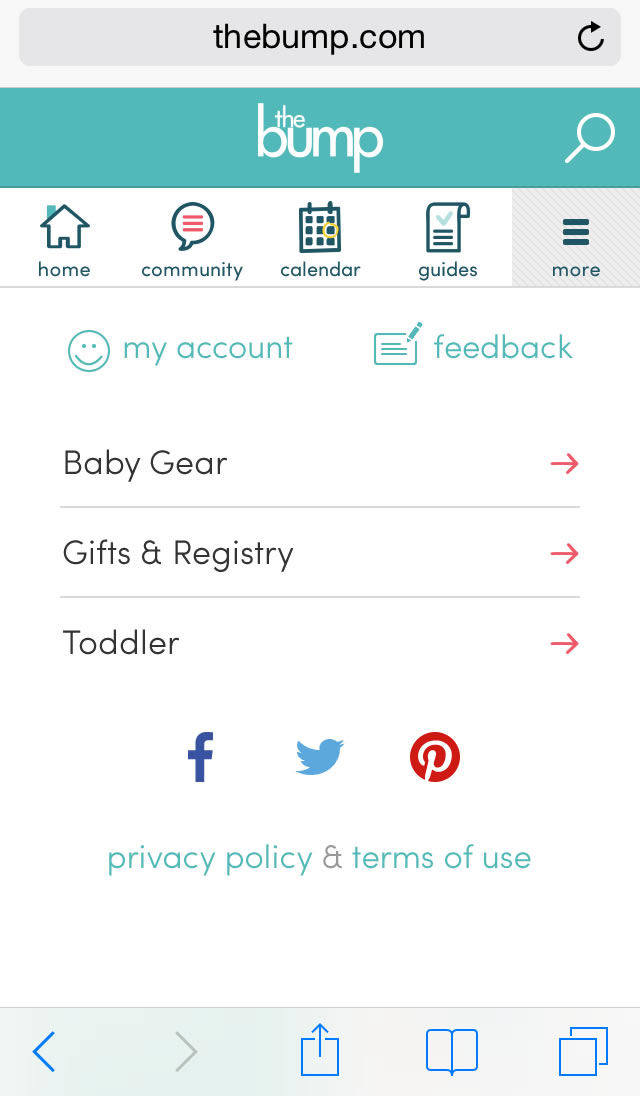
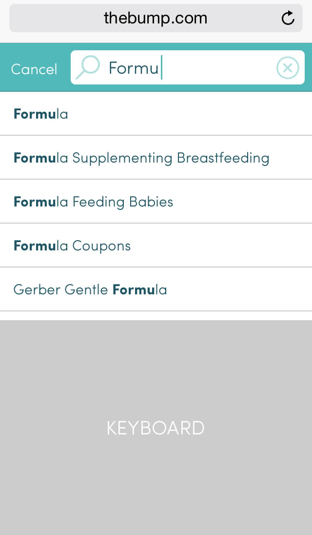
Mobile Web Case Study
Below are a selection of my UX mocks for the "m-dot" mobile website.
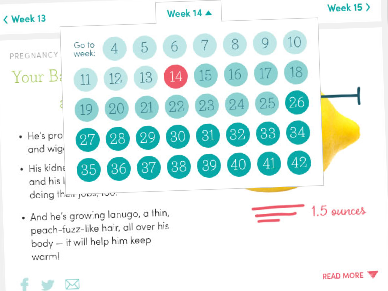
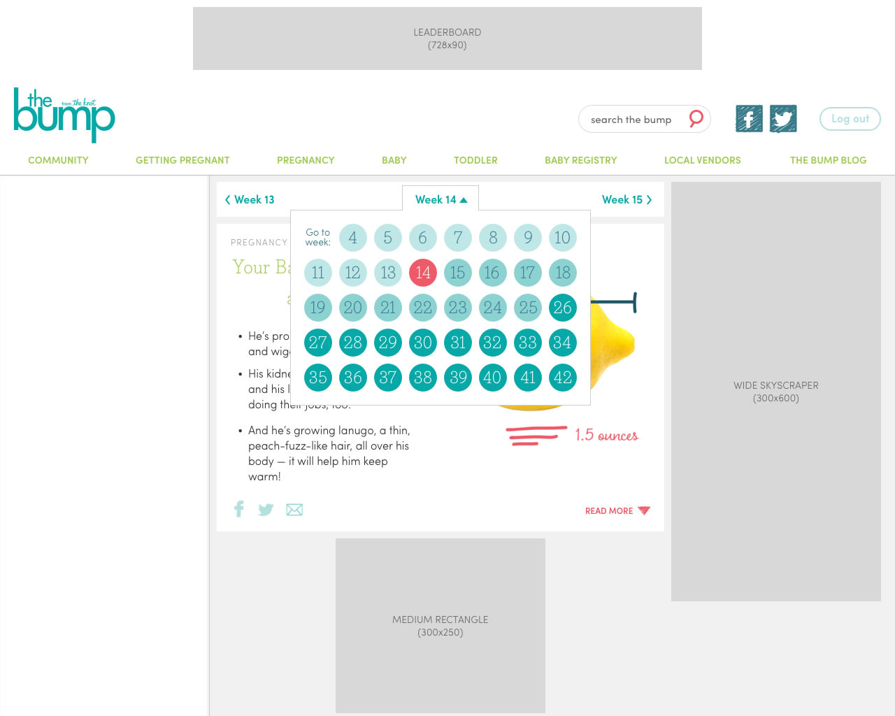
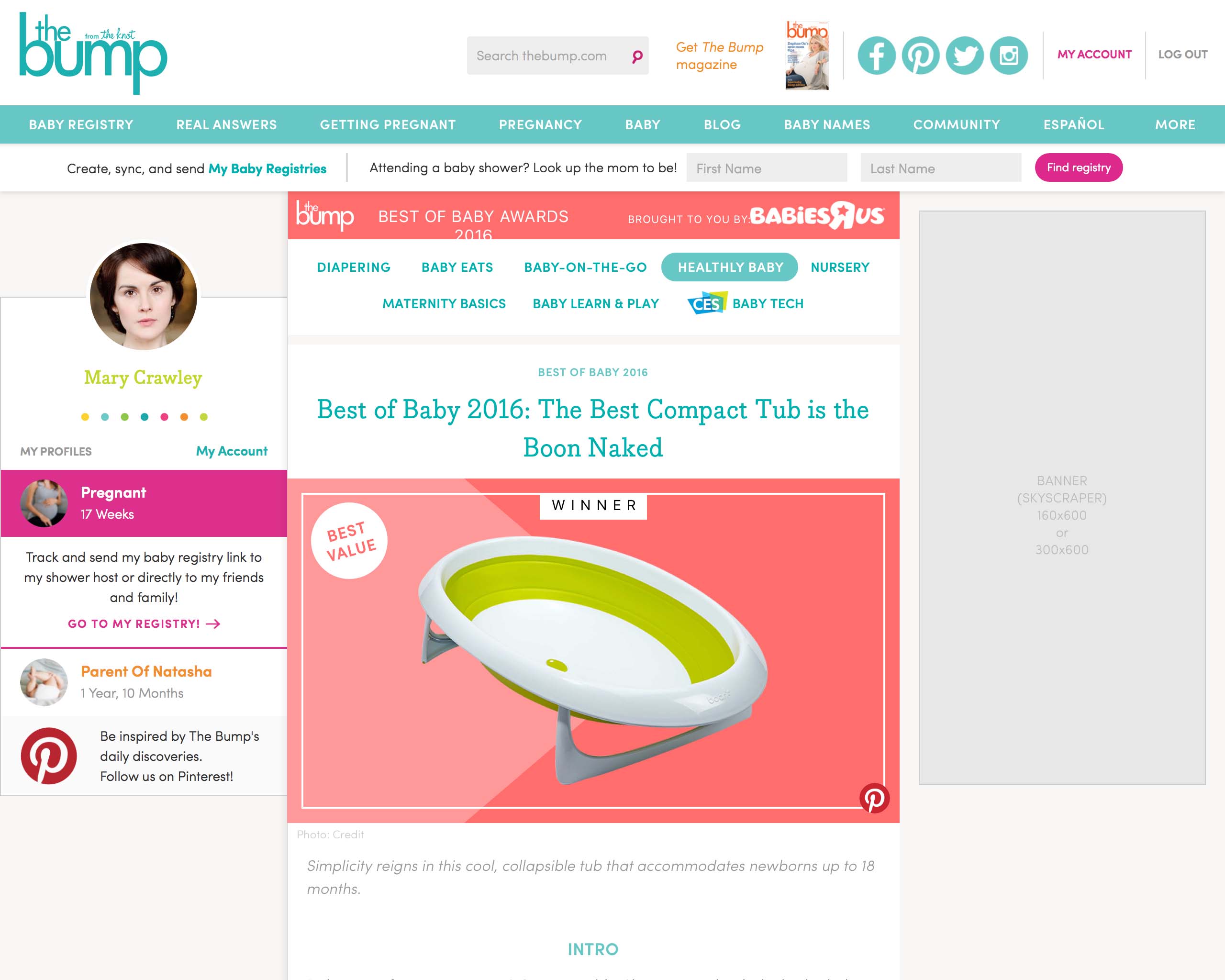
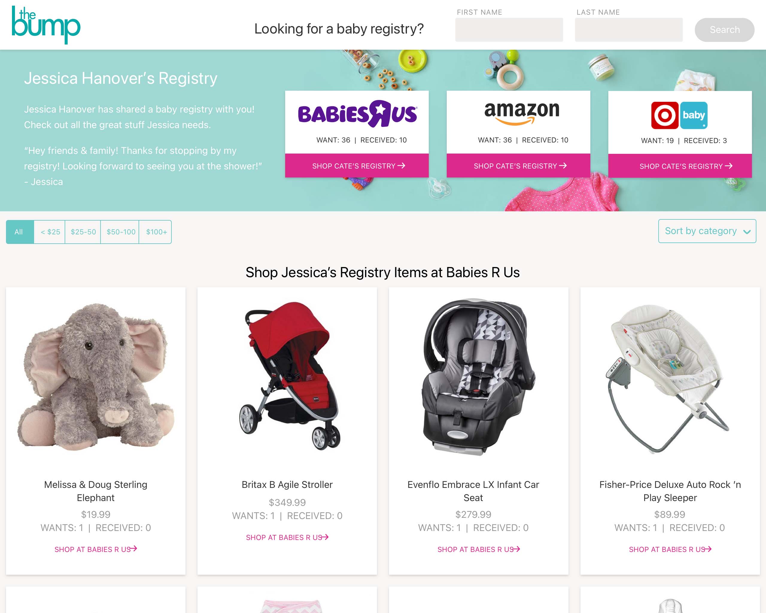
Desktop Web Case Study
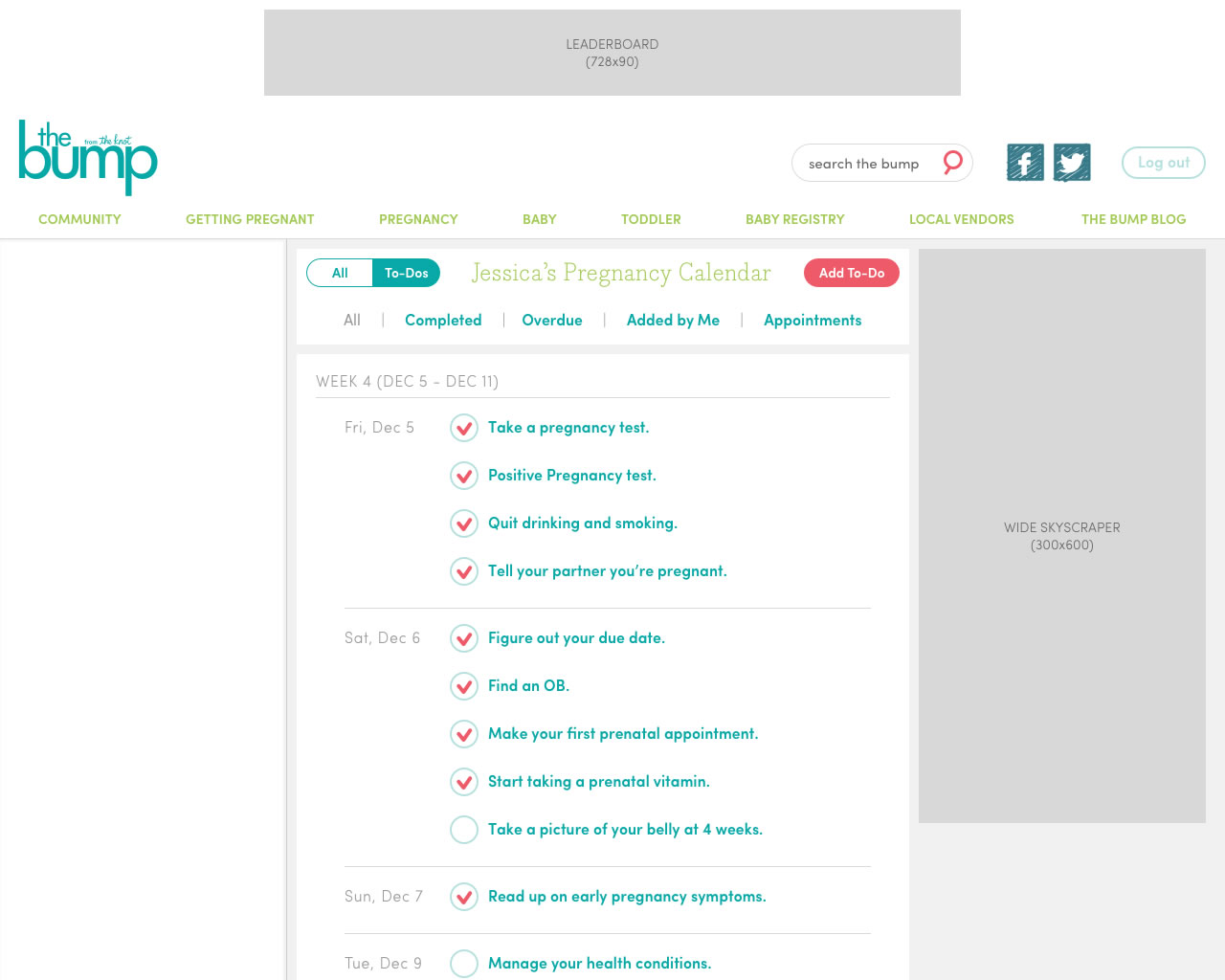
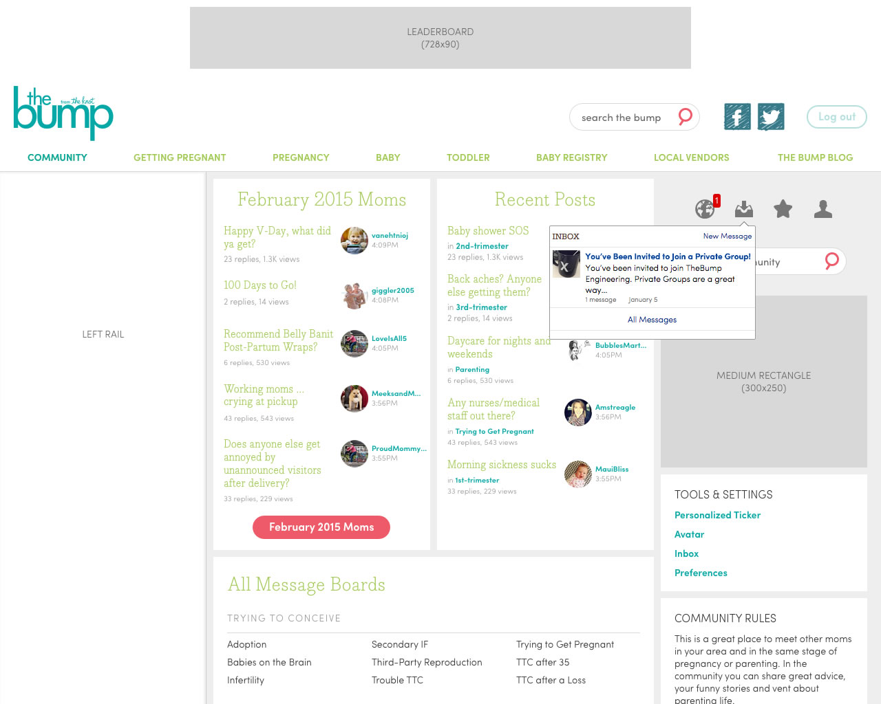
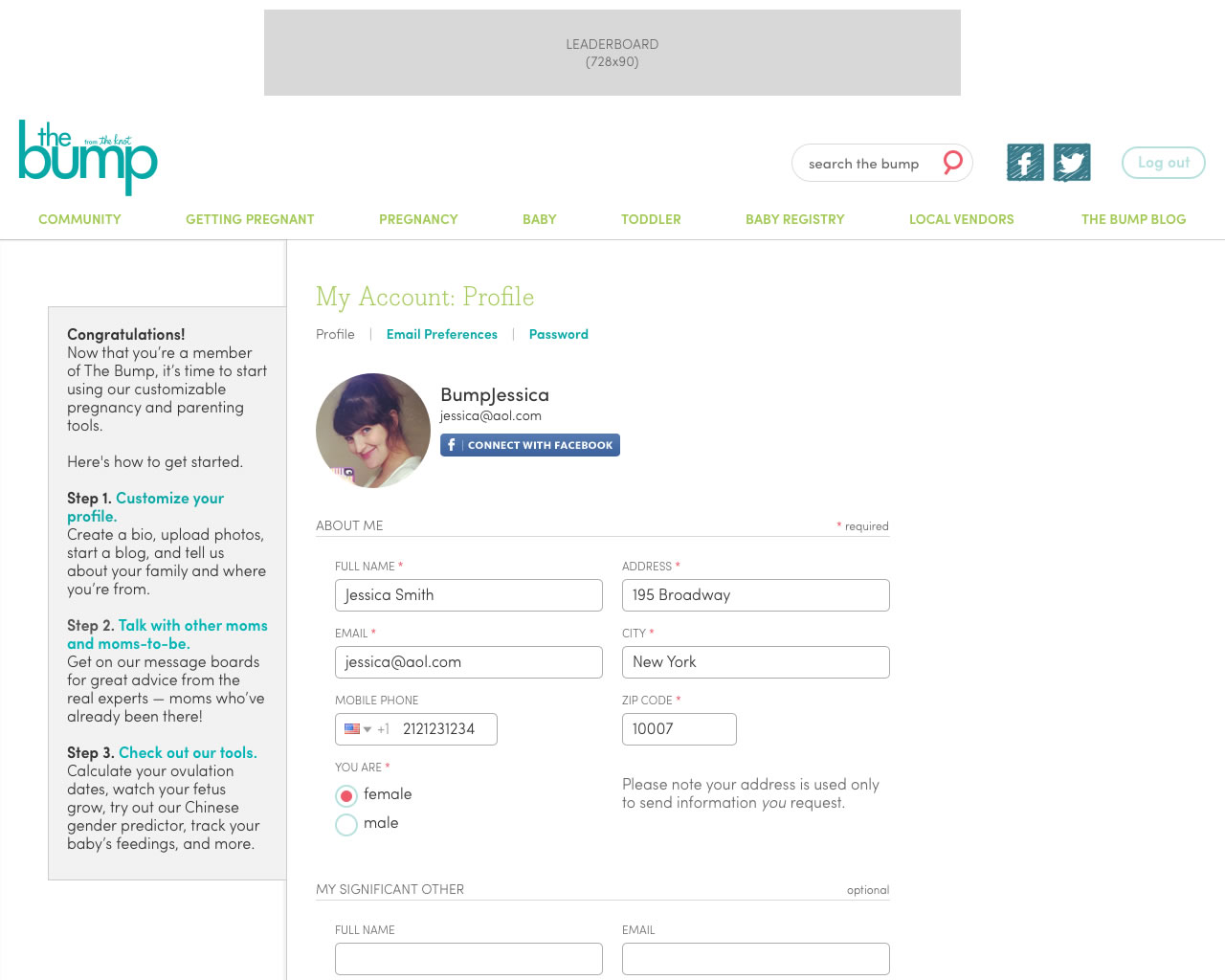
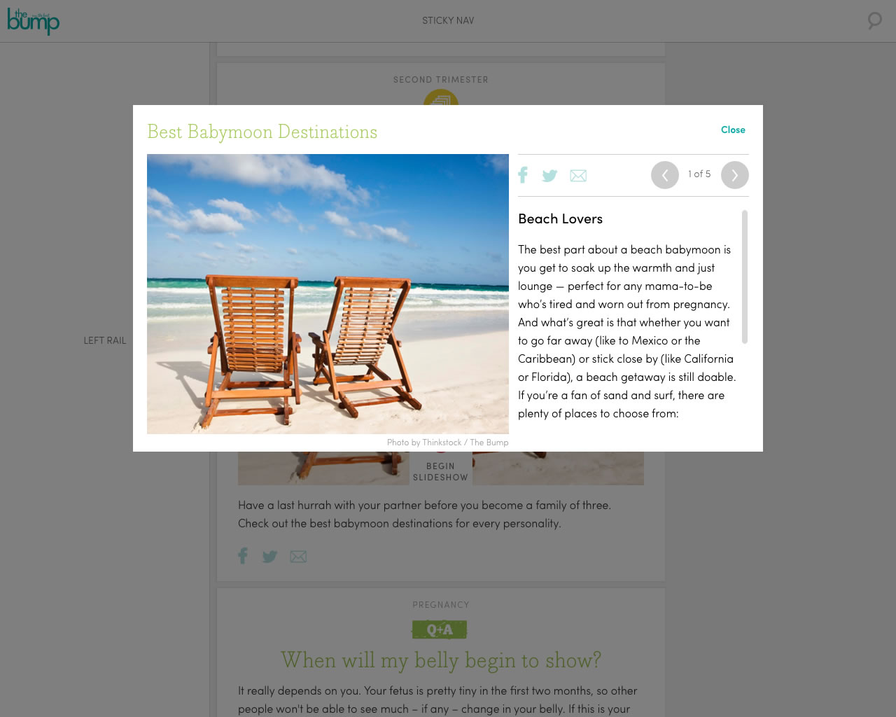
Below are a selection of my UX mocks for the desktop website.
Responsive Email Case Study
Indirectly related to the above, we also experimented with overhauling The Bump's email template. I already had extensive experience building HTML emails for Warner Bros., but the complicated techniques required to create responsive emails were new to me. I built two prototypes in demonstrating different approaches (more than prototypes, actually; more like actual usable code). Screen recordings below: