One of the first tasks for the small team I joined at XO Group was the complete redesign and relaunch of the TheBump.com desktop and mobile websites. For legacy reasons, the site could not be properly responsive.

I am searching my backups for screenshots from earlier in the process, but below are some prototypes and a selection of high-fidelity wireframes from a later stage in the process, during which I was a UX designer working with UI design elements created by the team's UI designer.

In this case study:

Prototypes:

Even though the legacy Bump website could not be rebuilt to be fully responsive, we explored various adaptive column structure concepts for desktop web. Below are screen recordings of a few prototypes I built:
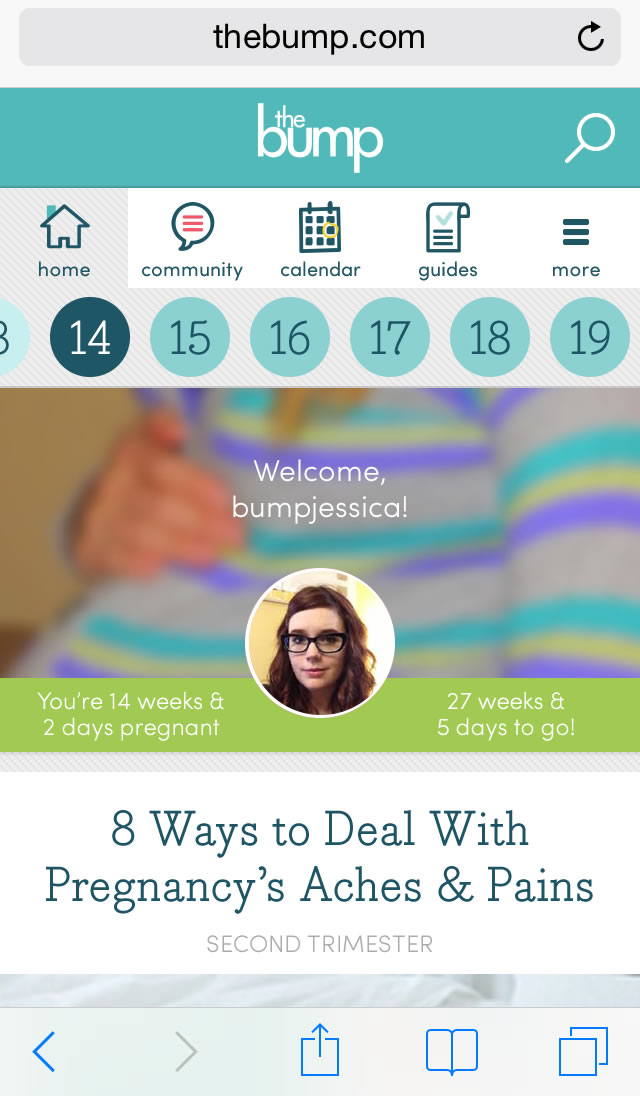
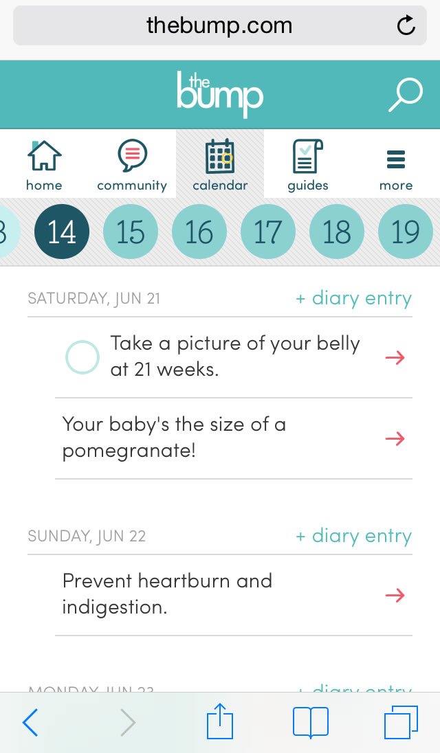
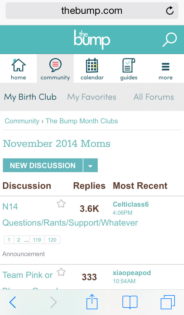
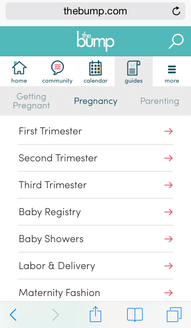
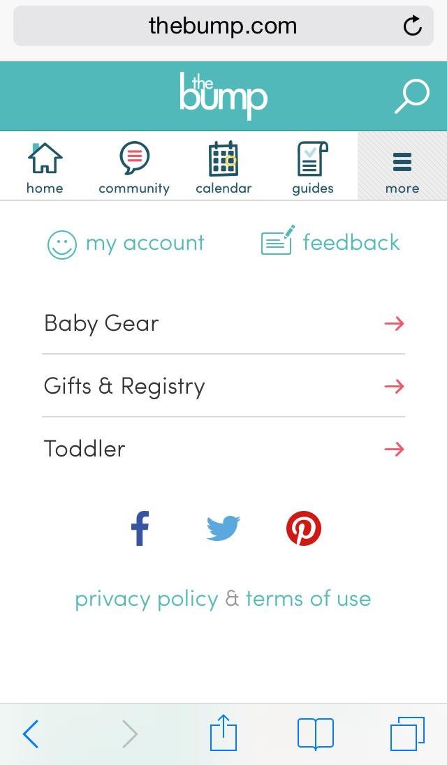
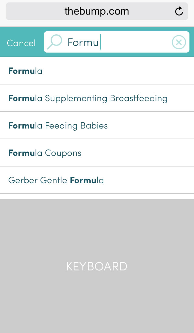
Prototype: An expandable left rail, collapsed at smaller widths
Prototype: Two-column structure
Prototype: Three-column structure

Mobile Web

Below are a selection of mocks for the "m-dot" mobile website.
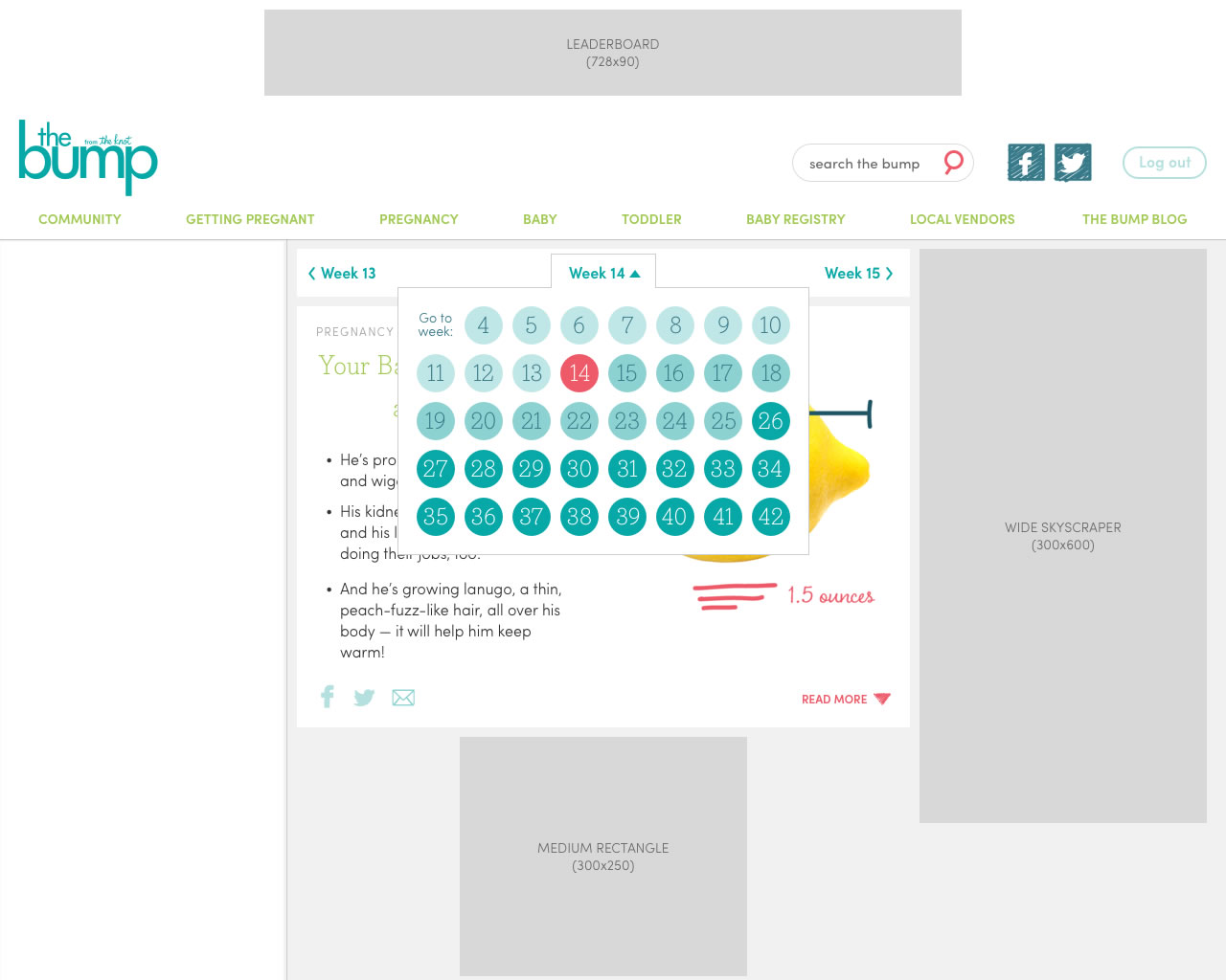
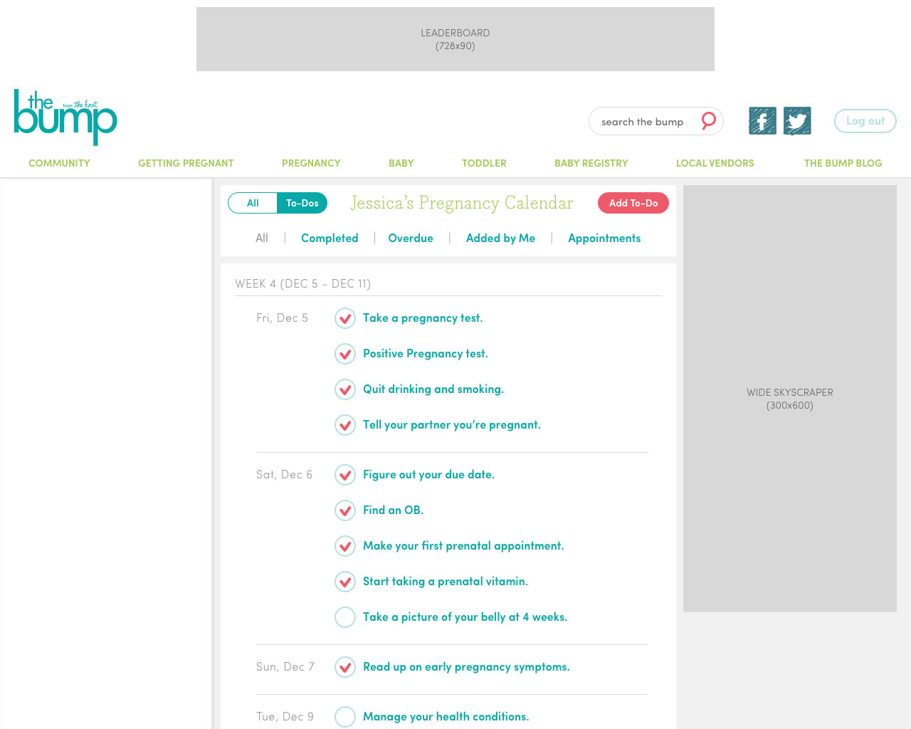
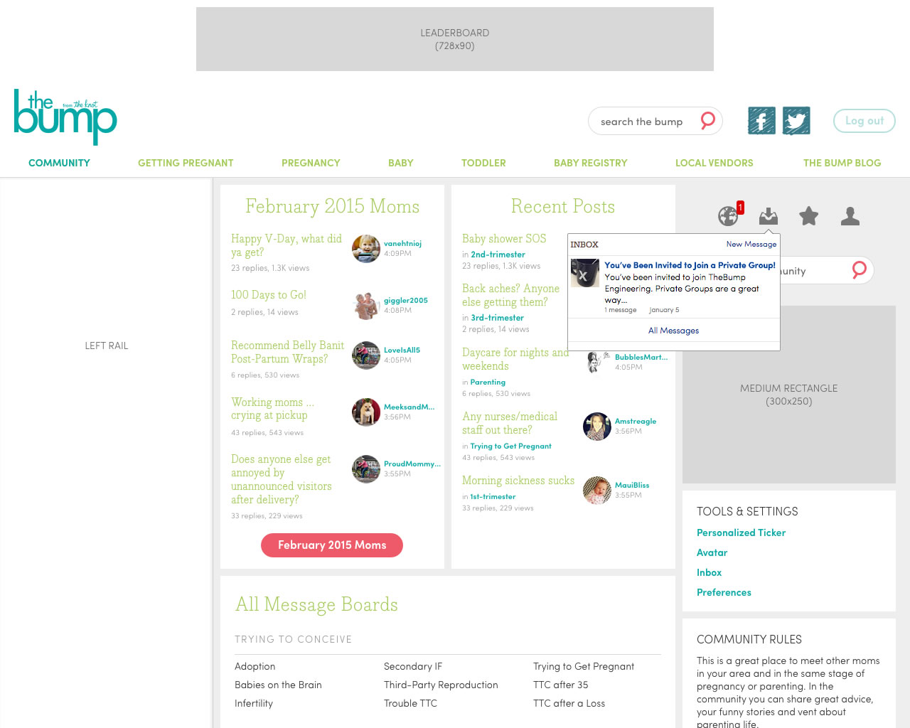
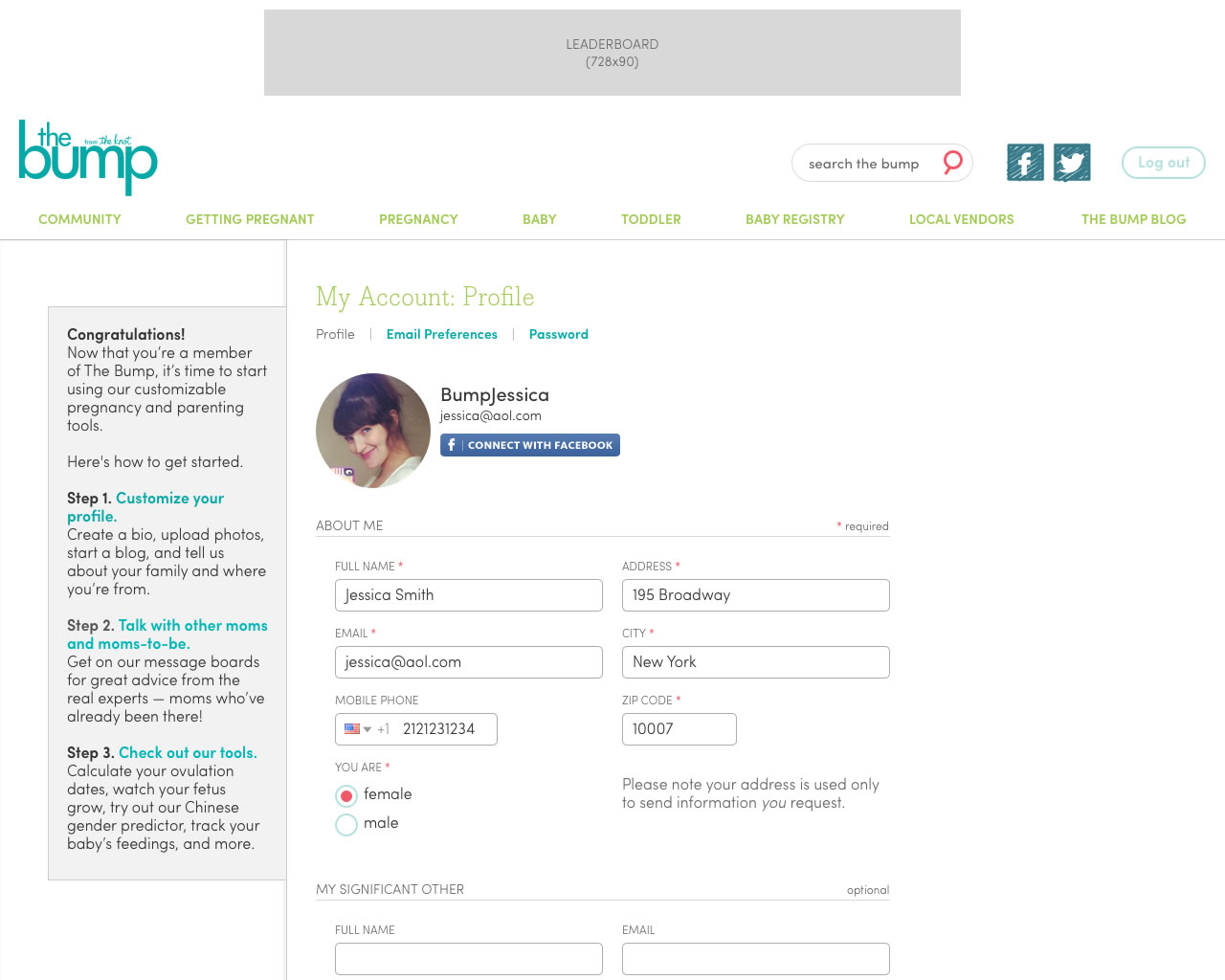
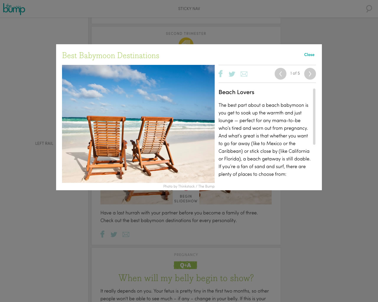
A screenshot of The Bump mobile website homepage.
Mobile Web Home Screen
A screenshot of The Bump mobile website calendar.
Mobile Web Calendar Tool
A screenshot of The Bump mobile website community page.
Mobile Web Community Screen
A screenshot of The Bump mobile website guides section.
Mobile Web Guides Screen
A screenshot of The Bump mobile website more screen.
Mobile Web More Screen
A screenshot of The Bump mobile website search screen.
Mobile Web Search

Desktop Web

Below are a selection of mocks for the desktop website.

A screenshot of The Bump website homepage.
Desktop Home Screen
A screenshot of The Bump website calendary pate.
Desktop Pregnancy Calendar Tool
A screenshot of The Bump website community page.
Desktop Community Landing Screen
A screenshot of The Bump website account page.
Desktop Account Screen
A screenshot of The Bump website article slideshow page.
Desktop Slideshow Modal Window