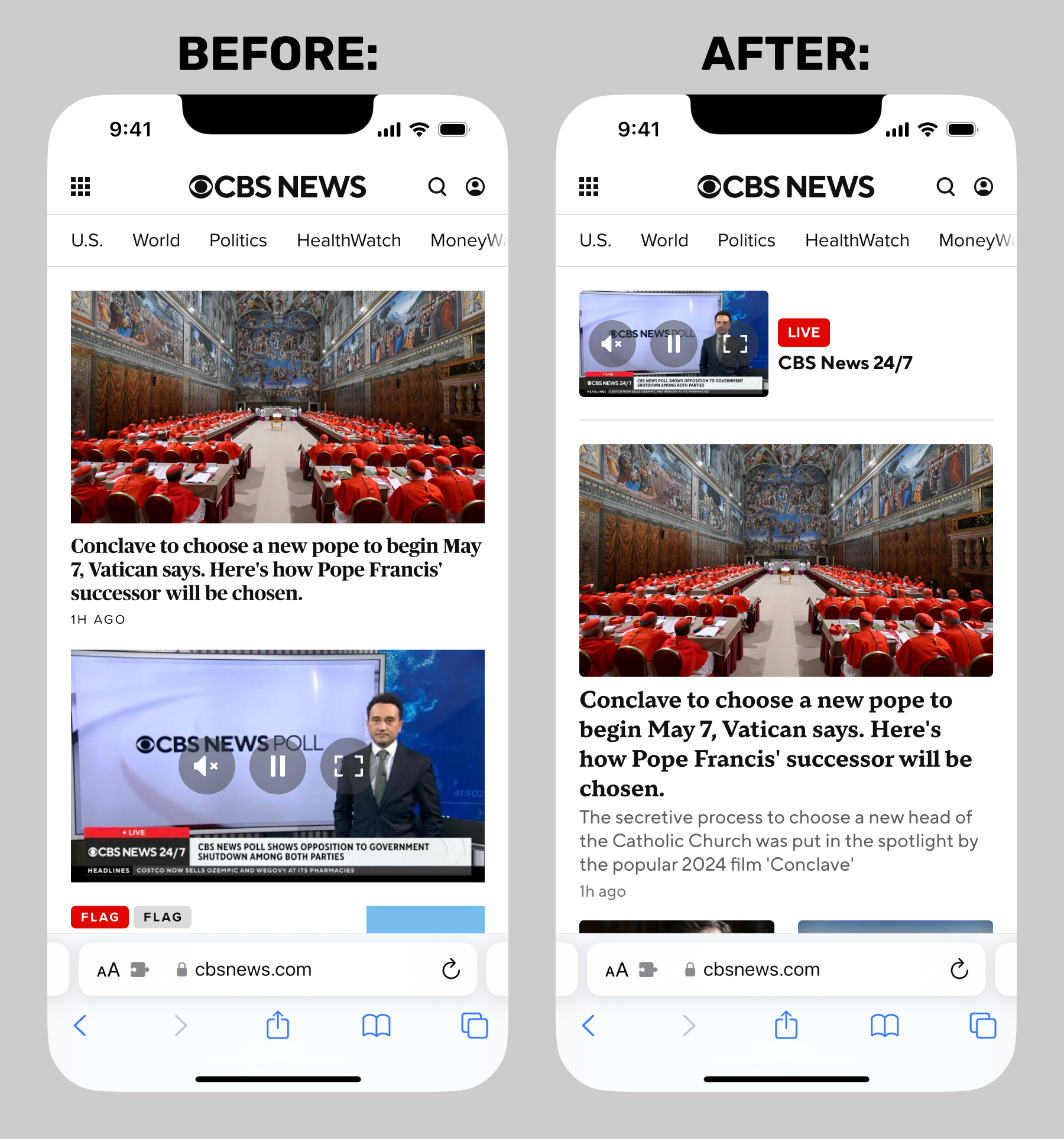
My final project during my time at CBS News was a redesign of the homepage (known internally as the "front door"), and related page templates. Like a number of other projects I worked on at CBS News, it had a number of false starts. But after the successful navigation and article/liveblog redesign projects, the homepage was finally on the roadmap.
I completed a full round of designs and a full-featured prototypes in late 2025. As I then accepted a "severance opt-in offer" made to a large number of Paramount employees, I cannot speak to what may have happened with the project after that point.
In this case study:
- Final Designs
- Doomsday Component
- Dark Mode
- Video Component
- Grid Component
- Prototype
- Shows and Local Affiliates
- Internal Page
It's worth noting that the example content in all of the below mockups and prototypes was taken directly from real CBS News articles, as was my practice. I had developed an understanding over years of observation, of how editorial would realistically program content.
Final Designs Case Study
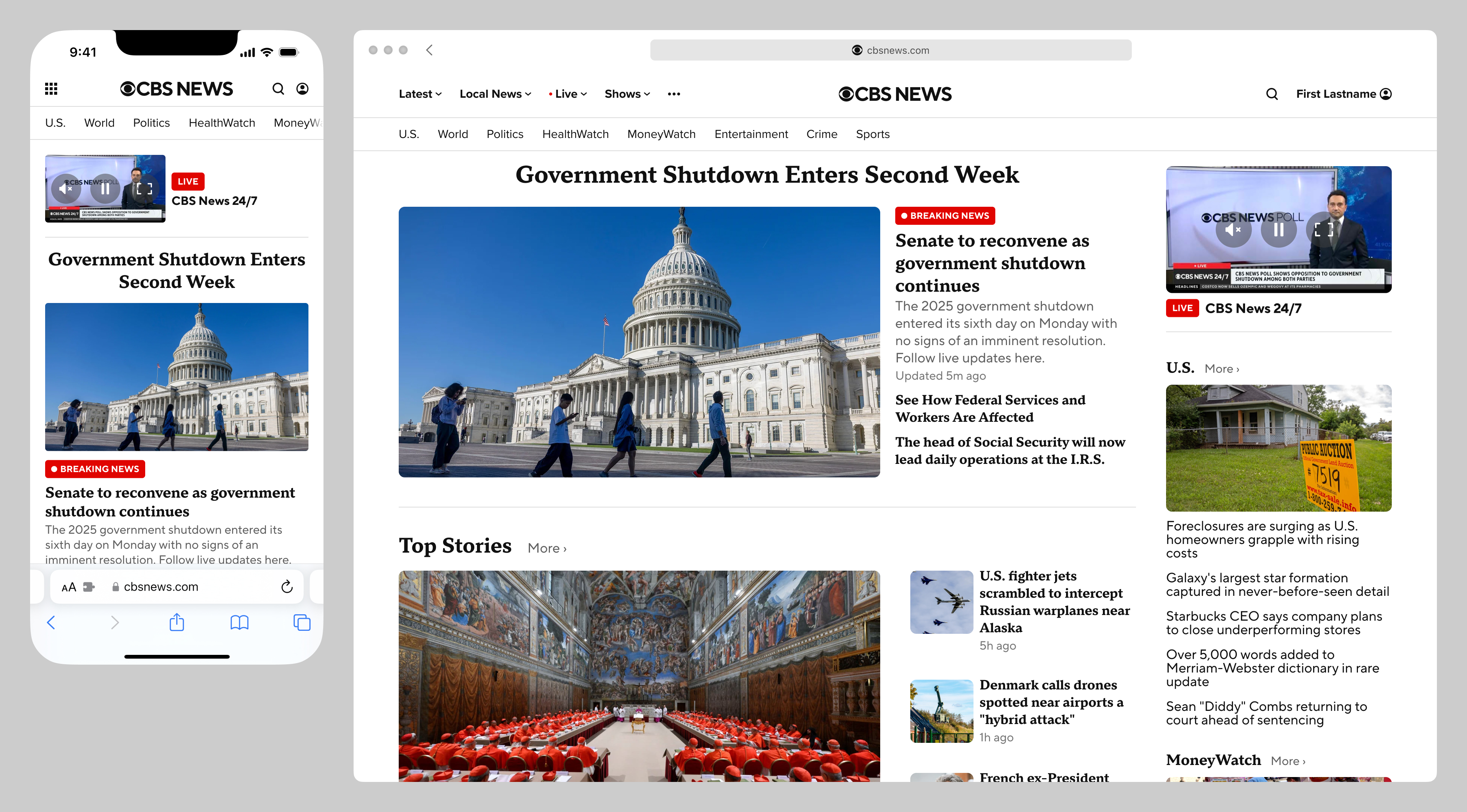
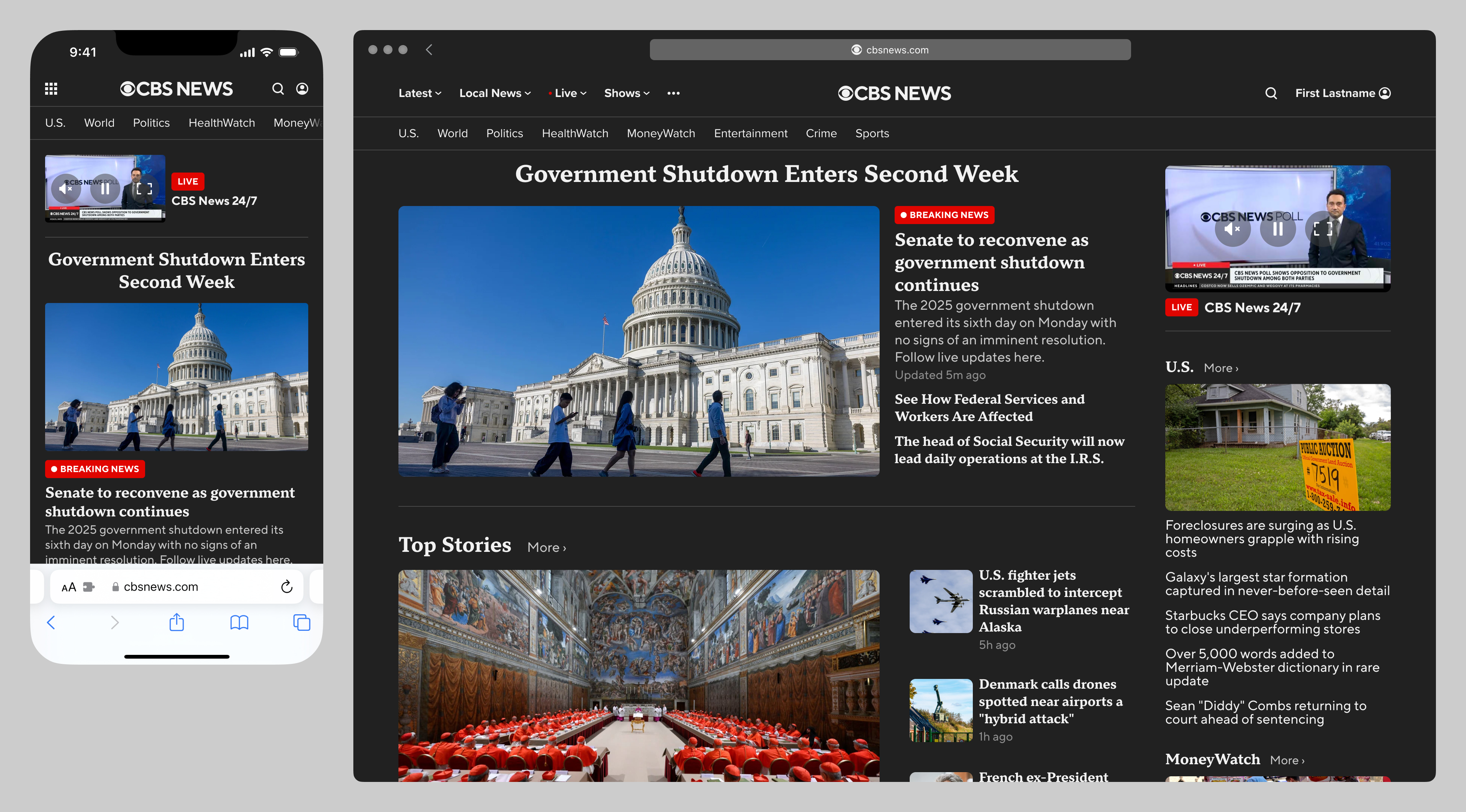
Below are before-and-after comparisons of the national front door, at two representative breakpoints.
Doomsday Component Case Study
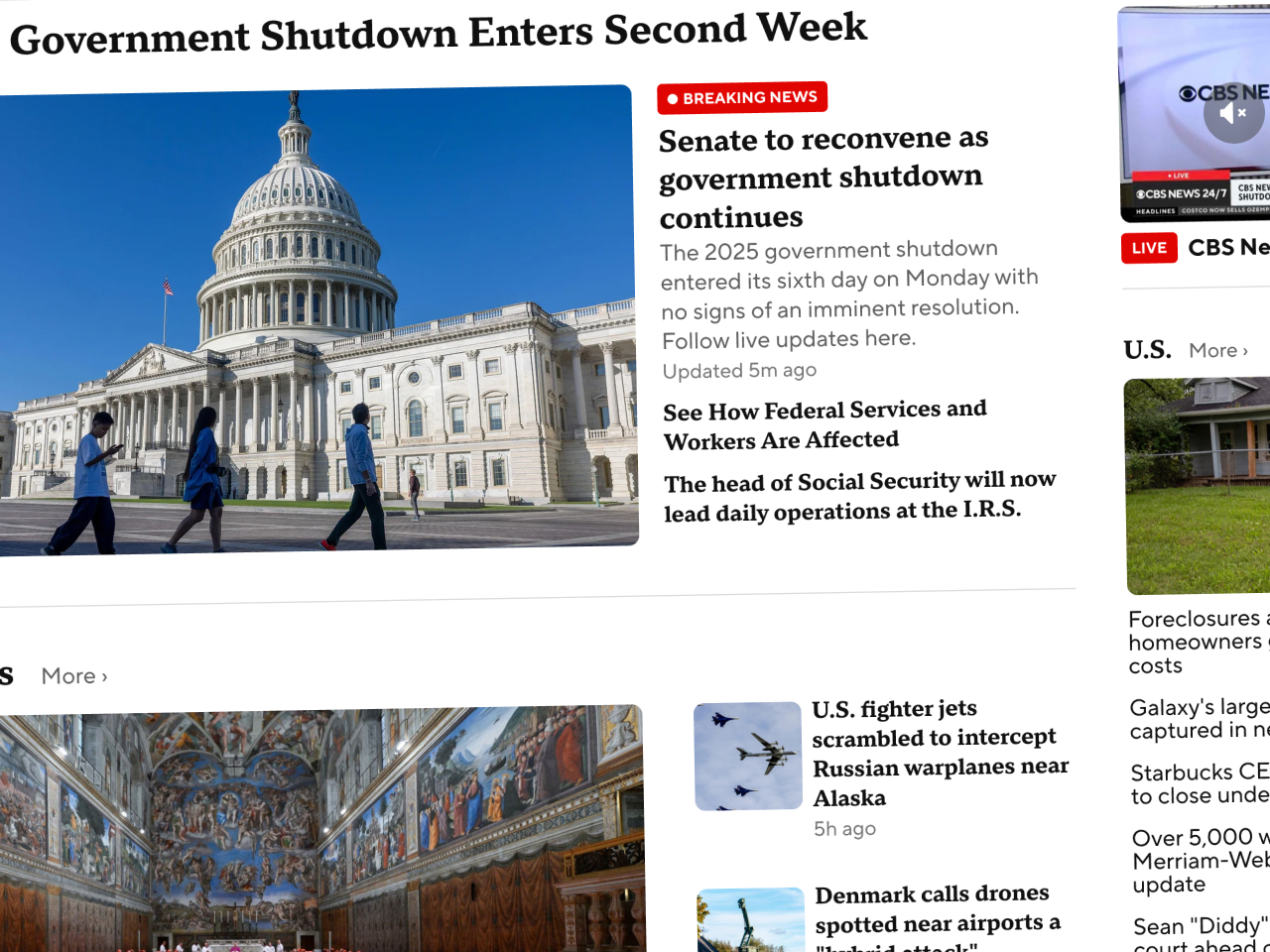
For major events, the new door template supports an optional "doomsday" component, long requested by CBS News editorial. As a point of interest, this particular feature was often an obstacle when the designs were presented to other Paramount groups outside of CBS News. I would often have to advocate for the News division on this point, explaining that this was a specific request of editorial, and indeed table stakes for the homepage of any news website.
The "doomsday" component supports a single asset, plus an optional jumbo headline and related stories below. CBS News never had a single-asset component previously, and was limited to 5- or 9-asset grid components. My hope was that any number of these single-asset components could be programmed in any slot on the homepage, as editorial saw fit, depending on the events of any given day.
Dark Mode Case Study
Although the feature was not on the roadmap, my Figma file and prototype both naturally supported device dark mode:
Video Component Case Study
This project necessarily involved redesigning every existing door component, from top to bottom. In my opinion, two of the most-improved are the video component and the grid components (in its 5 & 9-asset variations).
One interesting factor was that the ad market had changed so much since the previous version of the site launched, that the copious 300x250 MPU ads integrated into the previous versions of the components were no longer profitable, and I was thankfully given the green light to omit them from the redesigned components. To point out the obvious, their fixed dimensions severely limited my options as to responsive flexibility.
Below are before-and-after mockups of the video component, with the following improvements:
- standardized hero video treatment across all breakpoints
- removed brand color backgrounds (which were consistently applied across breakpoints, and had legibility issues)
- standardized heading and "more" button treatments
- no horizontal carousel at the smallest breakpoint, so all assets are shown
- optional "dek" article summary supported across all breakpoints (this was not desired by CBS News editorial, but was important to CBS Sports)
- new play button treatment
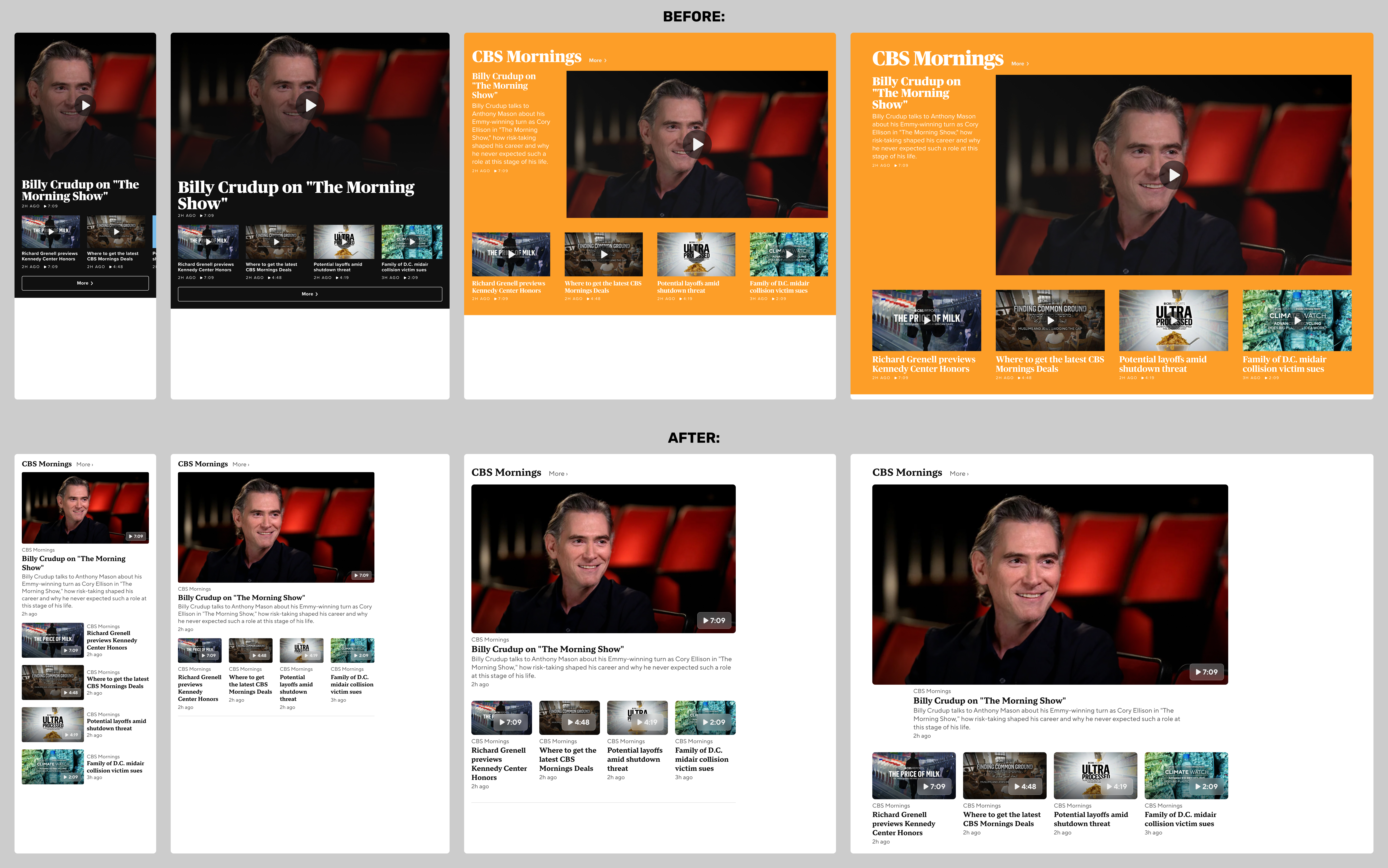
Looking at this again now, I think there are two problems with the video component redesign: it may appear too generic after removing the yellowish CBS Mornings brand color, and the new play button treatment is not prominent, especially at wider breakpoints.
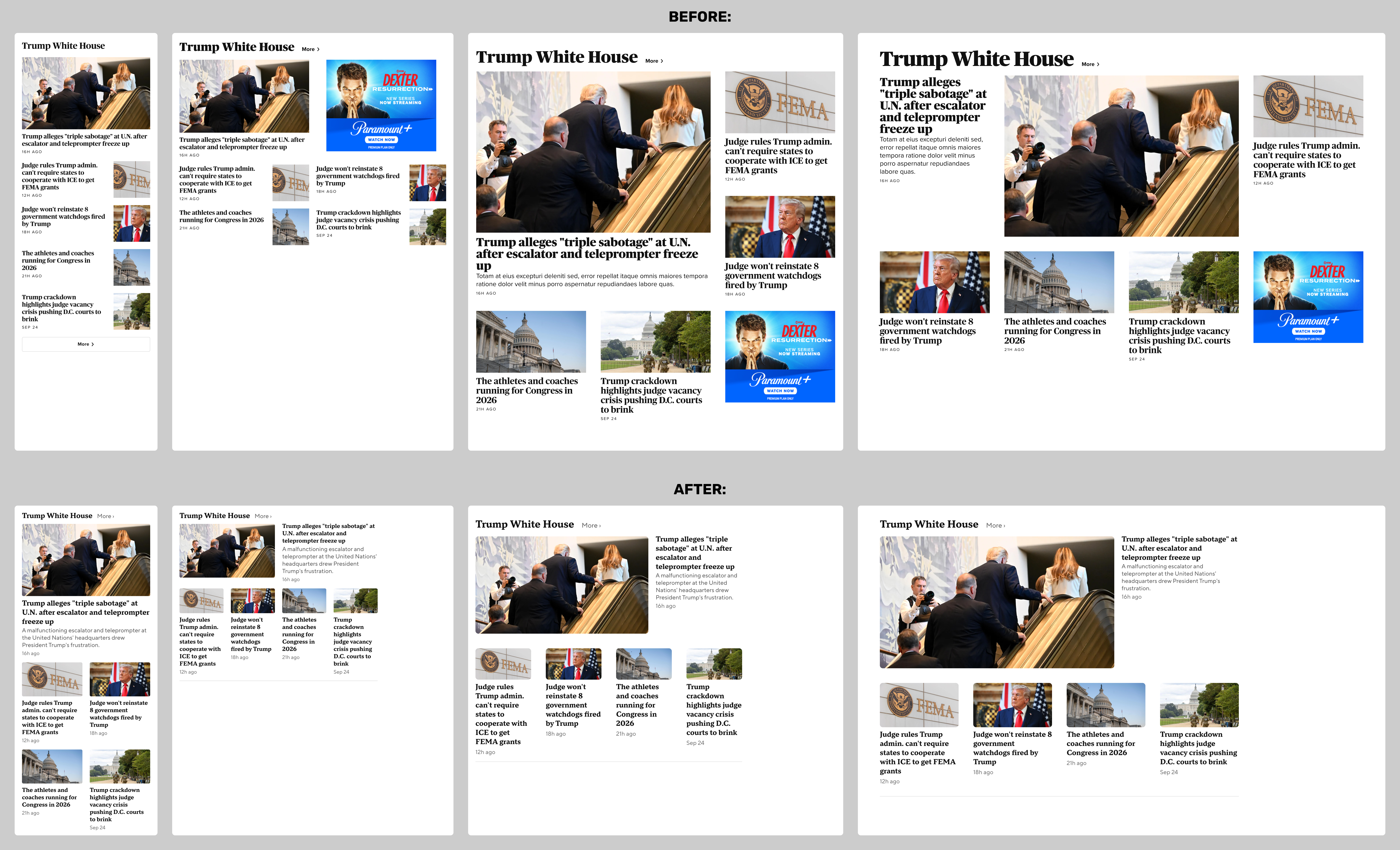
Grid Component Case Study
The much-improved 9-asset grid component is shown in the mocks at the top of this case study. Below are before-and-after mockups of a typical 5-asset grid component, with the following improvements:
- standardized all thumbnails to 16:9 aspect ratio (the previous version used three different aspect ratios, which varied across breakpoints)
- optional "dek" article summary supported across all breakpoints
- standardized heading and "more" button treatments
- assets two through five displayed with the same visual and editorial prominence across all breakpoints
Prototype Case Study
As part of my process, I built a responsive prototype to demonstrate:
- responsive behavior
- scrolling behavior, particularly the sticky nav and persistent video
I cannot share the actual prototype here, as it utilizes licensed webfonts, but here is a screen recording:
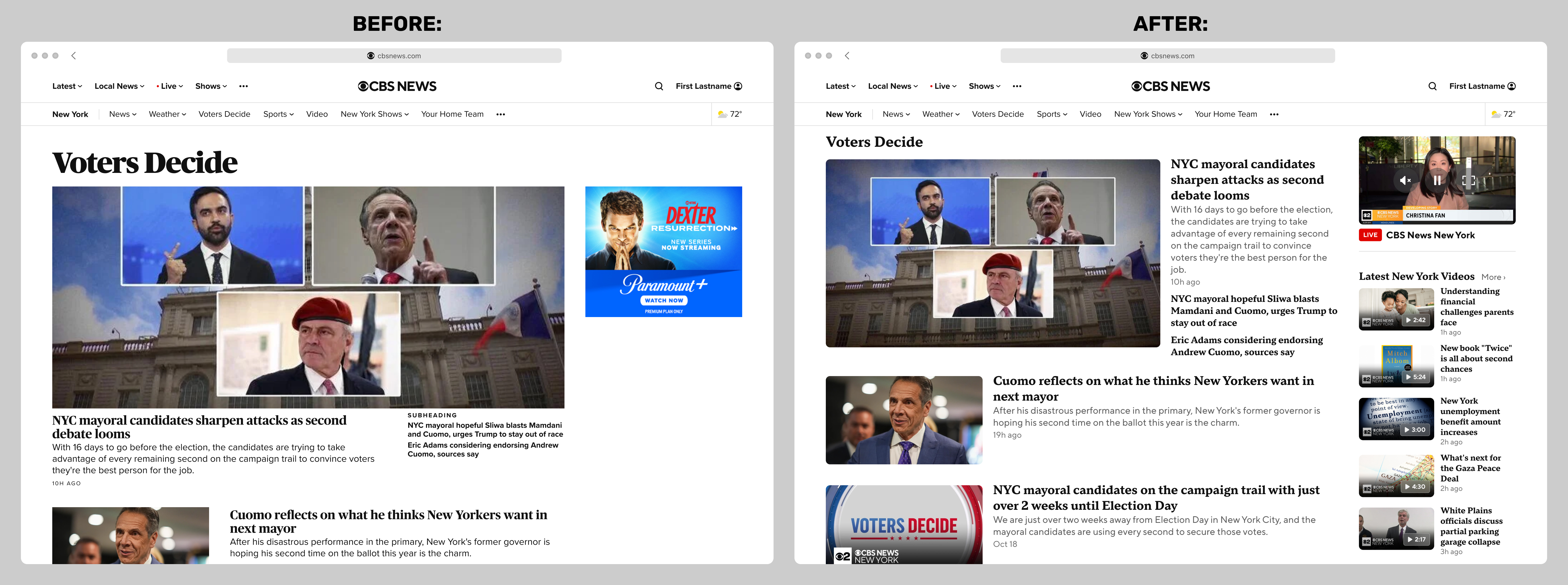
Shows and Local Affiliates Case Study
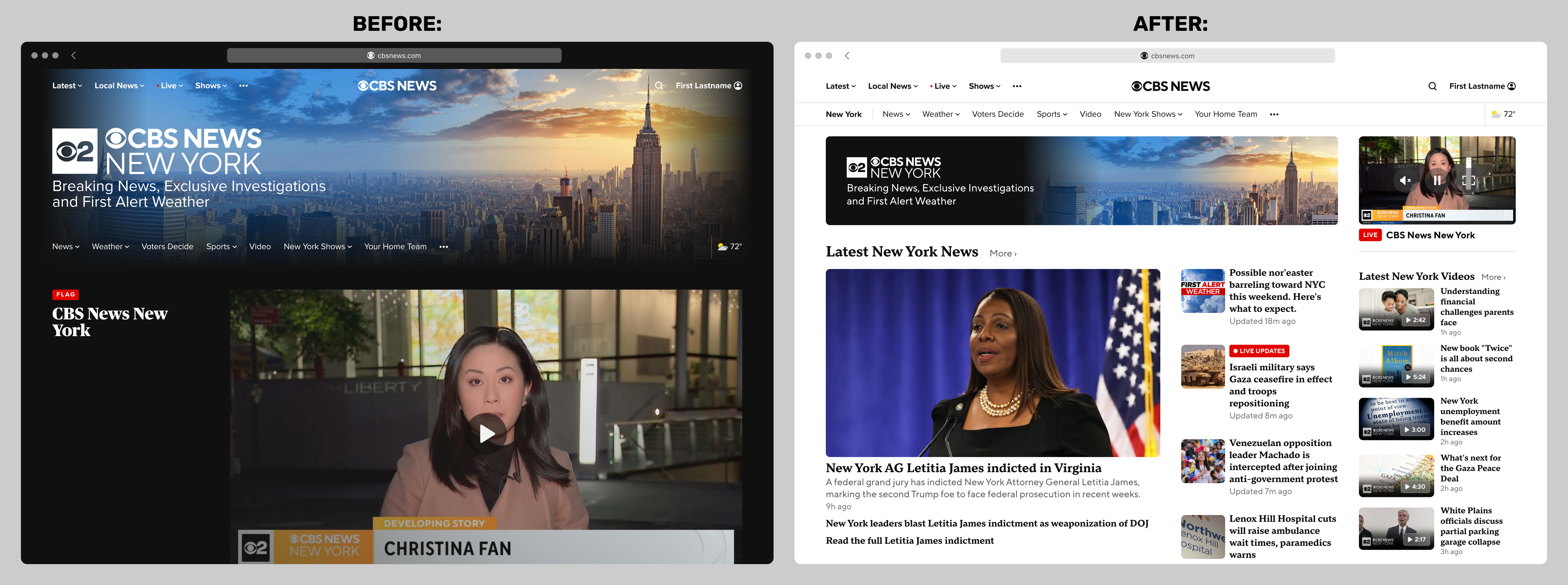
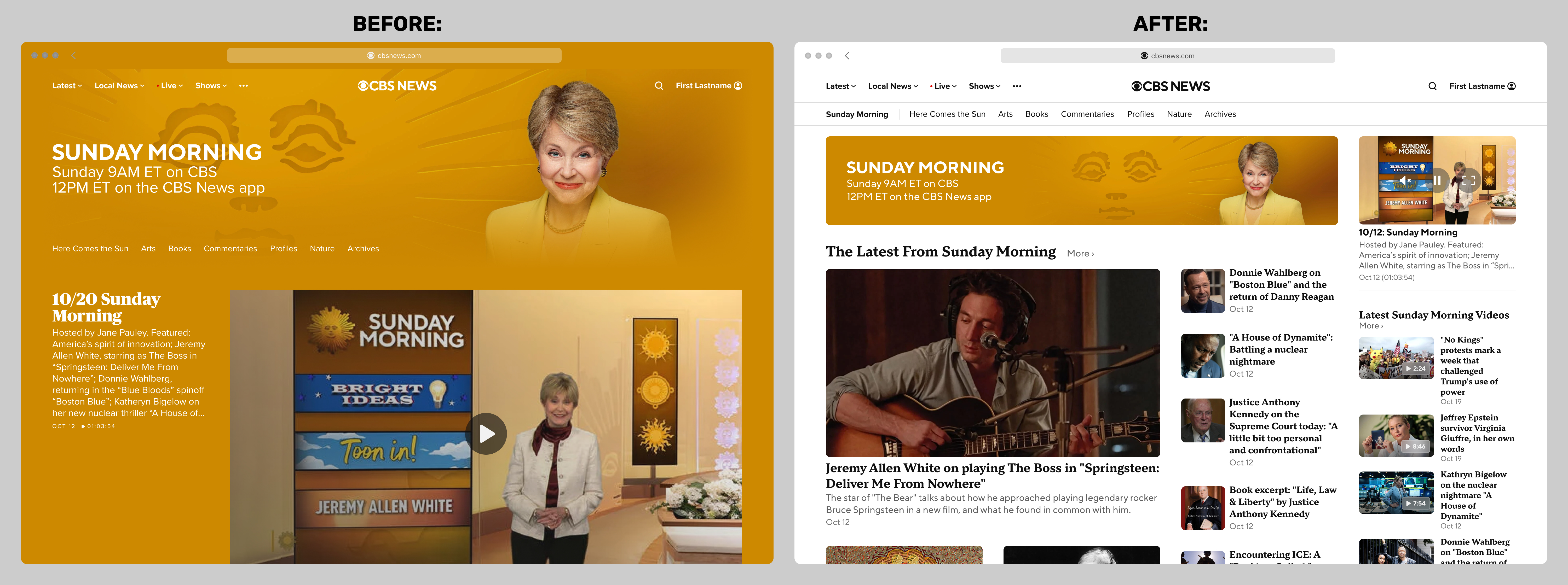
The improvements are more dramatic when seen in the context of shows (such as Sunday Morning) and local affiliates (such as CBS News New York). I wrote more about this process in the Brand Headers case study. Before-and-after comparisons below:
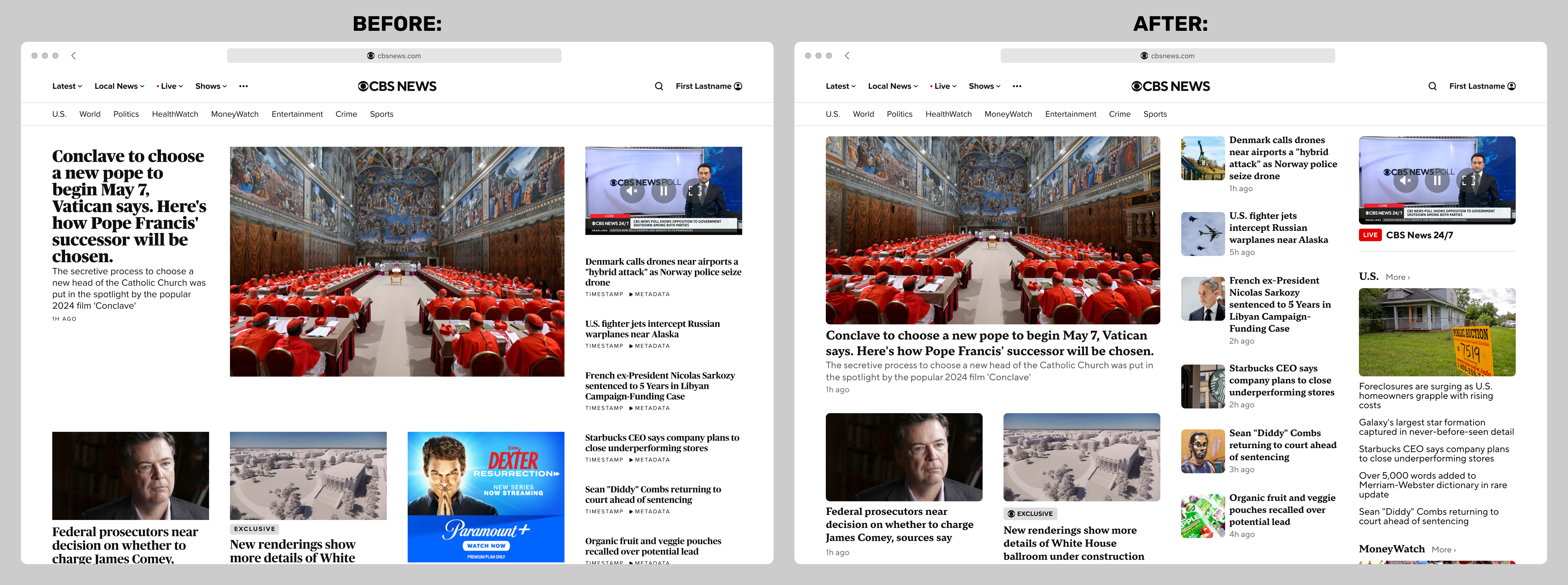
Internal Page Case Study
Below is an example of how a typical internal page would look after the redesign. This particular type of page was known internally as a topic page with a "river" component: